Pomus by Sömestr Studio
Branding a film production company is a delicate business. On the one hand, you need branding that can match and even enhance the quality of the films being produced, but on the other, you need something that doesn’t distract from the work or compete with it. Film is an intrinsically creative visual medium, and building a framework to support it...
PAC NYC by Porto Rocha
There have been some brilliant logo designs inspired by the very buildings they represent. The Centre Pompidou, for instance, bears a powerfully stark logo that’s been largely unchanged since it was first created in the 1970s: six black stripes crossed by two zigzags representing the site’s ‘caterpillar’ escalator, one of the most famous parts of Renzo Piano and Richard Rogers’...
RTS Cambridge Convention by Studio Kiln
The Royal Television Society’s annual two-day event at The University of Cambridge brings together leading television industry bigwigs to ponder the present and future of the small screen. This year, over 350 luminaries descended on Cambridge to contend with such weighty topics as ‘the future of media, the impact of AI, and the role of opinion in news’. Quite a...
RSPCA by JKR
It’s often the launch of major charity rebrands that puts the gulf between how the design world views something, and how the rest of the world might, into sharp relief. Countless headlines abound bemoaning the £££millions ‘spent on a new logo’, as if that’s just about all there is to it, and now the children/animals/elderly etc will directly suffer as...

The Gospel by DDMMYY
Not a new project, but one certainly worth revisiting; this work for whisky brand The Gospel scooped a fair few awards back in 2020, and it’s not hard to see why. The design agency behind everything from strategy and naming to brand story, creative direction, packaging design, and more is DDMMYY, based in Auckland, New Zealand. The team was initially...
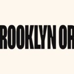
Brooklyn Org by Mother and Mother Design
Mother New York and Mother Design (Fhirst, Brooklyn Org, Peerspace) have overseen the rebirth of Brooklyn Community Foundation as the commandingly named Brooklyn Org. The sea change arose from a desire to distance the organisation from ‘notions of traditional philanthropy, seen largely today as elitist, dysfunctional, and detached’. If that sounds like a solution to a problem that shouldn’t exist...
Frank Penny by Bedow
Frank Penny is a consultancy specialising in AML – anti-money laundering. Knowing next to nothing about financial matters, I had no idea such companies existed. But like pretty much any other business, to succeed and stand out against their competitors, at some point or another anti-AML consultants need to think about their brand identity. Stockholm studio Bedow was recently tasked...
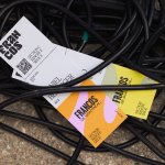
Francos de Montréal by LG2
Les Francos de Montréal is Canada’s premier festival of French language music and culture. Held annually in downtown Montréal, it is a fixture in both the social calendar and cultural life of the city, and the wider francophone world. This year’s edition of the festival has been given a sophisticated new look, courtesy of LG2, Canada’s largest independent creative agency...
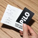
Pilo by 5.5
Youth hostels aren’t exactly associated with luxury – nor great branding. For the most part, they’re deemed the cheap and cheerful option; a trip where home comforts are sacrificed for socially minded living, affordability, and a more adventurous sensibility than the average Travelodge. They’re the sorts of places where creaky bunk beds, shower queues, pillows so thin they’re barely more...
Plume by Human After All
Plume is a Denver-based telehealth service (or ‘virtual-clinic’) tailored specifically to the needs of the trans community across the US, offering a range of services including prescriptions for oestrogen or testosterone. This is a hostile political landscape to step into, but Plume is doing it with bright and bold panache, courtesy of a fresh rebrand from London-based studio Human After...
Hometree by How&How
It’s all well and good for a design agency to make some wild, boundary-pushing, all-singing all-dancing work for things like Gen Z healthcare products; or ‘top shelf’ spirits; or craft beer. But most client projects aren’t going to be the sort of thing that merits bright orange and typography that dances around the boundaries of legibility. And arguably, it’s those...
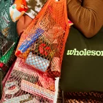
Wholesome by Universal Favourite
Wholesome is a new breed of supermarket that doesn’t fill a gap in a market so much as it positions itself at a nexus of multiple intersecting demands. The pursuit of ethical grocery and household shopping has, for decades, been both deeply commendable and exasperatingly time-consuming, expensive and convoluted. One supermarket will stock Fairtrade products but have a scant gluten-free...