Minimal Package Design
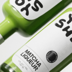
Yoshi by Saint-Urbain
Early days for sure, but this is hands down the best brand identity design I’ve seen this year – kudos to Saint-Urbain for once again putting a project out into the world that’s not only an absolute joy to look at, but which shows a razor-sharp nous for branding that’s both searingly zeitgeist and resolutely, timelessly future-facing. Said project is...
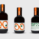
ITO Gin by Analogue
ITO Gin is first and foremost, brilliantly eyecatching – huge fluorescent letters, the epitome of ‘make it big’ when it comes to a brand name; deep black bottles – behind this bold exterior lies a narrative woven across cultures, histories, and generations. The brand was born of a collaboration between Komaki Distillery in Japan and UK-based gin brand Kokoro. However,...
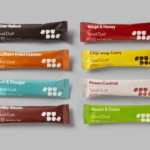
Spudos by Paul Belford Ltd
We live in chaotic and excessive times. Brands and politicians alike demand attention, clamouring for consideration and creating – quite frankly, for me at least – an unwelcome cacophony of competing voices and issues. All too often, the lines between competing interest are blurred, and even absurd. I crave clarity and simplicity, particularly when it comes to basic consumables. What’s...

Hello Klean by Two Times Elliott
Beauty is, of course, in the eye of the beholder, but there’s no denying that objectively, its branding and identity design has undergone some huge changes over the past decade or so. Gone are the days of faux-luxurious designs that were all about swathes of abstract silk; women coiffured to within an inch of their life; a microscopic lens on...
Trulli Ulivi by Here Design
Most people have likely never played the game ‘Italian Food or Italian Celebrity’; but trust me, it’s a pretty fun game – great for car/tube/bus journeys, or whiling away a bit of time after Christmas between gorging on something and watching Eastenders Omnibus. The premise is simple: someone says a name, the others guess if it’s an Italian food, or...

Ventura Foreman by Studio Blackburn
Founded by Robert Ventura and Sophie Foreman, Ventura Foreman is a design and manufacturing studio based in Woolwich, south London, which specialises in quality workwear pieces for clients like Paul Smith, Matches, and much-hyped North London ‘liberal metropolitan elite’ take on the greasy spoon, Norman’s Cafe. Having been around for a while without a ‘brand’, there came a point in...

Eadem by Lotta Nieminen
The skincare industry is a varied visual landscape. At one end of the spectrum, brands like Glossier and Soft Services (reviewed July 2022) have found balance in softness and understated minimalism. At the other Dr.Jart+ (reviewed Jan. 2018) and Malin+Goetz bring pharmacy-chic with functional, type-led packaging. And then we have our classic, heritage brands – like Kiehl’s and Elizabeth Arden – which...
Unto by Studio Bergini
Five years ago, the discerning and culinary-minded were content with their everyday Waitrose Essential Extra Virgin Olive Oil. But now – as with wine – there is increasing awareness that the taste of oil is individual, depending on olive variety, soil type, climate, cultivation method, and a host of other factors. From The River Café’s hotly anticipated annual pressing to...

LBDO by Universal Favourite
Self-care is nothing new, but our understanding and appreciation of it as a society has grown enormously in the last half century, and especially recently when it became a trending topic during the isolation periods of coronavirus in 2020 and 2021 (70 million hashtags on Instagram, and counting). In the dawn of this enlightened thinking, products in this space have...
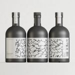
Still Waters by Makebardo
There’s a drink for all occassions. Could be with friends, out at a bar, in a restaurant, perhaps alone. There are also drinks that you might expect to take you away from the everyday, perhaps to a quieter more tranquil place, where torrent of ice water meets the churn of the sea. Still Waters, a New Zealand distilled gin and...
Future Factory by Dutchscot
‘Lead generation for creative agencies’. It’s one of those lines that makes complete sense to some but sounds like gobbledigook to everyone else. ‘Lead generation’ is a general mystery, unless your job depends on it. And what is a creative agency after all? But of course, so far as branding is concerned, ‘everyone else’ really doesn’t matter. Hitting the spot...
Baseline by Garbett
‘There’s better ways to build’ is Baseline’s opening gambit on its landing page. And Surrey Hills-based Garbett worked with the government and commercial builder to bring this and its core values of simplicity, precision, clarity and transparency to life. ‘Every successful build needs the right foundation’. This notion is expressed through a single unit that expands and grows into a dynamic system of blocks, not quite...