Monochromatic Brand Identities

Varnom Ross by Bibliothèque
Varnom Ross is a London-based specialist recruitment agency carefully pairing property professionals with private and public sector clients operating throughout the UK. Their specialism emerges from a single-minded focus on searching for and discovering the perfect synergy between individual character and collective corporate culture, professional skill set and task. This is achieved through personal conversation rather than the impersonal algorithmic governance...

Maven by Design By Toko
Maven is described by Design By Toko, the Sydney-based design studio behind its recent rebranding, as a top-tier architecture recruitment agency operating worldwide. Drawing on the built environment and with the intention of expressing the agency’s prominence within the architecture industry Toko developed a brand identity of simplicity and impact through bold solid form and single colour that links business...
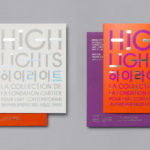
Highlights by Studio fnt
Highlights is an exhibition of works from French contemporary art museum The Collection of the Fondation Cartier pour l’art contemporain at the Seoul Museum of Art (SeMA). The exhibition runs from May 30th to August 15, 2017, features work by artists such as Ron Mueck, David Lynch and Sarah Sze, and also includes commissioned pieces and major artworks by Korean artists. Highlights is curated...
Corps Reviver & L’Heure du Cocktail by Spin
Corps Reviver is a French publisher and revivalist, redesigning and reprinting classic literary works, the first of which is L’Heure du Cocktail, The Cocktail Hour, written by journalists Marcel Requien and Lucien Farnoux-Reynaud and originally published in 1927. L’Heure du Cocktail, at the time, revolutionised the cocktail book, approaching the subject in a new way. This 2017 bilingual edition, presented in French and English,...

Tulura by Build
Tulura is an independent luxury botanical skincare brand created Eileen Feighny, a former professional model brought up in Korea and now working from New York. The first of Tulura’s products is a two-step moisturising program that includes a vitamin peptide serum and a botanical facial oil made from seasonal ingredients hand picked and custom-blended. Ingredients are chosen for their effectiveness, and formulations created without the use...

Collect by Spin
Collect is an international art fair that this year took place between the 2–6 of February at London’s Saatchi Gallery. Presented by the Crafts Council, Collect gave visitors the chance to see and buy museum-quality and contemporary ceramics, glass, jewellery, wood, metal and textiles created by established and emerging artists and makers represented by over thirty of the world’s best galleries. Collect’s...
Blå Bär by BVD
Blå Bär (Swedish for blueberries) sells a variety miscellaneous goods from Scandinavia from its store in Osaka, Japan. These include, but are not limited to, glass and kitchenware, soft furnishings, ornaments and jewellery. Many of these could be described as having something of a shared Scandinavian simplicity of form, lightness of colour, natural material quality and cheerful character in pattern...

Artek Helsinki by Tsto
Artek is a Finnish furniture and product design business and retailer with a flagship store in Helsinki. It was founded in 1935 by architect Alvar Aalto and wife Aino Aalto, the arts promoter Maire Gullichsen and art historian Nils-Gustav Hahl. Artek grew alongside and shared many of the qualities of the 20th century modernist movement, blending art and technology, and making the...

Galerija Kranjčar by Bunch
Galerija Kranjčar is an art gallery, located at the heart of Zagreb, opened in 2006 to showcase the work of Croatian contemporary artists and function as hub for a variety of cultural activities. The gallery is a long and unique space, one that balances the modern and historic. This can be seen in the meeting of smooth white walls, concrete floor...

In Search Of The Present at EMMA by Werklig
In Search Of The Present is a new series of exhibitions on a 3–4 year cycle held at Helsinki’s Espoo Museum of Modern Art (EMMA). These intend to tackle many of the existential questions that we face in an ever changing world. The first exhibition, inspired by Olavi Paavolainen’s essay collection from 1929, took place between October ’16 – January ’17 and was a study in the representations...
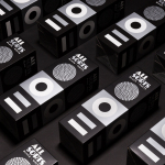
Allsorts Black & White Edition by Bond
Bond continue to work with Scandinavian confectionery brand Cloetta, owner of liquorish brand Allsorts, on the packaging for their Allsorts Black & White edition. The packaging for Allsorts’ originals range looked to bring the distinctive shapes and colours of the liquorice to the forefront using geometric forms and bright colour, enhanced by the black background of a simple card box. It was an approach rightly described...
InsideSource by Mucho
InsideSource is an American office space planning, design and installation business with 25 years experience and past clients that have included Facebook, Box, Shutterfly and Tango. InsideSource worked with graphic design studio Mucho to help them better express who they are and what they do through a new visual identity. This was achieved using a modular and custom type-based system that runs across tote bags,...