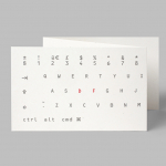
Monospaced Logotypes
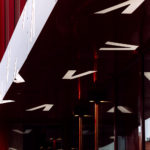
Vega Scene by Metric
Vega Scene is space for food and culture located on the river Akerselva in the centre of Oslo. It features three film screens, a theatre, debate lounge, an organic and sustainable cafe and a wine and cocktail bar. Vega Scene sits within an area of urban culture, features a distinctive exterior of burgundy concave panelling and vertical slats, and a...
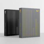
The Conference Company by Studio South
The Conference Company (TCC) specialises in the design, organisation and execution of large-scale conferences throughout New Zealand and Australia. They also apply this expertise to award ceremonies under the trading name The Awards Company. It is a strategically interesting delineation yet a straightforward naming practice. Expressing what either company does was clearly not an issue, however, in a fast moving...
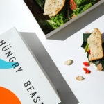
Hüngry Beast by Savvy
Hüngry Beast is a cafe and juice bar located in Mexico City’s Roma Norte neighbourhood, a place of recent cultural and gastronomic development. It is a modern and casual experience with a focus on simple, high-quality cold-pressed and gluten-free products creatively prepared from healthy organic ingredients. The urban, natural and creative positioning of the cafe is expressed materially throughout an...
Kimski by Franklyn
Kimski is a Korean-Polish street food restaurant, created by Ed Marszewski and chef Won Kim, located in the Bridgeport area of Chicago. The restaurant has a distinctive interior of geometric wood panelling, bright yellow stools, utilitarian booth seating, wood panelled ceiling and concrete floor with a warehouse quality in its space, shape and box-like exterior. In contrast, Kimski’s brand identity, developed by New...
Designers’ Friend by Paul Belford Ltd
Designers’ Friend is a UK web development company working with designers and design studios to deliver fast sites that look exactly as they were designed. The company commissioned London-based graphic design studio, past client and collaborator Paul Belford Ltd., to deliver a brand identity concept that would work in print and online. The studio’s concept is described as a dramatisation of the line ‘we write code’ and visualised,...
Shuang Shuang by ico Design
Shuang Shuang is new restaurant experience, located on London’s Shaftesbury Ave, that brings a contemporary twist on hotpot—a long-established and family favourite throughout China and East Asia, and a fun and social way of eating—to the United Kingdom. Shuang Shuang worked with London based graphic design studio ico Design on naming and interior design, as well as brand identity. This extends across signage, tableware, menus and...
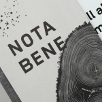
Nota Bene by Blok
Nota Bene is a restaurant, located on Toronto’s Queen Street West, with a menu made from locally-sourced and seasonal ingredients. It was opened by chef David Lee and business partners Yannick Bigourdan and Franco Prevedello in 2008, and was awarded “Best New Restaurant” by Toronto Life and enRoute Magazine soon after. To coincide with the restaurant’s 2016 relaunch—which saw David Lee take...
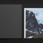
Maaemo by Bielke&Yang
Design studio Bielke&Yang have worked with Norwegian two Michelin starred restaurant Maaemo to develop a holistic brand identity solution informed by the philosophies and creative practices of its unique dining experience and culinary expertise. The studio’s brand identity design, which encompassed website, custom typography, colour, the tone and content of images, and the tactile finishes of welcome notes, magazines, business cards, folders...
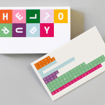
Hello Ruby by Kokoro & Moi
Hello Ruby is a Scandinavian company that offers an accessible and playful way for children to learn about technology, computing and coding, guided by Ruby, an illustrated character, and her animal friends. Founded in 2009, with the intention of being a small art project, and initially limited to a book, Hello Ruby has rapidly grown into a popular and comprehensive children’s computing...
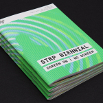
STRP Biennial 2015 by Raw Color
STRP brings together art, technology and experimental pop culture, and connects these to a broad audience, and through its light art, interactive art and robotic performances, lectures, workshops, music and film events, offers a glimpse into the future. This culminates with the STRP Biennial, an indoor art and technology festival that provides visitors with an opportunity to experience the extent to...
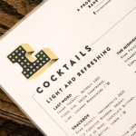
Libertine Liquor Bar by CODO
Libertine is a bar and restaurant, located on Indianapolis’ Mass Avenue, that celebrates the pioneering American spirit with an emphasis on classic cocktails, craft distillers, boutique wines and an evolving menu. It is recognised as one of the best restaurants and bars in the country, and as being instrumental in the city’s growing and continued support of local food and independent...
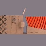
Finchtail by Believe in
Finchtail is dedicated to the design and manufacture of simple, useful and sustainable solutions to everyday problems. Its first product, a low-cost, flat-packed card tablet and mobile phone stand, features a distinctive brand identity and packaging design treatment developed by UK based graphic design studio Believe in. Monospaced type and corrugated card sit alongside die cut detail, white ink, a bold pattern...