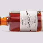
Uproot by Believe in
Uproot is a premium and limited edition maple syrup created to celebrate the opening of UK-based Believe in’s second design studio in Canada. It features a distinctive packaging design that takes a Canadian icon and infuses it with what the studio describes as a European design sensibility. Believe in, from its two studios and through their collaborative effort, will now support clients...
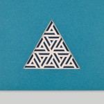
WallpaperSTORE* by A Practice For Everyday Life
WallpaperSTORE* is the online store of UK architecture, interior, fashion, art and contemporary design magazine Wallpaper*. It features and ships worldwide a broad but tightly curated catalogue of tabletop, lighting, desktop, stationery, grooming, technology and travel objects. Many of these objects, while individually distinctive, share a sense of contrast; in form and finish, materiality and colour, but also in their contemporary crafted quality....
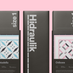
Hidraulik by Hey
Hidraulik is a Barcelona-based business producing floor mats, table mats and runners for contemporary spaces. These are inspired by cement panels hydraulically pressed, rather than fired, with a layer of coloured pigment. Hydraulic panels originated in the 1850’s and experienced a resurgence in the mid 20th century. At that time they would often feature brightly coloured and detailed patterns, and were popular during an era of...

Mathias Dahlgren Edition by Essen International
Mathias Dahlgren Edition is a set of contemporary kitchen appliances which are the product of a collaboration between the Grand Hôtel Stockholm, its renowned Swedish Michelin starred chef Mathias Dahlgren, and kitchenware retailer Dafra. Scandinavian graphic design studio Essen International worked with the trio to translate the culinary vision and creativity of Mathias Dahlgren into a modern graphic expression and packaging solution...
Faculty Brewing Co. by Post Projects
Faculty Brewing Co. strives to create an open and collaborative environment where visitors, of all levels of expertise, can learn about how craft beer is made with the intention helping them to navigating Vancouver’s thriving craft scene. The brewery boasts a 7 barrel, 1450 square-foot brewery with 6 fermentors, 6 bright beer tanks and 28-seat tasting room with an industrial and utilitarian interior design. It also...
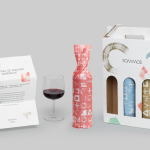
Sommos by Mucho
Summos is an online platform that gathers together and shares the knowledge of the six best sommeliers of the Netherlands and offers a seasonal subscription service that sends out a selection of some of the country’s best wines once every two months. Sommos worked with graphic design studio Mucho to develop name, brand identity and packaging. Based around the concept of group and innovation, and clearly informed...
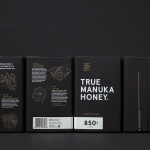
The True Honey Co. by Marx Design
The True Honey Company (TTHC) dedicates itself to the production of mānuka honey, a monofloral variety produced in Australia and New Zealand from the nectar of the mānuka tree. It has a unique colour and texture, and a high level of Dietary Methyglyoxal, an organic compound with antibacterial and antiviral properties. With a price range starting at 60.00AUD and rising to 230.00AUD per jar,...
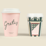
Gretas by 25AH
Gretas is a café set within the Haymarket, a hotel located at the heart of Stockholm, Sweden. The building was formerly home to a famous department store that dates back to the early 20th century and was the place where actress Greta Garbo was discovered while working at one of the concessions. 25AH, the Scandinavian graphic design studio behind Haymarket’s own brand identity, as well as Paul’s, a restaurant also situated...
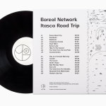
Boreal Network, Itasca Road Trip by Bedow
Nicole Johnson is a Seattle-based Minnesotan creating what Miles Bowe of Fact Magazine describes as “sun-drenched, foggily nostalgic electronica” under the name Boreal Network. Itasca Road Trip is a limited edition vinyl rerelease and trimmed down version of an earlier album by Boreal Network, distributed by More Than Human Records and featuring artwork by Swedish graphic design studio Bedow. Where the album takes an aural tour...
Collected Coffee by Fivethousand Fingers
Collected Coffee is a New York-based coffee subscription service committed to sourcing the world’s best coffee beans, prepared by speciality roasters. The service worked with Canadian design studio Fivethousand Fingers to develop a brand identity, which included logo, packaging, tote bag and web design, that would be perceived as intelligent, cultured and curious to a sophisticated coffee enthusiast. This was achieved through a contemporary gallery-like...
Higher Living by B&B Studio
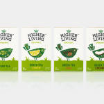
Higher Living is a British company who have been blending teas, herbs and spices for over 45 years using only 100% natural and organic ingredients. Continuing their collaboration with Higher Living, which began back in 2010, London-based graphic design studio B&B Studio worked with the company, following a recent expansion of the range, to help redefine its packaging and brand identity with the intention...
Solrug by Bielke & Yang
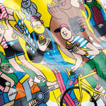
Solrug is a high-quality, ready-cut, Finnish sourdough rye bread created for the Norwegian market by Magnus Högnäs, a Finnish expat living in Norway, and in response to the county’s poor wholemeal choice. The bread is dense with a strong flavour, low in sugar and salt but high in fibre and protein, and produced by Finnish bakery Leipomo Rosten Oy using only...