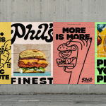
Phil’s Finest by Gander
It’s a moot point now that the last few years have seen an explosion in all things vegan and ‘plant-based’ (a term arguably used lightly, when you consider the ingredients in many no-meat, no-dairy, no-animal product alternatives). There’s vegan cheese that actually tastes nice, there’s mushroom and hemp ‘magic mince’, even vegan tuna. I’m writing this while eating a vegan...
Logo
Number 12 Cider by Buddy Buddy, 2020
Number 12 Cider. That’s a gift of a name for a logo designer. Why complicate things? Of course, the skill is in the execution. The win here is in the configuration of the twelve circles into a recognisable and distinctive tree form, and then getting that ‘they’re apples!’ a-ha moment. On pack and online this is dressed this up a...
Beams by Only Studio
The Beams is ‘an expansive new venue and event space on the Royal Docks in the heart of East London’ (that’s as long as you prefer your cartography loosely impressionist). Manchester-based Only Studio was tasked with branding the former Tate & Lyle sugar factory. The award-winning agency has previous form in the field of London industrial-eyesores-turned-cultural-juggernauts: it was also responsible...
Philharmonie Luxembourg by NB Studio
It is fair to say that rebrands of music organisations, of which there have been a number in the past few years, have benefitted from the recent explosion of graphic design into the world of sound and motion. Music has always inspired other forms of art, but these new digital tools are uniquely suited for producing design solutions for these...

BP&O Voices
Rich Baird on Design History:
Bandai by PAOS, 1983
The story of PAOS’ 1983 logo for Japanese toys and games company Bandai....
GUT by &Walsh
Guts aren’t exactly glamorous. And the connotations of the word ‘gut’ are multifarious: there’s the gory (‘blood and guts’); the Germanic ‘good’; the straightforwardly corporeal; or for those with an interest in newer psychological findings, it’s a wondrous ‘second brain’. Ad agency folk, however, have long taken the word ‘guts’ far outside of the bodily. For many of them, ‘guts’...
Logo
Sandvik Group by Lynxeye, 2023
Sandvik provides manufacturing, mining and infrastructure industries with high tech engineering solutions. Its new logo, designed by Lynxeye, is said to represent progress and circularity, and further, visually summarise the commitment of Sandvik to advance the world through engineering. A simple use of heavy to fine lines, a diagonal upwards motion left to right and good balance of volume and...
Logo
Hometree by How&How, 2023
Hometree ‘excels’ in transitioning homes towards more greener heating and energy solutions. Wether it be boilers, home cover and ‘green finance’ Hometree has it covered. Transformation and the green agenda are the foundation for a distinctive new logo, an unusual ‘twist’ on the universal motif of a tree. Familiar yet distinctive and ownable, scaling up and down well. Placed within...
Orchestra Sinfonica di Milano by Landor & Fitch
In the words of synesthete Johann Wolfgang von Goethe, ‘music is liquid architecture; architecture is frozen music’. Unlike 19th-century architecture, contemporary graphic design is afforded no such static reprieve – it faces the challenge of animating the ‘universal language’. Whereas once the plastic arts could content themselves with merely freezing music, any contemporary attempt to visually translate music must now...
Logo
Antora Energy by Buddy Buddy, 2023
The sun has been depicted in many ways and across millennia, and has been a motif mined thoroughly by designers since the dawn of corporate identity design. It’s difficult to imagine where a designer might take it today in order to achieve both similicity and distinctiveness. Drawing on the strategic positioning ‘building blocks for a lower carbon future’ Buddy Buddy...
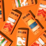
Miles by Buddy Buddy
Deodorant isn’t traditionally a hotbed of innovation: for the most part, ‘women’s’ products don an unremarkable raft of white packaging (freshness!); blue, pragmatic type; and vague, rarely-kept promises about lasting for 72-hours. For the men, packs are sombre shades of black, dark blue, or grey (manly!) and just as drearily practical as the women’s. Deodorant, for the most part, has...
Logo
Nationwide by New Commercial Arts, 2023
The world’s largest building society gets a new logo and corporate identity designed by New Commercial Arts. It’s the first significant rebrand for the bank in thirty years, and part of a drive to modernise it. Reduced to the absolute bare essentials, the logo favour usability–scaling far better than the previous mark–over the down-to-earth homeliness of what came before. The...