Future Circular Collider by Bleed
After the scientific successes of CERN’s Large Hadron Collider (and its blessed failure to create any world-destroying black holes), the research organisation has an even greater need for speed. The team of scientists over in Geneva has been illuminating the nature of our universe since 2009: accelerating and smashing particles together, then snatching glimpses of their tiny collisions. Their appetite...
Big C Charters by Mucho
Big C Charters is a premier charter service located in the San Francisco Bay Area, offering hands-on fishing trips and excursions. The company gets its name from Christian Cavanaugh, captain, founder and former professional basketball player. With a growing fanbase and fleet, Mucho was commissioned to create a new logo, colour palette and custom typeface for the brand, as well...
Logo
Citroen by In House & Stellantis Design Studio, 2022
Citreon returns to the past, drawing on its heritage to position itself better for the future. No surprises in terms of strategy, they’re all doing it, but practically it makes sense. The limitations of the past (reproducibility in both print and in cast metal) may have changed, however, when brands expect their logos to light up on their electric cars...
Logo
D’Angelo Coffee by Studio Band, 2018
How many coffee logos have you seen? And how many can you remember? Attribution is incredibly difficult, especially in a market that is competitive and creative. How do you move that great coffee experience and expectation between franchises or on to products. In terms of logos too much and it’s difficult to recall, too little and it’s generic. A way...
Logo
Perfumehead by Underline Studio, 2022
The name sets the brand up to be a bit of an oddity in the luxury perfume market, and the logo delivers on this too, moulding a ‘P’ into the profile of a head. Its proportions caricature-like and its geometry formal. Underline Studio have created something that is certainly memorable, in the spirit of mid-century modernist design but with an...
BP&O Voices
Paul Belford on Ads:
Polaroid press ad
A guest article from Paul Belford on Doyle Dane Bernbach’s press advert for Polaroid (1980). BP&O Voices presents the opinions of industry experts on a wide range of topics....
Logo
Baseline by Garbett, 2022
It’s a ‘B’ and an ‘L’. A simple monogram for Baseline that expresses, with immediacy, that sense of a urban skyline, floor plans and frameworks. It works well as a static form but gains more as it is functions as a brand building block in which to construct a multiplicity of visual elements. These, however, are not literally buildings, more...
BP&O Voices
Seth Rowden on Brand Language:
Farmyard Frozen – Vibrant language to brighten up your freezer
A guest article from Seth Rowden on Farmyard Frozen’s brand language. BP&O Voices presents the opinions of industry experts on a wide range of topics....
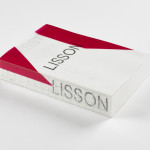
ARTIST | WORK | LISSON by Irma Boom
It’s rare that an art book comes with a personal story. As we ease ourselves into this new strand of the Voices column and as we begin to get to know each other, let me share one with you. I first discovered ARTIST | WORK | LISSON on a shelf in the office at Whitechapel Gallery and thought it was...
Logo
Leapling Films by F37, 2021
It’s amazing to see what can be done with just a few simple geometric forms. Two circles and an oval and the mind is immediately drawn to a wide-mouthed frog. A bright green and simple motion cues online further the frog-like playful and distinctive nature of the mark. Whether you also see a film camera will be up to you,...
Upgrade to
BP&O Plus
Read more
Logo
Openweb by Collins, 2022
Openweb forms trusted spaces for quality conversations that move society forward, improving how and where people talk to each other online. Collins designed an ‘O’ made from a community of ‘W’s’. It’s a stable and supportive ring forming a secure space within. A sun or a ring, enlightenment or exchange, whatever the designers have drawn on, the result is a...