BP&O Voices
Seth Rowden on Brand Language:
Farmyard Frozen – Vibrant language to brighten up your freezer
A guest article from Seth Rowden on Farmyard Frozen’s brand language. BP&O Voices presents the opinions of industry experts on a wide range of topics....
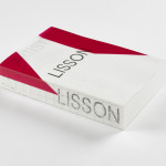
ARTIST | WORK | LISSON by Irma Boom
It’s rare that an art book comes with a personal story. As we ease ourselves into this new strand of the Voices column and as we begin to get to know each other, let me share one with you. I first discovered ARTIST | WORK | LISSON on a shelf in the office at Whitechapel Gallery and thought it was...
Logo
Leapling Films by F37, 2021
It’s amazing to see what can be done with just a few simple geometric forms. Two circles and an oval and the mind is immediately drawn to a wide-mouthed frog. A bright green and simple motion cues online further the frog-like playful and distinctive nature of the mark. Whether you also see a film camera will be up to you,...
Logo
Openweb by Collins, 2022
Openweb forms trusted spaces for quality conversations that move society forward, improving how and where people talk to each other online. Collins designed an ‘O’ made from a community of ‘W’s’. It’s a stable and supportive ring forming a secure space within. A sun or a ring, enlightenment or exchange, whatever the designers have drawn on, the result is a...
San Francisco Symphony by Collins
Formed in 1911, while San Francisco was rapidly rebuilding after the devastating earthquake of 1906, the San Francisco Symphony (SFS) has been serving audiences in the Bay Area and beyond for 111 years. In 2018, Esa-Pekka Salonen – a Finnish conductor and composer – was announced as the incoming musical director, with his tenure to start during the fall season...
Logo
Fable by The Collected Works, 2022
Fable is a web-based motion design platform. Bearing in mind the dynamic and scalable nature of online content and motion graphics, delivered across different device sizes, an F constructed from three differently proportioned frames feels like a fitting gesture. That these exist in motion, animated to give the impression of being placed on different planes in three dimensional space, just...
Logo
Padel Haus by Leo Lab, 2022
Logo design could be seen as a search. The uncovering of idea that lies between disparate and everyday things. Here, Leo Lab beautifully connect the letter P and H via the familiar construction of a Padel ball, similar to a tennis ball but with less internal pressure. Played between two people, a ball passed through the space between, is captured...
Logo
Girl Scouts of the USA by Collins, 2020
For most, the logo for the Girl Scouts of the USA will be associated with Saul Bass who, in 1978, designed the silhouetted trefoil of three female figures. Aside from a slight revision by OCD in 2010, this remained consistent for 30 years. What is not as well-known, is that the trefoil, an undoubtably distinctive form on its own, has...
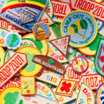
Girl Scouts of the USA by Collins
Not just a patch, but a full patchwork. Collins has injected ‘fashun darling’ into a club that has collected aesthetic cobwebs over the past few decades. The Girl Scouts of the USA has finally been ripped from old-world rigidity into a brand with whimsey. A reset for now, and a lifestyle brand for tomorrow. Scouts is the sort of extra-curricular...
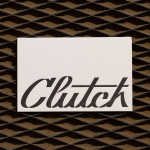
Clutch Automotive by Parker Studio
From à la mode Lick paint to gramable Aokka coffee, everything comes in a tin these days. The rise of metal packaging solutions in food and beverages, healthcare, household and consumer is expected to accelerate by 3.1% year-on-year from 2021 to 2030, driven by the demand for sustainable alternatives to plastic and lightweight substitutes for glass. Aesthetically speaking, the tin...
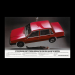
BP&O Voices
Paul Belford on Ads:
Volvo 740 ad
A guest article from Paul Belford on AMV’s advert for the Volvo 740 (1983). BP&O Voices presents the opinions of industry experts on a wide range of topics....
Logo
Great Wrap by A Friend of Mine, 2022
Great Wrap is the only compostable cling wrap made from food waste and, as a brand, is on a mission to end a reliance on petroleum-based plastic. Whilst serious about the science behind their product, they also believe in having fun along the way. This is wonderfully expressed by their logo, designed by A Friend Of Mine, in the plasticity and...