Logo
Renault by Gilles Vidal, 2021
In branding, to go back is to go forward. This has often been to return to simpler times (read: understandable), channeling a nostalgia and conjuring up romantic visions of the past. The past can evoke strong emotions, but it also contains some practical insights that remain relevant today. Functional requirements of a logo such as ease of use, flexibility across...
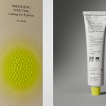
Soft Services by Decade
Skin is the human body’s largest organ while skincare is the fastest growing segment of the beauty industry. Yet with all their promises of ‘dewy’, ‘glowing’ and ‘blemish free’, most products on the market, are focused on the face. Direct-to-consumer business Soft Services creates skincare products for specific body skin problems, such as acne, ingrown hairs, stretch marks and fungal...
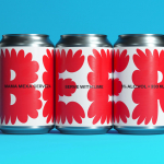
Mama Mexa by Seachange
Tacos are a Mexican staple, consisting of a small hand-sized corn or wheat-based tortilla topped with a range of fillings. They make for perfect on-the-go food, packed full of flavour. This combination of convenience (quick to make or eat) and tastiness has seen the traditional dish rise in popularity as an ideal product to package and sell in many markets....
Upgrade to
BP&O Plus
Read more
Logo
Extinction Rebellion by ESP, 2011
Designed in 2011 and appropriated, with permission, by Extinction Rebellion in 2018 the XR logo is dramatic in its form-language, employing an hourglass motif to signal the imminent threat climate change poses. That this also forms an X and placed within a ‘globe’ reinforces a collective urgency. Elemental forms and a consistent line weight offers an exceptional functionalism, capable of...
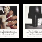
BP&O Voices
Paul Belford on Ads:
V&A print campaign
A guest article from Paul Belford on Saatchi & Saatchi’s print campaign for the V&A (1988). BP&O Voices presents the opinions of industry experts on a wide range of topics....
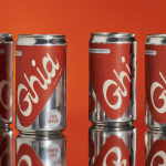
Ghia Non-Alcoholic Aperitif by Perron-Roettinger
In case you’ve missed it, low and no-alcohol drinks are a thing. With over 20% of adults in the UK claiming to be teetotal, abstinence is cool: Brewdog is now Punk AF (that’s ‘alcohol free’), Thomson & Scott’s Noughty is (fairly) nice, and Seedlip is sexy. This sobriety revolution is driven, in part, by the mindfully sceptical Gen Z, turned...
Sitko Pizza Co. by Werklig
Pizza making is a lot like brand identity design. It has many potential configurations: it can be generic or wildly individual, but fundamentally, it’s systematic, a framework of organised elements. It is a base that holds a variety of communicative assets and techniques (the toppings, if you will). Appeal is determined by how well this is orchestrated, and how well...
Logo
Linktree by Collins, 2022
To link all that you are online, this is the vision for Linktree, a “tool that lets anyone untangle their web and become the personal tour guide of their digital universe”. This notion is elegantly symbolised by a new logo by Collins, an arrow pointing to a growing network of online spaces which forms an abstract tree. Connections, growth and...
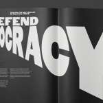
Forward Majority by Order
The balance of power in the US isn’t decided in Washington. It’s decided in state capitols where Republicans have gained overwhelming control, asserting systematic bias on voting rights and election processes. Through policies of suppression and gerrymandering, certain priorities and populations are often neglected in election results. Forward Majority is a political action committee on a mission to accelerate Democratic...
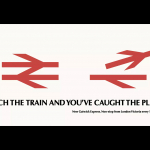
BP&O Voices
Paul Belford on Ads:
British Rail poster
A guest article from Paul Belford on Hedger Mitchel Stark’s poster for British Rail (1984). BP&O Voices presents the opinions of industry experts on a wide range of topics....
Logo
Stephen Ambrose by Paul Belford Ltd, 2022
Taking inspiration from the original drawing of what would become Paul Renner’s Futura typeface, an unusual geometric ‘a’ is turned by Paul Belford Ltd into both a distinctive camera motif and monogram for the British photographer Stephen Ambrose. The logo presents the viewer with a playful duality, fluctuating between a pictographic and typographic gesture....