PR Logos
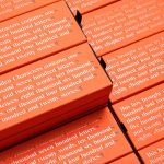
Hidden Characters by RE
Hidden Characters is the latest PR offering from international advertising agency network M&CSaatchi. It replaces/is an evolution of Bang PR, developed in response to the changing public relations landscape. With the advent of social media and the subsequent growth of non-traditional influencers and an increase in inauthentic product placement, Hidden Characters intends to make sure that their client’s reach is handled in an ethical and authentic...
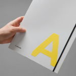
K. Apeland by Bielke&Yang, Norway
K. Apeland is a Norwegian independent civil engineering consultancy that specialises in construction technologies, and applies its experience to new builds, remodelling projects and renovation. It has a favour for steel-wood and concrete structures, which has won the consultancy a number of awards, and has a broad portfolio that covers public infrastructure, private offices and housing, as well as viewing platforms,...
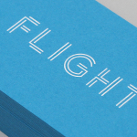
Flight PR by DIA
Flight is a Los Angeles based public relations business, founded by Alysha Light, that works with clients at the intersection of the technology, marketing and entertainment industries. New York graphic design studio DIA worked with Alysha to update the Flight visual identity. This extended to custom logotype and logo animation, business card, poster and website design. These are bound by a distinctive...
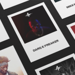
Life or Death by DIA
Life or Death is a New York and LA based full-service public relations and management business with hip hop roots. It draws its name from the idea that, within the music industry, there is no middle ground, it is either life or death. This abstraction and dual notion manifests itself within the firm’s new brand identity system, designed by DIA, as...
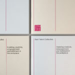
Rush Talent by Bunch
Design studio Bunch worked with Rush Talent, a London based public relations company, to develop a visual identity, this included monogram, logotype and stationery design. Rush Talent describes itself as at forefront of the factual and lifestyle television scene and represents emerging UK broadcasters working within the fields of fashion history, sports, science, architecture, food and art, and includes the likes of Amber...
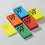
GR Communications by Ascend
GR Communications is a London based PR agency that is described as being made-up of a ‘close knit group of progressive and forward thinking experts’. Their visual identity, designed by independent brand, graphic and web design agency Ascend, captures the idea of unity, communication and creativity through a simple ligature detail, single quotation marks and a diverse, vibrant but complementary...
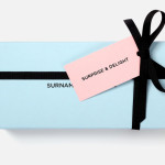
Surname & Surname by NB Studio
Surname & Surname is a new consumer focused brand communications agency formed by London-based PR specialist Blue Rubicon. Their visual identity, recently created by NB Studio, utilises a simple but well executed typographical solution to deliver an alternating union of language which conveys professionalism, communicative creativity at its most elemental, and a thoughtful, evolving brand personality....