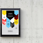
Insiders by Garbett
Insiders is the membership program of Sydney Opera House launched to nurture customer loyalty, increase market share and raise the frequency of attendance through priority booking, discounts, dress rehearsal ‘sneak peeks’ and invitations to meet staff and artists. Multidisciplinary design agency Garbett were commissioned to ‘evolve’ the Insiders visual identity, positioning it as a retail product with greater focus on communicating the value proposition for members,...
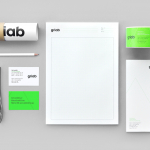
Griab by Kollor
Griab is a Swedish engineering firm, founded in 1957 and located in Helsingborg, Sweden, that specialises in delivering a holistic design and build service that includes land planning, wastewater management, architecture and construction. Developed by multidisciplinary design agency Kollor, Griab’s visual identity, “inspired by the the straight lines and shapes commonly seen in architecture” and created to help reinforce the firm’s environmental...
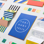
Torikorttelit by Kokoro & Moi
Torikorttelit is the old town district of Finland’s capital Helsinki. Its new visual identity, designed by Kokoro & Moi and based around bright colours, simple geometric patterns, a stacked typographic serif logo framed by a circle and paired with a modernist inspired secondary typeface neatly reflects the historic setting at the heart of a modern metropolis....
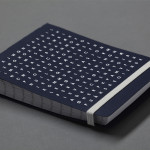
Bedre Kommunikasjon by Work In Progress
Bedre Kommunikasjon is a oslo-based consulting firm, run by communication specialist Nils M. Apeland, that offers personal, professional and independent advice to business, drawn from 20 years of analysis, strategy, promotion, media relations and crisis management experience. Multidisciplinary design agency Work In Progress recently worked with Nils to develop a new visual identity solution which included a logo, business card and stationery design...
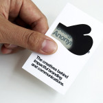
Designers Anonymous by Designers Anonymous
Designers Anonymous is London-based multidisciplinary design agency with global clients from a variety of sectors. The agency has appeared on BP&O on a number of occasions, with highlights including their packaging work for Zest and Patchett’s, and their identity work for Fuller’s hospitality brands The Parcel Yard, The Tokenhouse and Brewer St. Following the launch of their new website this...
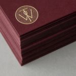
Willow Tree by Bunch
Willow Tree, one of London’s leading business consultancies, worked with graphic design studio Bunch to develop a new but traditional-looking visual identity with an attention to detail. Based around a WT monogram, created by typographer Spencer Charles, utilised as a mix of embosses, carved in seals and simulated watermark, and using purple cloth, black leather, cream paper and handmade coffee pottery, Bunch’s solution embraces a...
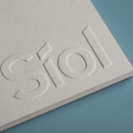
Síol Studio designed by Mucho
San Francisco-based architecture studio Síol recently commissioned multidisciplinary design agency Mucho to develop a new visual identity solution that would embody “their philosophy of conceptual, clean architecture for both interior and exterior design.” Based around a customised sans-serif logotype executed as a blind deboss, the identity conveys the familiar architectural themes of light and shadow formed within three-dimensional space and a practical, corporate efficiency....
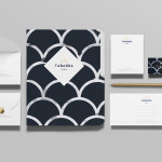
Tabarka Studio by Anagrama
Tabarka Studio specialises in ‘detail-oriented’ and handcrafted tiles made from terracotta, a ‘clay-based ceramic earthenware that becomes porous when fired creating a worn-out, antique finish’. Anagrama, the design agency responsible for the studio’s visual identity and collateral, describe their approach as embracing an ‘archaic timelessness’ that reflects the products through the use of a blue and white scale pattern, tiled icon...
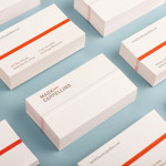
Mark Cappellino by Perky Bros
Mark Cappellino is described by Perky Bros, the Tennessee-based studio behind his new logo and stationery, as a leadership consultant who travels the worldwide helping individuals and teams better communicate through stronger relationships. Their design solution, “based on the behavioural beliefs that shape his practice”, “plays on the typographic device called the em dash, meaning an interruption of thought” and...
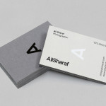
Ali Sharaf by Mash Creative
Ali Sharaf is a Bahrain-based commercial photographer who specialises in fashion, beauty and lifestyle images for the advertising and editorial markets. He describes himself as contemporary, upbeat, outspoken and edgy. Inspired by a shared interest in Swiss modernism and adopting a less is more approach, design studio Mash Creative developed a new brand identity for Ali that combines an iconic...
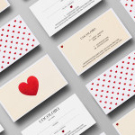
Cocolobo by Anagrama
Cocolobo is described by Anagrama – the multidisciplinary design agency behind their new visual identity – as a ‘high-end shopping boutique that caters exclusively to strong women with a confident and in vogue fashion sense’. For the name, Anagrama played with the patrons’ ‘characteristic duality’, with a ‘catchy and fun’ compounding of “Coco” (coconut in Spanish) and “lobo” (Spanish for...
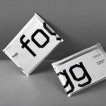
Fogg by Bunch & Kurppa Hosk
By purchasing overcapacity from international telecom networks, Fogg Mobile provides a fixed cost mobile data traffic service for people who want to avoid unexpected roaming bills when travelling abroad. Through the animate and evolving qualities of computer generated imagery and a combination of unbleached paper, stitching, flat coated colour and silver polypropylene, Fogg’s visual identity, created by Kurppa Hosk and developed by Bunch, delivers...