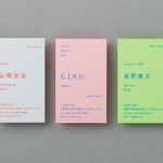
Laji Hair & Make by UMA
Laji is a hair and make-up studio located in the city of Osaka, Japan, with a distinctive interior design developed by dot architects. It features chipboard dividers and mirror frames, pegboard panels, strip lighting, exposed concrete ceilings, brick walls and utilities, concrete cast with wood surface texture, red stained floors as well as custom furniture created by Ryohei Yoshiyuki. It is a...
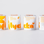
Lycka by BVD
Lycka is a 100% natural hand filled frozen yoghurt brand from Germany that donates 11 cents from each sale to Welthungerhilfe, a humanitarian aid project tackling issues such as world hunger, land grabbing in Cambodia and displacement across Syria and Iraq, amongst many other issues. Lycka’s brand identity and packaging, a mix of bright geometric forms which appears to draw some of...
Junction Moama by Seesaw
Junction is a bar and restaurant situated within the tourist district of the Australian twin-towns of Moama and Echuca, both of which have histories that began in the middle of the 19th century and grew to share a border along the Murray River. Originally a wooden tavern built by James Maiden in 1840, and named the Junction Inn – a reflection of...

Croft Knitwear by Commission
Croft is a contemporary men’s knitwear brand that specialises in high quality cashmere and soft wool garments. These are available exclusively through online retailer Superdemin. Each garment is hand knitted on Scotland’s Shetland Islands by crofters, a name given to those using traditional batch production processes within small communities unique to the Highlands. Alongside a new logo, London-based design studio Commission worked with photographer Luke Evans to...

Luka Žanić Photography by Studio8585
Luka Žanić is a Croatian interior and architectural photographer who works with clients worldwide. He approaches each project individually, gathering information about objects, spaces and their purpose before beginning a shoot. His brand identity, designed by Studio8585 and which included stationery, poster and portfolio folder, takes advantage of a typographically challenging set of characters in the form of a monogram and uses this...

Bryan Pearson by Strategy
Drawing on his extensive experience as a successful CEO, one that spans 20 years in the corporate, private and public sectors of New Zealand and Australia, Bryan Pearson has developed a niche business that provides strategic leadership and support to CEOs. His brand identity, created by design and advertising studio Strategy, is informed by the personal skills and experience that defines his business, and...
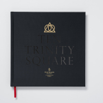
Ten Trinity Square by Pentagram
Ten Trinity Square is a super prime real estate project developed by the Chinese conglomerate Reignwood Group. It is made up of a private members club, residencies and a Four Seasons hotel, all set within the Port of London Authority building which is located at the centre of the city near the Tower of London and with views of the Thames....

University Church by Spy
Located at the heart of Oxford, University Church of St Mary the Virgin, abbreviated to University Church, has been a site of worship and debate for over 700 years and is the “spiritual home” of the oldest university in Britain. The church recently received a grant from the Heritage Lottery Fund to raise awareness of the historical nature of the site...

Theatre Royal Plymouth by Spy
Theatre Royal Plymouth (TRP) is the largest and best attended regional producing theatre in the UK and leading promoter of theatre in the South West. It runs a diverse programme of performances, activities and events, and has a 1300 seat auditorium capable of delivering West End musicals, opera and ballet, as well as a smaller 175 seat theatre for experimental productions. The building,...

The Stow Brothers by Build
The Stow Brothers is an estate agent working within the area of Walthamstow, a place where urban London meets the Epping Forest, and is described by the estate agent as a rapidly expanding community of like-minded people looking for a place with a strong sense of community, plenty of culture, good food and a decent pint. UK-based graphic design studio Build worked with The...
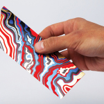
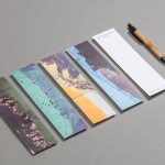
Arjowiggins Curious Matter x FIAC by The Bakery
FIAC is an annual contemporary arts fair where galleries from across the world gather and present work by the emerging artists they represent. The fair takes place at the Grand Palais in Paris and runs for four days during October. Paper merchant Arjowiggins, a longstanding partner, continued to support the event by providing material for FIAC’s catalogue and event guides. This year, these featured a distinctive bookmark...

Bray & Slaughter by Mytton Williams
Bray & Slaughter is a UK based regional contractor with over 100 years of experience in the construction industry and an extensive understanding of the education, healthcare, commercial, heritage, conservation and residential sectors. Following industry and company changes, Bray & Slaughter commissioned design studio Mytton Williams to create a new visual identity that would better reflect their growth and move from ‘local builder’ to ‘regional...