Feel the heat
Most branding has to give some suggestion of what said brand is, or does, or stands for – it’s usually not ideal if they bear little to no resemblance or representation of their category, audience or ideals. The exceptions are usually things like record covers, or other inherently creative entities like musical instruments, editorial projects; occasionally booze brands, like the...
Eat Dirt by Cachete Jack and Marta Veludo Studio
The best branding and packaging projects – or at least the ones that most excite this slightly jaded old design hack – are those that not only take a category and do something genuinely innovative within it, but the ones that rethink structure as much as style. The identity for Eat Dirt does all that and more, and so safe...
Hotel Park Ave NYC by Colt
Located on the corner of Park Avenue South and East 30th Street in Manhattan’s Midtown, Hotel Park Ave is the artist formerly known as the Mondrian Park Avenue. Its change in name is thanks to its change in owner: international hospitality company Lore Group announced its acquisition of the site and mooted its subsequent rebrand late last year, and to...
Church by Porto Rocha
Naming your company ‘Church’ is, it’s probably fair to say, a bit of an edgy move. Some might even go as far as to suggest it to be sacrilegious. But here, in the case of this proverbial temple of film post production, Church seems to really fit – and without even the faintest hint of edgelordery about it all. And...
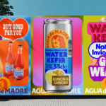
Agua de Madre by Chris Chapman
It seems you can’t move for well-designed, wellness-adjacent alcohol-free drinks brands right now. In the past couple of months alone we’ve covered a nightlife inspired Yerba Maté that went hard on Big Drink NRG and Rolus, a new botanically enhanced entry into the (apparently) burgeoning ‘braincare beverage’ category. Making it a hat-trick is London-brewed water kefir brand Agua de Madre’s...
Hip Pop by Robot Food
Running a design blog sharpens your eye for category conventions. Stick with it long enough, though, and you’ll start to see those conventions unravel. What once felt fixed begins to flex. This creates a challenge for writing about design: you’re constantly assessing the landscape, but that landscape is always shifting. Take minimalism, for example. Once the dominant aesthetic of the...
Dark Arts Coffee by NOT Wieden+Kennedy
If a brand that fuses memes, hot takes, occultism, and coffee is going to succeed anywhere, it’s probably in east London. Dark Arts Coffee started out in 2014 in a Homerton railway arch, and managed to corner that distinct subgenre of goth/metal/biker-ish aesthetics which opts for craft ale over snakebite; Hackney over Camden; self-care over self-destruction. Where the old guard,...
Olympic Museum by Studio Blackburn
Few things have a design legacy quite like the Olympics: it’s hard to think of another event or organisation that has both a history spanning more than 120 years (the first modern Olympics’ was in 1896), and a distinct graphic identity each time it takes place. Since every Games has its own unique ‘emblem’ logomark device, the events become sort...
LEGO by Interbrand & OLA
As recognisable brands go, LEGO is up there with the Nike swooshes and McGolden Arches of this world. Pretty much anything in that red and yellow lockup with vaguely Stay Puft-esque lettering (naturally there’s a LEGO version of that exact sailor) instantly says ‘LEGO’ – even when what it really says is, unlawfully, ‘Lepin’; or somehow scraping into legality, ‘Xinh’;...
Brooklyn Org by Mother and Mother Design
Mother New York and Mother Design (Fhirst, Brooklyn Org, Peerspace) have overseen the rebirth of Brooklyn Community Foundation as the commandingly named Brooklyn Org. The sea change arose from a desire to distance the organisation from ‘notions of traditional philanthropy, seen largely today as elitist, dysfunctional, and detached’. If that sounds like a solution to a problem that shouldn’t exist...
Qasa by Bold
Now that the likes of ed-tech (education technology) and fin-tech (financial technology) have become a natural part of everyday parlance, it was surely only a matter of time before prop-tech (property technology) entered the equation, too. Proptech largely refers to platforms and services that use tech to help people buy, sell, research, market, and manage a property – ranging from...
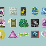
De-Extinction by Koto
Koto’s new work is undoubtedly gorgeous – after all, what’s not to love about a suite of very cute dinosaurs? Especially when they’re rendered in a charming faux naif sort of style, and the whole colour palette is based around Barney & Friends purpley pink and the effervescently Gen Z-baiting neon of ‘terminal green’. The project in question is Koto’s...
Ami Ami by Wedge
We’ve all, at some point in life, encountered a few “But Actuallys”: the kind of people who always know a little bit more than you, constantly correct you, diligently fact check in social situations. They’re perennially just that smidgen More Right than you: a heady combination of The Simpsons’ Comic Book Guy; the classic pedant (or pendant if you want...
Philharmonie Luxembourg by NB Studio
It is fair to say that rebrands of music organisations, of which there have been a number in the past few years, have benefitted from the recent explosion of graphic design into the world of sound and motion. Music has always inspired other forms of art, but these new digital tools are uniquely suited for producing design solutions for these...
Curve Club by Wildish & Co.
For a type-nerd (hello!) there are few things more seductive than a beautiful, beguiling letterform. But what makes such shapes even more siren-like is when they leap off the page and come to life, not just in motion, digitally; but in a physical environment. The branding for new private members club Curve Club, then, certainly ticks a lot of boxes...
Black Star Pastry by Studio Ongarato
A visual identity just as Instagrammable as the ‘the world’s most Instagrammed cake’. Sydney bakery Black Star Pastry has been on the ascendancy, from local pastry maker to global cult status, racking up millions of views, thousands of loyal followers and generating hype around its ‘original cakes woven together with poetic storytelling’. Working with Japanese illustrator Noritake, (known for his...
Seedsman by Here Design
Water masquerading as an edgelord-baiting energy drink (Blackletter fonts, skulls, and a name straight out of the heavy rock canon); running shoes aping a chesty cough remedy; olive oil bottles that owe more to the science lab than the Mediterranean. Packaging at the moment, it seems, is frequently playing fancy dress. That’s no bad thing, of course: brands borrowing aesthetics...
Fork & Good by Mother Design
There’s nothing more human than food says Nyati Gupta, CEO and Co-founder Fork & Good. However, the first place people in more temperate regions will feel the effect of climate change will be on their plate. ‘To be able to eat your favourite dishes without the environmental impact, that would be the dream’. Although vegetarianism and veganism have made it to...
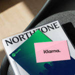
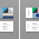
Northzone by Ragged Edge
Northzone is an early stage venture capital fund with the insight necessary to cut through the hype of funding and recognise strong teams doing good work. From their offices in London, Stockholm and New York they partner with founders at Seed, Series A and Series B stage across Europe and America. London-based Ragged Edge worked with Northzone to create a brand identity that would...
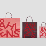
Åhléns by Happy FB
Åhléns began in 1899 as a small mail-order business. Aside from it being one of the oldest it has also grown to become one of the largest retail chains in Sweden. By carefully collating a variety of items across brands and price categories, the retailer maintains its relevance today, understanding and responding to the many ways in which its customers...

Tangent GC Hand Cream by Carl Nas Associates
Tangent GC began as a Scandinavian organic garment and shoe care company developing products that intended to ensure longevity, and entered the organic skincare market in 2016. The company’s graphic identity, a simple typographical expression, designed by Essen International, delivered a sense of informational immediacy through the absence of superfluous stylistic detail and colour, yet divide content and drew out a distinction in...
Brighton & Brighton Beach ELC by Studio Brave
Brighton & Brighton Beach are privately owned boutique childcare and early learning centres in Brighton, Australia. Brighton ELC, the first of the two, opened in 2001 and caters to 60 children, aged between the ages of 8 months and 6 years, and recently underwent renovations, led by Christopher Elliott Design. To coincide with this renovation, Brighton ELC worked with Studio Brave on...
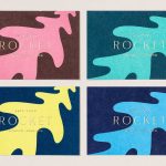
Rocket by Here Design
Rocket began in 2000 as a small family-run catering company, implementing other people’s plans, and has grown to become a multifaceted enterprise with its own ideas, creating culinary worlds in partnership with some of the country’s most prestigious institutions and brands. Rocket worked with London-based Here Design to express this bold new position throughout its brand identity, in logo design, and across its stationery, business cards, print...
Tangent GC Soap by Carl Nas Associates
Tangent GC is a Scandinavian organic garment and shoe care company developing products that intend to ensure longevity. The company’s brand identity, a simple utilitarian typographical expression, designed by Essen International, delivered a sense of informational immediacy through the absence of superfluous stylistic detail and colour, dividing content in the arrangement, orientation and typesetting of Akkurat Mono. Venturing into organic personal skincare, Tangent GC worked with...