Stationery Design
An act of restitution
Caffè Nazionale is a historic bar on Piazza Libertà in Arzignano, a small city in Veneto, Italy, which was the social heart of the town – a place for conversation, card games, billiards, and the daily ritual of an espresso at the bar – for generations, before falling into closure and decline. Having first opened in the 1950s, the Caffè...
Drizzle and Drama
I’ve never really thought about wedding venues needing a brand; but then again I’ve never really thought much about wedding venues at all – and neither is Chateau Engalin much like most other nuptials-centric sites. Recently bestowed with new brand design courtesy of Pentagram London partner Samar Maakaroun and her team, Chateau Engalin is based in the heart of the...
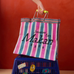
Yes we Makan
The chintzy rose; the bright but slightly dusky pink; the multifarious wordmarks; the apparently haphazard, painterly decorative flourishes; an approach to letter sizing that’s borderline unhinged – the branding for Makan has the potential to be all kinds of terrible. Instead, it’s absolutely the opposite, thanks to the deft hands at Foreign Policy (Park Bench Deli, Project Send, Critical Mass)....
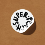
Super Peach by Pentagram
Restaurant brand Momofuku began life with its New York Noodle Bar in 2004 and in the two decades since, has opened more than 15 restaurants across North America, each building on founder chef David Chang’s vision of boundary-pushing cuisine. Since its naissance Momofuku “became known for reshaping Asian-American cuisine and challenging dining conventions with a bold and innovative approach,” according...
Hotel Park Ave NYC by Colt
Located on the corner of Park Avenue South and East 30th Street in Manhattan’s Midtown, Hotel Park Ave is the artist formerly known as the Mondrian Park Avenue. Its change in name is thanks to its change in owner: international hospitality company Lore Group announced its acquisition of the site and mooted its subsequent rebrand late last year, and to...
Eternal Research by Cotton
Niche/difficult electronic music types and brand design nerds are rarely found too far from one another; often, indeed, they’re one in the same. It’s little surprise really when you look at the typographic wonders to be found across the spectrum of things like vintage synthesisers – the sublime curves of ‘Omnichord’ or the strangely pagan-ish letterforms on a Prophet-5, to...
IAAC by Mucho
The IAAC (Institute for Advanced Architecture of Catalonia) is an organisation which boasts a remit that feels both nigh-on impossibly wide but also hyperspecific. Based in Barcelona and founded in 2001 as a hub for innovation in architecture and design, IAAC describes itself as ‘a platform for producing knowledge to shape the future of cities, buildings and society’. The long...
Society De La Rassi by Blurr Bureau
Ideas around the ‘new codes of luxury’ have come up a lot lately; an updated, contemporary take on what makes something look special, valuable, covetable, and ultimately, expensive. The long and short of it is that it’s out with the old – lavish foils, gold everywhere, bling and ornamentation and ostentation – and in with a quieter, more subtle aesthetic...
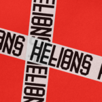
Helions by Pentagram
HELIONS… now that sounds impressive. Something to do with helium atoms and stellar fusion, the force that powers stars? Or perhaps it’s invoking Helios, the Greek god of the sun, blazing his chariot across the sky? Nope – it’s actually a tribute to Helions Bumpstead in Essex, a beneficiary of the British gift for naming that also gave us Pratt’s...
North Road by Manual
Independent content studio North Road was founded in 2022 to unite a portfolio of companies covering everything from scripted entertainment (‘Chernin Entertainment’) and non-scripted content (‘Kinetic Content’) to non-fiction productions (under ‘Words + Pictures’). Across these entities, North Road is one of the largest global suppliers of TV and film content, and is able to work on over 70 active...
Chester Zoo by How&How
I’d lazily assumed that, like jazz record sleeves and Dutch public transport, zoos were one of those sectors with a visual legacy that’s packed with game-changing brand design – the sort that fills the pages of graphic design histories, up there with the likes of Paul Rand’s ‘IBM’ and the FedEx arrow and Alan Fletcher’s gloriously clever ampersand trickery for...
Ultraderp by Mucho
The name Ultraderp seeks to combine all things extreme (think ‘ultrafast’, or ‘ultra marathon’) with ‘derp’, which is, apparently, the face a dog makes when they don’t know what’s happening. The product that bears this name is an ultra-light, easily-packable dog leash that can be worn on the collar and deployed when needed, simply by pulling the tongue-like tab. This...