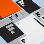
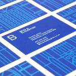
Estampaciones Fuerte by Hey, Spain
Estampaciones Fuerte is a Spanish cold metal stamping and pressing business with over forty years experience producing a variety of components for the automotive, domestic appliance and construction industries, as well as providing welding, finishing, threading and set assembling services. This year Hey worked with Estampaciones Fuerte to develop a new contemporary brand identity that would better reflect their industrial experience and professionalism....
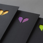
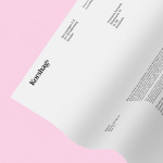
Minke by Atipo
Minke is a Spanish print production studio that favours ‘analogue splendour’ over mass manufacture, providing its clients with a variety of small-scale, mechanical and handcrafted processes and print finishes. Their visual identity, developed by multidisciplinary design studio Atipo, reflects this philosophy and service through a mix of traditional and contemporary detail split across type, colour, material texture, print finish, pattern and die cut...
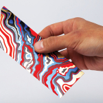
Arjowiggins Curious Matter x FIAC by The Bakery
FIAC is an annual contemporary arts fair where galleries from across the world gather and present work by the emerging artists they represent. The fair takes place at the Grand Palais in Paris and runs for four days during October. Paper merchant Arjowiggins, a longstanding partner, continued to support the event by providing material for FIAC’s catalogue and event guides. This year, these featured a distinctive bookmark...
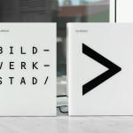
Bildmuseet by Stockholm Design Lab
Bildmuseet is a centre for visual culture and a museum dedicated to the exhibition of modern international art, architecture, design and photography, as well as retrospectives, and is described as a place for experiences, reflection and discussion. Opened in 2012, Bildmuseet is part of the arts campus at Umeå University, Stockholm, and housed within a distinctive building designed by Henning Larsen Architects...
Bray & Slaughter by Mytton Williams
Bray & Slaughter is a UK based regional contractor with over 100 years of experience in the construction industry and an extensive understanding of the education, healthcare, commercial, heritage, conservation and residential sectors. Following industry and company changes, Bray & Slaughter commissioned design studio Mytton Williams to create a new visual identity that would better reflect their growth and move from ‘local builder’ to ‘regional...
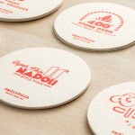
Melt by Can I Play
Melt is a Australian takeaway and restaurant franchise with a philosophy that looks to honour the 200 year old Napoli history of pizza making and its origins as a fast and nutritious meal by mixing high quality ingredients and recipe authenticity with the speed, price-point and openness that today’s consumers have come to expect. These values are also reflected through an absence of oil, fat or sugar...
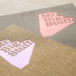
Mr Big Stuff by Can I Play
Mr Big Stuff is a Melbourne-based Southern American soul food restaurant and cocktail bar with a unique and distinctive interior designed by Technē Architecture and influenced by the music and film culture of the 1970’s and 80’s. The restaurant features an exposed concrete floor, timber and acoustic foam walls, neon signage and utilitarian furniture, as well as interior graphics and a brand identity treatment...
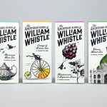
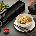
The Adventurous Blends of William Whistle by Horse
The Adventurous Blends 0f William Whistle is a small tea and coffee merchant crafting exotic flavoured teas, coffees and tisane from the highest quality ingredients sourced from across the world using an approach that is described as bringing together the very best discoveries of the past with the expertise of the present. This philosophy, as well as the merchant’s well-travelled and eccentric English nature, informed...
Korshags by Kurppa Hosk
Korshags is a family-owned seafood company located in Falkenberg on the Swedish west coast. Previously named Falkenbergs Lax (Falkenberg’s Salmon), Korshags has grown from a small local company specialising in smoked salmon, into an international player with a variety of products. With this in mind the company commissioned Stockholm-based Kurppa Hosk to establish a new name and brand identity that would better position...
Ninjaplast by Kurppa Hosk
Ninjaplast is a Swedish plastic food wrap product with a unique packaging solution that addresses the difficulties often associated with cutting similar products effectively from a roll. Rather than a serrated card bar, Ninjaplast comes with a built-in and safe to use cutting blade that makes wrapping food a “fumble free” experience. The close relationship between product and packaging is enhanced by,...
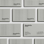
Ascui & Co. Architects by Grosz Co. Lab
Ascui & Co. Architects is an Melbourne-based studio with a rich history, depth of experience and a vision they describe as being a true perspective rather than one founded on intuition. Their projects are considered smart and environmentally sustainable, unexpected yet grounded by purpose, and range from residential additions to multimillion-dollar commercial developments. Anchored in the concept of Process & Possibility — a maxim that refers...
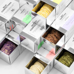
Neat Confections by Anagrama
Neat Confections is a San Pedro-based pastry shop creating handmade biscuits and cakes using organic spices and fruits, are absent decoration and specifically developed as a wine or tea accompaniment. Neat Confectionery’s brand identity and packaging solution, designed by Anagrama, draws its inspiration from the theme of perfection and craft, which is then visualised through what the studio describe as a “pureness” of their...