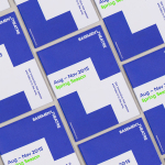
Basement Theatre by Studio Alexander
Basement Theatre is an independent, underground, community theatre located on Auckland’s Lower Greys Avenue. It was established in 2008 as a place to showcase new voices, fresh perspectives and emerging young talent, and to provide these with the space to develop their performances. The theatre has played host to dancers, visual artists, poets, musicians, comedians and everything in between. Taking their...
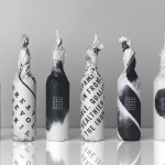
Iron Grill by End Of Work
Iron Grill is fast food outlet preparing healthy, flame grilled wraps and burgers, to order, from its kitchen and counter at the Optus headquarters at Macquarie Park, Australia. The food court at Optus is a competitive environment with a large captive audience of over 6,500 people and a number of other food outlets competing for business but serving familiar, unhealthy favourites. To help define and convey...
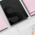
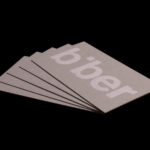
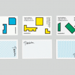
Studio South by Studio South
Studio South, formerly APLUS, is graphic design studio working within the fields of brand identity and packaging from their office in the city of Auckland, New Zealand. In conjunction with a new name and site launch, which coincides with the expansion of studio space, South have also developed a new visual identity treatment. This extends across business cards, folders and headed paper, a...
Fundació Joan Miró 40th Anniversary by Mucho
Fundació Joan Miró is a cultural centre located on Barcelona’s Montjuïc hill. It was opened in 1975 as a place to encourage young artists to experiment with and exhibit contemporary art, and would allow the general public better access to new work of the time, which it continues to do today. Fundació Joan Miró has a distinctive exterior structure of modular geometric prefabricated surfaces, extrusions, recesses...
Reel by Richards Partners
Reel, formerly Reel Good, is a digital production company telling memorable stories and crafting digital experiences from its offices in Auckland, New Zealand. It has positioned itself at the intersection between new technologies and established filming techniques, and delivers both creative and distribution services. These include providing direction, production, post-production, animation and music to clients such as New Zealand Air, Casio, Warner Music...
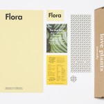
Flora by P.A.R
Flora is a Barcelona based business that looks to provide an alternative to caring for live plants, and describes itself as having an interest in bringing nature indoors in a new way and offering an antidote to the frantic pace, dark rooms and concrete of the city. Flora essentially sell, from their online shop, framed prints of plants shot on a...
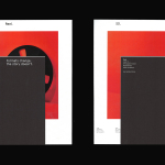
Life or Death by DIA
Life or Death is a New York and LA based full-service public relations and management business with hip hop roots. It draws its name from the idea that, within the music industry, there is no middle ground, it is either life or death. This abstraction and dual notion manifests itself within the firm’s new brand identity system, designed by DIA, as...
Biber Architects by Spin
Biber Architects is the New York based practice of teacher, author, architect and former Pentagram partner James Biber. Biber is made up of a tightly organized, highly experienced, and efficient team that have been producing design-led work—where others are process-focused or ideologically orientated—for more than 25 years. The practice was conceived as a place to tackle architectural work from a fresh perspective,...
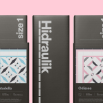
Hidraulik by Huaman
Hidraulik is a Barcelona based business producing rugs for contemporary spaces. These are inspired by cement panels hydraulically pressed, rather than fired, with a layer of coloured pigment. Hydraulic panels originated in the 1850’s and experienced a resurgence in the mid 20th century, these would often feature brightly coloured and detailed patterns, and were popular during an era of personalisation and interior expression....

From Babies With Love by Paul Belford Ltd
From Babies With Love is an organisation that sells organic baby clothes, blankets and accessories, as well as a range of greetings cards online. The money raised from the sale of these goes to SOS Children’s Villages, a scheme that supports babies who have lost parents to war, famine, disease or poverty, by placing them with families and within communities that are safe and stable. London based Paul...
Poseidon Helsinki by Kokoro & Moi
Poseidon Helsinki centralises the tasks of architect and builder with the intention of delivering higher quality construction projects based around visionary and uncompromising design solutions. Poseidon’s values are deeply rooted in a love for Helsinki, a belief in aesthetically ambitious architecture and expansive urban spaces, and improving the capacity and quality of the city through sensitive renovation and attic conversions. Poseidon’s visual identity, inspired...
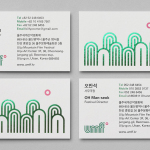
Ulju Mountain Film Festival by Studio fnt
UMFF is a film festival that takes place at the Ulju Arts Centre located in the South Korean city of Ulsan, and draws its name from the Ulju mountains to the west. Studio fnt worked with the film festival to develop a new visual identity treatment, which went on to include logotype, iconography, business cards, stationery, t-shirt design and signage, based around a contemporary...