
Junction Moama by Seesaw
Junction is a bar and restaurant situated within the tourist district of the Australian twin-towns of Moama and Echuca, both of which have histories that began in the middle of the 19th century and grew to share a border along the Murray River. Originally a wooden tavern built by James Maiden in 1840, and named the Junction Inn – a reflection of...
Bryan Pearson by Strategy
Drawing on his extensive experience as a successful CEO, one that spans 20 years in the corporate, private and public sectors of New Zealand and Australia, Bryan Pearson has developed a niche business that provides strategic leadership and support to CEOs. His brand identity, created by design and advertising studio Strategy, is informed by the personal skills and experience that defines his business, and...
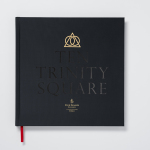
Ten Trinity Square by Pentagram
Ten Trinity Square is a super prime real estate project developed by the Chinese conglomerate Reignwood Group. It is made up of a private members club, residencies and a Four Seasons hotel, all set within the Port of London Authority building which is located at the centre of the city near the Tower of London and with views of the Thames....

Brass Union by Oat
Located in the Union Square neighbourhood of Somerville, Massachusetts, Brass Union is a pub and cocktail bar with a small plate dinner menu. It takes over the space formerly occupied by the restaurant and music venue Precinct, both of which incorporated the historic nature of the building as a former police station into their names. To British readers, Brass Union would comfortably...

Woodland Wine Merchant by Perky Bros
Woodland Wine Merchant is described by Perky Bros, the design studio behind its new visual identity, as a tidy and eclectic wine store in Nashville, Tennessee that carefully curates wines from artisan producers practicing natural and sustainable methods, and hunts for and gathers the best value wines from around the world. Perky Bros’ identity solution was inspired by the collision of two worlds—the...

El Semillero by Anagrama
El Semillero is a large residential development program, managed by Fraterna, that intends to create a sustainable environment with expandable housing solutions based around basic needs and “economic flexibility” – presumably spaces that keep pace with current economic changes, improved social mobility and are accessible to a variety of income groups. Set at the heart of the Mexican city of Monterrey,...

Torrefacto by Fork
Torrefacto is a Russian coffee roasting business founded in 2011 in response to what they describe as the difficulty of sourcing freshly roasted coffee beans in Moscow, and the time and trouble associated with importing it. Torrefacto prides itself on batch production and hand roasting processes, good consumer relations – which sees its owners personally answering letters and addressing website comments – and...

Austin Fraser by Felt
Austin Fraser is a UK information technology and engineering recruitment specialist with an open and transparent business practice. Established in 2007 it has gone on to win a variety of awards and recently opened its first international office in Munich with another office planned for Austin Texas this year. Described as dated, parochial and not reflective of Austin Fraser’s ability or ambition,...

30 Park Place New York by Mother Design
30 Park Place is a private residence with 82 floors and 157 apartments created by the internationally renowned luxury hotel and resort management chain Four Seasons. Located in Tribeca, New York, the residences are described as having breathtaking views, soaring ceilings, multiple exposures, and warm details, as well as five-star hotel level services and amenities that include swimming pool, fitness centre, private dinning experience and...

Theatre Royal Plymouth by Spy
Theatre Royal Plymouth (TRP) is the largest and best attended regional producing theatre in the UK and leading promoter of theatre in the South West. It runs a diverse programme of performances, activities and events, and has a 1300 seat auditorium capable of delivering West End musicals, opera and ballet, as well as a smaller 175 seat theatre for experimental productions. The building,...

The Stow Brothers by Build
The Stow Brothers is an estate agent working within the area of Walthamstow, a place where urban London meets the Epping Forest, and is described by the estate agent as a rapidly expanding community of like-minded people looking for a place with a strong sense of community, plenty of culture, good food and a decent pint. UK-based graphic design studio Build worked with The...

Hemslöjden by Snask
Hemslöjden is a non-profit organisation promoting craft across Sweden through courses, talks and activities. Set up as a response to the advance of industrialisation, Hemslöjden has a significant 100 year history, fostering strong relationships between culture and industry to ensure the survival and development of handicraft. It is also a publisher, events organiser and acts as an umbrella for Sweden’s handicraft societies with the understanding that these, and their activities, contribute...