The Best Packaging of 2014
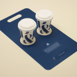
Pablo & Rusty’s by Manual
Pablo & Rusty’s is a small-batch coffee roaster, wholesaler, retailer and cafe with four locations in and around Sydney, and a company culture passionate about sustainability and the pursuit of perfection. San Francisco based studio Manual created a visual identity for Pablo & Rusty’s that would better reflect their values, was sensitive to local coffee culture and is described as having a level...
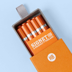
Signet 100 HB Pencils by Well Made Studio
Signet is a new pencil range developed by British home, outdoor and lifestyle retailer Pedlars, who applied their expertise to an own-brand product line following a lengthy international search for the perfect pencil. 100, the first of the Signet range and launched in November this year, is made from American basswood, finished in orange with a silver foil detail and crafted by a long-established family-run business...
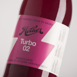
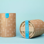
Mother Cold Pressed Juice by Mucho
Mother creates fresh cold pressed juices, milks, smoothies, cereal bars, snacks and detox systems from its location at the centre of Barcelona. Mother recently commissioned design studio Mucho to develop a name, visual identity and packaging treatment that would help express the love and care they put into crafting their range and the technological and industrial processes required to produce them....
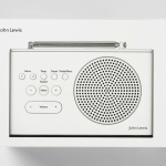
John Lewis Spectrum by Pentagram
Spectrum is a recently redesigned consumer electronics range created by and sold through British department store John Lewis. The range includes DAB radios, alarm clocks, speakers and iPad covers. These are bound by a cohesive aesthetic of soft plastic, geometric forms, bright colours and a packaging treatment created by international design studio Pentagram, led by partner Harry Pearce....
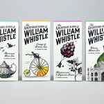
The Adventurous Blends of William Whistle by Horse
The Adventurous Blends 0f William Whistle is a small tea and coffee merchant crafting exotic flavoured teas, coffees and tisane from the highest quality ingredients sourced from across the world using an approach that is described as bringing together the very best discoveries of the past with the expertise of the present. This philosophy, as well as the merchant’s well-travelled and eccentric English nature, informed...
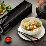
Ninjaplast by Kurppa Hosk
Ninjaplast is a Swedish plastic food wrap product with a unique packaging solution that addresses the difficulties often associated with cutting similar products effectively from a roll. Rather than a serrated card bar, Ninjaplast comes with a built-in and safe to use cutting blade that makes wrapping food a “fumble free” experience. The close relationship between product and packaging is enhanced by,...
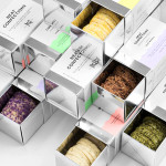
Neat Confections by Anagrama
Neat Confections is a San Pedro-based pastry shop creating handmade biscuits and cakes using organic spices and fruits, are absent decoration and specifically developed as a wine or tea accompaniment. Neat Confectionery’s brand identity and packaging solution, designed by Anagrama, draws its inspiration from the theme of perfection and craft, which is then visualised through what the studio describe as a “pureness” of their...
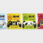
Bear Paws by B&B Studio
Bear Paws is a baked and shaped pure fruit snack range available in four distinct flavour combinations and produced by the British health food brand Bear Nibbles. To draw attention to endangered species such as pandas, polar and sun bears, the brand recently launched a limited edition pack design alongside a pledge to donate 5p per sale to the WWF. This limited...
Soma by Manual
Soma is a water filtration brand that is described by Manual, the design studio behind its brand identity and packaging treatment, as bringing together sophisticated design, sustainability and charity. These values are evident within Soma’s first product, a glass water carafe that uses a 100% compostable filter, its packaging, and the commitment to charity donations that comes with each sale....
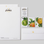
Aspall by NB Studio
Aspall is a British family run cyder maker with a significant history, now into its eight generation and third century. In response to increased competition from both the Cyder and Vinegar categories, Aspall recently worked with NB Studio to help reinvigorate and re-craft its brand identity. This included new logo and packaging treatments for retail and trade as well as website, point...
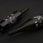
The Bone Line by Inhouse
The Bone Line is a New Zealand winery with a name that references the K—T Boundary, a thin band that runs close to The Bone Line’s location in the Waipara Valley, and that marks the end of the Mesozoic Era and the extinction of the dinosaurs. Auckland based graphic design studio Inhouse worked with the winery to establish a distinctive packaging and identity treatment. Like...
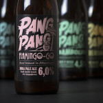
PangPang Summer Beer by Snask
PangPang is a Stockholm based microbrewery that was established by oddball Fredrik Tunedal in 2011. Fredrik, only 23 at the time, tattooed PangPang across his knuckles to celebrate the founding of what he believes to be Sweden’s first microbrewery. These knuckles now form the basis of the brewery’s logotype. Swedish design studio Snask were commissioned to develop a strategy for PangPang’s 2014 summer series...