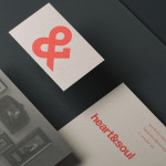
Heart & Soul Interiors by Band
Heart & Soul is an Australian interior decoration firm, specialising in residential properties, with a holistic, adaptable and flexible philosophy. Adelaide-based design studio Band were commissioned by the firm to update their brand identity so that it would better reflect their contemporary approach. Based around the duality of a heart/ampersand marque, a sans-serif logotype and print that juxtaposes a modern bright red...

Nuts.com by Pentagram
Originally established in 1929 as the Newark Nut Company, Nuts.com is a family owned on-line retailer of nuts, dried fruit, snacks, chocolate, tea and coffee. Following a recent url change, international design agency Pentagram, lead by partner Michael Bierut, created a new visual identity and packaging solution ‘that would help establish Nuts.com as a distinctive brand’. Based around a bright and distinctive colour palette,...
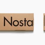
Nostalgi and Classic Racks by Bedow
Nostalgi is a hat and shoe rack, now considered a Swedish furniture classic, designed by Gunnar Bolin in 1937 and manufactured by Essem. Taking its cues from Essem’s functionalist past and artisanal manufacturing processes, Stockholm based graphic and product design studio Bedow, developed a packaging solution for Nostalgi that contrasts two vastly different sizes of Futura, reflecting the products bold,...