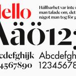
Essem Design by Bedow
Bedow worked with Essem Design, a Swedish manufacturer of ‘artisanal hallway interiors’ to develop a new brand identity treatment. This included logotype, advert, catalogue, product sheet and stationery design based around “Hej—Hej då”, hello and goodbye in Swedish, a reference, Bedow explain, to the most common phrase used in the hallway....
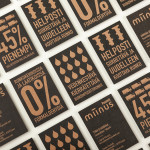
Miinus by Bond
Miinus is kitchen created by Finnish furniture manufacture Puustelli. As the name suggests, Miinus was developed around the philosophy of reduction, the process of removing superfluous elements to leave only the minimum, most functional aspects intact. Helsinki based design studio Bond where commissioned by Puustelli to develop a brand identity for the kitchen that would extend across stationery, print, retail and exhibition spaces. By utilising...
Haverstock by Spy
Haverstock is a UK based architectural practice that specialises in public-sector projects with a strong humanistic approach that enables “clients and the people who use the buildings to have a voice, and to shape the way their building ends up”. Following the retirement of Haverstock’s founding partners design studio Spy was commissioned to develop a new brand identity for the firm—which included a...
Frederik Laux Photography by LSDK
Frederik Laux is an award winning German portrait, fashion, lifestyle and editorial photographer with a client list that includes Alliance and Mercedes-benz. His new visual identity, developed by Stuttgart based design agency LSDK, takes a competently spaced but generic condensed, sans-serif logotype and executes it as a redacted three-line mark die cut by hand across a print solution that mixes...
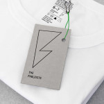
The Fableists by Freytag Anderson
The Fableists is a children’s clothing company that creates quality basics, predominantly unisex, designed to last with ‘punk rock flair’ and utilitarian, vintage clothing and work wear influence. Their products are underpinned by a sustainable brand philosophy that pays and treats their suppliers fairly, considers its impact on the environment and aims to educate buyers on the complete life cycle of their...
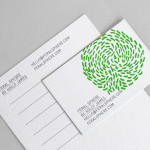
Feral Sphere by Mind
Established by Goldsmiths graduate Holly James earlier this year, Feral Sphere is a UK-based fashion label that creates simple, colourful and comfortable clothing and accessories made from organic cotton using 100% renewable solar and wind energy. The label’s brand identity and packaging solution, created by Mind Design working in collaboration with illustrator Lenia Hauser, was “inspired by Japanese Shinto spirits...
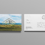
Valentto Olive Oil by Anagrama
Valentto is a Mexican cold-pressed virgin olive oil produced by Olivarera Italo-Mexicana – a Mexican Italian collaboration – created for commercial kitchen and restaurant use. Multidisciplinary design agency Anagrama recently developed a new brand identity and packaging solution for Valentto that juxtaposes the natural detail of Italian landscapes alongside the industrial utility of a square tin structural choice, described by Anagrama as being...
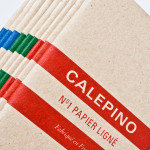
Calepino by Studio Birdsall
Calepino is a french manufacturer and brand of “traditional yet technical notebooks with an authentic vintage spirit” made from 100% recycled, locally sourced paper, covered with a cardboard from a factory with a heritage dating back to 1927 and assembled by hand. Calepino’s brand identity and print, recently designed by Florida based Studio Birdsall, juxtaposes the earthy craft textures of an...
Food Studio by Bielke&Yang
Food Studio is a group of food professionals, designers and photographers that come together to create unique and unconventional shared, natural and Nordic food experiences, table talks and workshops where “food becomes conceptualized through physical and mental experiments”. Design agency Bielke&Yang, who have been part of Food Studio from the beginning, recently worked with a team of copywriters, film producers and photographers to...
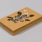
Crabapple Kitchen by Swear Words
Located on Hawthorn’s Glenferrie Road, Victoria, Crabapple Kitchen is a ‘high-end café/wine bar’ with an ever-changing menu of simple, rustic and seasonal Italian, French and Spanish cuisine created from local produce and served in a ‘homely and light-hearted environment’ – derived from the French and Italian countryside – made up of ‘beautiful fabrics, French pantries, hanging copper pots, comfy banquettes and...
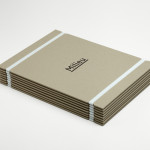
Milieu Property by Studio Hi Ho
According to Studio Hi Ho, the branding and communications partnership responsible for this project, Milieu Property is a Melbourne-based ‘boutique developer with an emphasis on creating spaces of influence’. The moniker ‘Milieu’ immediately positions the brand at the cerebral end of the property development spectrum. Indeed, for those without a thesaurus brain, the highfalutin’ vocabulary is even explained on the minimal...
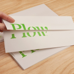
Plow by Perky Bros
Plow is a Tennessee based customer acquisition service and telecom/energy contractor for the large to mid-size business sector. Their identity, created by multidisciplinary design agency Perky Bros, neatly communicates the experience, professionalism and advisory nature of Plow’s service, the commodities they manage and their renewable energy options through a logo-type built from a stencil cut serif typeface and apostrophe detail set...