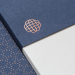
Hedeker Wealth & Law by Socio Design
Hedeker Wealth and Law is an American independent business group dedicated to helping people protect, preserve and grow their wealth through services based around four key areas of expertise—investment, management, financial planning and tax advice. This complete and holistic combination marks Hedeker out from what is a crowded market of individual businesses providing fewer services. To better express their experience and breadth of service, and...
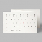
Designers’ Friend by Paul Belford Ltd
Designers’ Friend is a UK web development company working with designers and design studios to deliver fast sites that look exactly as they were designed. The company commissioned London-based graphic design studio, past client and collaborator Paul Belford Ltd., to deliver a brand identity concept that would work in print and online. The studio’s concept is described as a dramatisation of the line ‘we write code’ and visualised,...
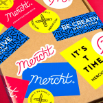
Mercht by Robot Food
Mercht is a UK based custom merchandise business, created by the team at Awesome Merchandise, that offers its customers a risk-free way to design, sell and ship customised t-shirts and wearable accessories, through an online showcase and print on demand service. It is a platform where, if designs sell well, both parties profit, with neither loosing if they do not. Leeds based graphic design...
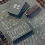
HEWN by Föda
HEWN is an American architectural woodworking shop, custom furniture fabrication and metalworking business with extensive facilities, a team of master-craftsmen, a national presence and local legacy. It also has a preference for native Texas and reclaimed woods. HEWN worked with Austin based graphic design studio Föda to develop a new brand identity that would help ensure market share and longevity, and would lay the...
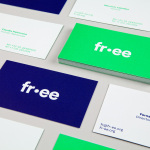
FR-EE by Pentagram
Fernando Romero Enterprise (FR-EE) is an architecture and design firm with offices in New York and Mexico City. The firm was founded by award-winning architect Fernando Romero, and is recognised internationally for their work on projects such as the new Mexico City International Airport and Museo Soumaya. FR-EE worked with Pentagram partner Natasha Jen, plus team, to help them capture and convey their innovative and pioneering spirit and democratic...
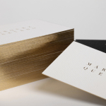
Marquez Quevedo by La Tortillería
Márquez Quevedo is a San Pedro based architectural practice that balances space, proportion, materials, form and colour to compose creative spaces filled with movement. Drawing on what is described as the practice’s sophisticated style and vision Mexican graphic design studio La Tortillería developed a new brand identity for Márquez Quevedo with a sense of space, structure and materiality, both in image and physical texture, that links business cards, stationery...
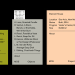
MOS Architects by Studio Lin
MOS is an American architectural practice that mixes playful experimentation with serious research. The practice, as it exists now, following two years of what seems to be an informal approach, was established in 2005, and has worked through a range of design experiments it describes as a make-believe of architectural fantasies, problems, and thoughts on what the practice would be building in the...
Reel by Richards Partners
Reel, formerly Reel Good, is a digital production company telling memorable stories and crafting digital experiences from its offices in Auckland, New Zealand. It has positioned itself at the intersection between new technologies and established filming techniques, and delivers both creative and distribution services. These include providing direction, production, post-production, animation and music to clients such as New Zealand Air, Casio, Warner Music...
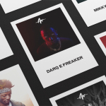
Life or Death by DIA
Life or Death is a New York and LA based full-service public relations and management business with hip hop roots. It draws its name from the idea that, within the music industry, there is no middle ground, it is either life or death. This abstraction and dual notion manifests itself within the firm’s new brand identity system, designed by DIA, as...
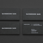
Background Bars by Campbell Hay
Background Bars provides bar, bar staff and equipment hire, pop-up and permanent bar design services, seasonal cocktail creation, bar management for corporate occasions, festivals, weddings and private parties, and income and report analysis. Alongside these, Background Bars also functions as a creative agency, helping brands to deliver compelling live events. Its visual identity, inspired by the name and which included website,...
Fosnavåg Konserthus by Heydays
Fosnavåg is a city on the island of Bergsøya, situated off the west coast of Norway not far from the Altantic Ocean. It is home to a variety of maritime businesses including fishing, logistics and shipbuilding, and now the location of Fosnavaag Cultural Centre, a new concert hall founded by the local community. Fosnavaag Cultural Centre’s brand identity, created by Scandinavian graphic design studio...
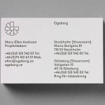
Ogeborg by Kurppa Hosk
Ogeborg is a Swedish, family-owned, manufacturer and supplier of high-quality carpet to the commercial sector, partnering with real estate owners, architects and interior designers since 1968. Stockholm based graphic design studio Kurppa Hosk worked with Ogeborg to develop a new strategy, visual identity treatment and website that would not only reflect some of the culture of the business but would help them...