Fazer Café by Kokoro & Moi
Opinion by Richard Baird Posted 27 February 2014

Established in 1891 by Karl and Berta Fazer and located in Helsinki district of Kluuvikatu, Fazer began life as a French-Russian conditory that has grown to become one of Finland’s largest food companies, working within the bakery, confectionery, and work-place restaurant sectors. Summer 2013 saw the return of Fazer’s café chain to Helsinki with locations in the centre of the city and in the districts of Munkkivuori and Tampere with more to follow.
Scandinavian graphic design studio Kokoro & Moi worked with Fazer to develop a new brand identity for its café chain—which included logo, print, packaging, signage, interior design and a clothing range—based around the custom typefaces Fazer Grotesk and Fazer Chisel drawn from signage that hung above Fazer Café’s original Kluuvikatu location.

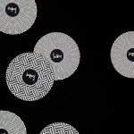
“The typefaces are used comprehensively for all the visual communication and marketing materials. They are utilized everywhere from the logo to the menu boards and price tags and with single characters that take over the packaging materials, clothing and the decor of the walls. Other custom-made graphic elements utilised in the identity, in addition to the typeface, are various patterns that Kokoro & Moi designed to be used in wallpaper, napkins, take-away packaging, and staff accessories among others.” – Kokoro & Moi


Building a visual identity from a custom typography has provided Faser Café with a very neat way to unite past and present without undermining the expectations of a modern cafe experience or the company’s significant heritage.
Kokoro & Moi has confidently appropriated the limited brand aesthetic of the café’s past, a simple but interesting logotype and sign, and extended it, creating two uppercase typefaces. The proportions and forms of these have been well handled, mixing familiar and conventional letters with those with a little more distinctive character. Both reproduce well in flat and chiselled forms with a retrospective appreciation that should be perceived as authentic.
The script above ties it to the recognised Fazer brand, itself a well rendered script, that offers a lighter and more accessible contrast to the heavy uppercase forms.

Fazer Grotesk and Fazer Chisel are executed in print with a more recent restraint and eye for space and colour, utilising single inks, a limited colour palette and plenty of unprinted white space, likely and appropriately informed by the extensive use of white tiled and marble surfaces of the interior. Set alongside an over-sized iconic typographic approach—perhaps a reference to the large signage at the café’s original location—the solution neatly binds print communication, packaging, digital and environmental experiences in a simple, cohesive and crafted way.