The Best of BP&O — Brand Identities of 2014
Opinion by Richard Baird Posted 5 January 2015
Last year’s brand identity highlights included Inhouse’s work for Auckland restaurant and bar Seafarers & Ostro, RE:’s visual identity treatment for PR business Bang, and dn&co’s work for commercial space Here East. However, through a mix of concept, design and clear communicative intention, there were five brand identity projects that really stood out and have made it into BP&O’s best of 2014. This a feature that brings together some the most interesting projects of the year for another opportunity to be seen and shared. These were selected by BP&O contributor Robert Holmkvist.

Fazer Café designed by Kokoro & Moi
Established in 1891 by Karl and Berta Fazer and located in the Helsinki district of Kluuvikatu, Fazer began life as a French-Russian conditory that has grown to become one of Finland’s largest food companies, working within the bakery, confectionery and work-place restaurant sectors. Summer 2013 saw the return of Fazer’s café chain to Helsinki with locations in the centre of the city and in the districts of Munkkivuori and Tampere with more to follow.
Design agency Kokoro & Moi worked with Fazer to develop a new brand identity for its café chain—which included logo, print, packaging, interior design and a clothing range—based around the bespoke typefaces Fazer Grotesk and Fazer Chisel drawn from signage that hung above Fazer Café’s original Kluuvikatu location.
Read more about this project here


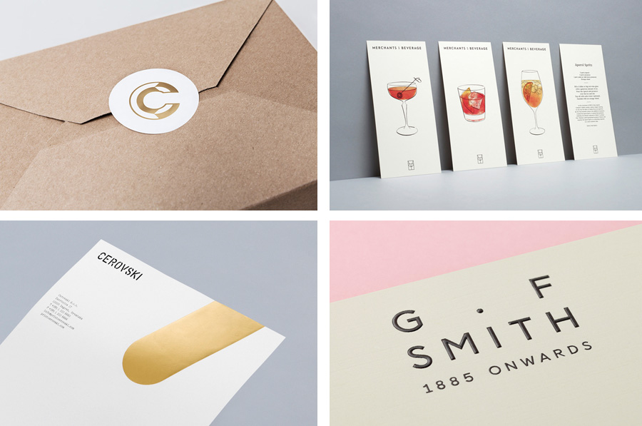
G . F Smith designed by Made Thought
G . F Smith is an independent British paper merchant with a heritage dating back to 1885 and a loyal staff, some of whom have provided over 20 years of loyal service. Made Thought, the design studio behind the visual identity for G . F Smith’s distinctive Colorplan range, were recently commissioned to develop a new visual identity treatment for the company that would better reflect the legacy, stature and future ambitions of the company. This included a new logo and logotype, sample and heritage booklets, stationery, pin badges and website.
Read more about this project here
Attention: Craft designed by Snask
Attention: Craft was an exhibition of innovative and experimental art created by eleven leading Swedish and Norwegian artists, and part of an annual programme run by and held at Stockholm’s Liljevalchs, the first independent public museum for contemporary art in Sweden. The exhibition took place between June and September this year and featured artists such as Karin Bengtson, Linus Ersson and Hanne Friis. The exhibition’s visual identity, which included a copper, stone, wood and ceramic logotype, large format posters and guide, were designed by Snask.
Read more about this project here

Merchants of Beverage designed by Manual
Merchants of Beverage is an online service that aims to make buying and gifting luxury items easy. Products include wines, spirits and Champagne’s, as well as hand-blown crystal stemware and professional barware. Each item has been handpicked and curated by a team of experts and sourced from a variety of international artisans. The service’s new brand identity, which included monogram, logotype, stationery and packaging design, art direction and e-commerce website, and features photography from Doron Gild and illustration by Sharon Hwang, was managed by San Francisco based Manual.
Read more about this project here

Cerovski designed by Bunch
Cerovski is a young Croatian print production studio that revels in the challenge of “nebulous finishing, microscopic editions, absurd materials and crazy deadlines”. Design agency Bunch developed a new brand identity for the studio—which included a custom logotype and typeface, website, and a variety of printed collateral—that delivers a distinctive contrast of utility and creative flourish, technology and individualised service, through stencil cut type, a number of material choices and print finishes, and a personalised but digitally generated daily planner.
Read more about this project here