New Belgium Brewing by Hatch
Opinion by Richard Baird Posted 9 February 2015
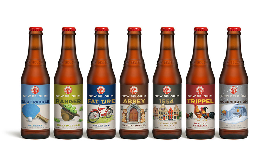
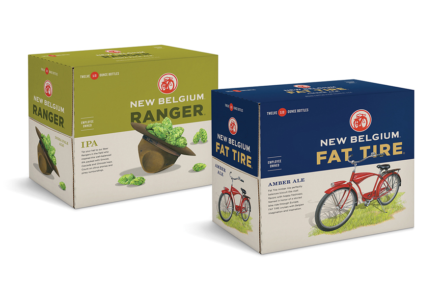
New Belgium is an employee-owned craft brewery located in Fort Collins, Colorado, with a quality-focused, fun-driven and environmentally conscious philosophy. Based around the concept of inviting discovery through unification, San Francisco based Hatch worked to redesign New Belgium’s brand identity and the packaging of its complete craft beer range, which included the popular and renowned Fat Tire Amber Ale. Hatch refreshed and modernised the brewery’s identity, breaking through clutter and increasing its prominence, and united a diverse product line through an iconic illustrative consistency whilst retaining individual character.
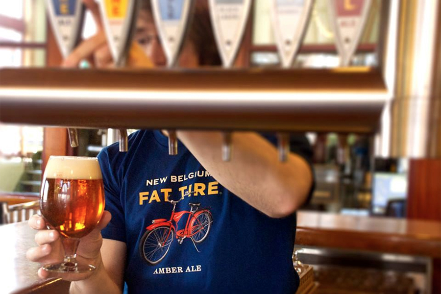
I had my first New Belgium beer last summer while visiting my fiancé’s parents in Boulder, Colorado. We were strolling down Pearl Street when a colourful vintage bicycle decked out in New Belgium Brewing Company graphics caught my eye. With the recent craft beer explosion back home in the Pacific Northwest I was surprised that I had never heard of the brewery. However, I was excited to learn they were local to Colorado, with their headquarters nearby in Fort Collins. Fat Tire Amber Ale, New Belgium’s flagship beer happened to be my soon-to-be father-in-law’s favourite, so when we found a place to sit down and eat, it was the first thing I ordered.
While waiting for my first bottle of Fat Tire to arrive I prepared to be open-minded. They say the average person takes less that two-tenths of a second to form a first impression of a brand, though I’m pretty sure it takes a graphic designer two hundred times longer. It’s true, partly from having to do it so often and partly from opening up the possibility to one of our greatest fears — conjecture. It’s our job to obsess over details, rationalize decisions, and build informed opinions
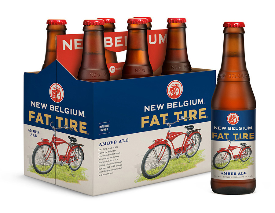
My first reaction to Fat Tire was how it resonated with an unmistakable balance of traditional and modern expression. The bold sans-serif typography and iconic style appealed to the modernist in me, while the colours and vintage illustrations appealed to the uh….hipster in me? I was instantly a fan of the Fat Tire label but it wasn’t until several months later while scouring the internet for branding projects that I found myself writing about it.
Hatch Design is a branding and graphic design firm located in San Francisco. After getting in touch with Joel Templin, (one of the companies co-founders) regarding another project, I learned Hatch was responsible for the New Belgium rebranding. Hatch was hired to unite their range under one family, in an approach that honoured the brewery’s heritage, a passionate fan base, and brand culture.

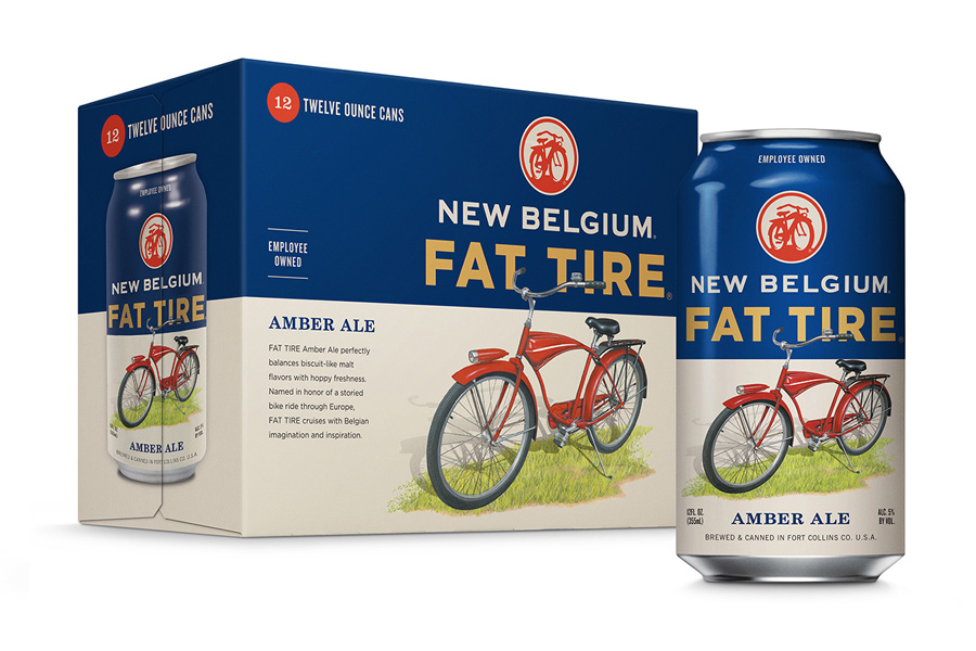
A core focus for the project was to make the New Belgium brand more prominent on the packaging. Hatch began by updating and isolating the mark above the brand name—simplifying the artwork and making the brewery’s name more visible. They devised whimsical names for new varieties, introduced bold typography and a formalized colour palette. This created a clear visual system, connecting variety with brand—allowing New Belgium to expand consistently while maintaining familiarity.
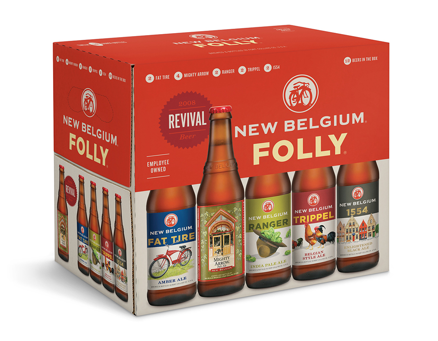
Long time fans of New Belgium Brewing are familiar with the beer’s original labels, these featured beautiful watercolour illustrations by Anne Fitch. For the redesign, Hatch worked with artist Leah Giberson to create fresh contemporary interpretations for the central image of each beer variety, with an approach that honoured the brand’s heritage. The team brainstormed ideas for each, began with a photograph, composited artwork and finally Leah repainted each. The resulting images express fun and sentimental feelings of affection, and play along with the metaphor theme of each variety.
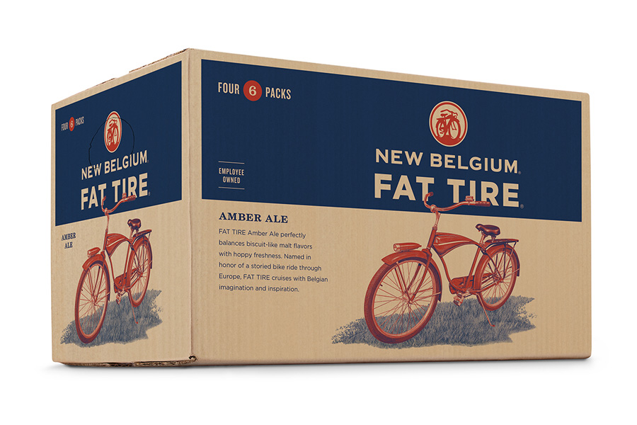
Hatch’s creative direction for the project have hit a home run. They successfully unite each beer variety under one big happy family while ensuring the Fat Tire equity lives on, and provided the other varieties opportunity to secure their own fame under the New Belgium brand. The new artwork lovingly honours the brand’s heritage in a fun and refreshing style, capturing the ideas and attitude of craft beer culture. Having entered six new states in the first year of launching the new design, New Belgium stated the redesigned packaging has contributed to a bump in sales and generate excitement from its distributors.
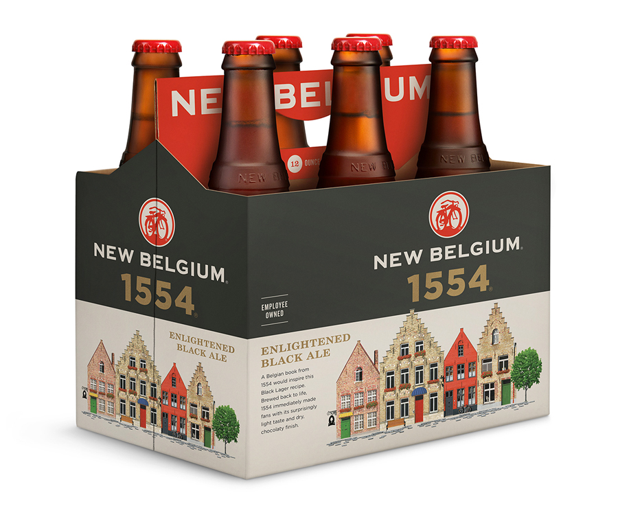
The project’s success can also be attributed to a very inclusive design process, a strong characteristic of both companies—Hatch and New Belgium. As part of Hatch’s research for the project they spent a few days in Fort Collins hanging out with employees, interview them, touring the plant and of course sampling beer. New Belgium’s culture of collaboration evolved out of a pursuit to be 100% employee-owned which eventually became a reality in 2013. I’m definitely a bit jealous of New Belgium employees who get to celebrate their 5-year anniversary with the company by receiving a free trip to Belgium, where they are paid to travel around and sample local brews for a week! Joel commented that during Hatch’s stay he’s never seen a happier group of people, likening the experience to a trip to Willy Wonka’s chocolate factory.
Design: Hatch. Illustration: Leah Giberson. Opinion: Josh Nychuk.
