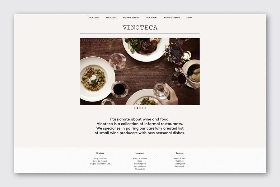
Vinoteca by dn&co
Opinion by Richard Baird Posted 13 October 2015

Vinoteca is a group of London based restaurants, founded by business partners and friends Brett Woonton and Charlie Young, that were inspired by the wine bars of Spain and Italy. Aside from the restaurant experience, and as a testament to the quality of their wine list, these restaurants also operate as local wine retailers.
dn&co. were commissioned to refresh and formalise Vinoteca’s brand identity. With an emphasis on balance and clarity, and a desire to convey Vinoteca’s welcoming and easily digestible take on the complex world of wine, dn&co., in opposition to the simplicity and clinicality often favoured by similarly positioned restaurants, embraces material colour and texture, typographic reduction and flourish, space and rich photography. This extends across menus, wine lists and labels, business cards and website.

dn&co.’s concept, based on the “industry-specific notion of pairings”, is communicatively subtle, manifesting itself throughout the identity in the form of an aesthetic contrast.
This contrast exists in a multitude of forms. These include, but are not limited to, mixed-fibre and single-fibre material choices, uncoated surface texture and reflective print finish, a single black ink and a copper spot colour, and plenty of unprinted space next to warm photography. Highlights include the copper foil across the deep green board of the business cards, and a diamond pattern used as both a graphic and embossed Gravure detail.
Although the relationship between concept and aesthetic outcome appears, for the most part, nuanced, these combinations are distinctive, visually interesting and work well to make the complexities of wine feel accessible. Flavour profile becomes an array of texture, colour, material and type in print.


The concept is perhaps most explicitly expressed through the pairing of the reductive sans-serif characters of Brown and the mechanical and utilitarian qualities of a typewriter font, as well as the custom flourish across the V and A of the logotype, which is inspired by the traditional wrought ironwork of Mediterranean vineyards. These two choices, while rooted in a concept specific to the industry, and aesthetically distinctive in their pairing, also function well to break up the content of the menus.
The result successfully moves between contemporary restraint and traditional ornament, visual and physical detail. These choices feel well-suited to the modern experience of drinking wines of age and nuance. It grounds a wealth of material detail and finish in a relevant concept, albeit an implicit one, which keeps it from appearing superfluous or too on-trend, and finds a comfortable intersection between high-quality, expense and accessibility. More from dn&co. on BP&O.
Design: dn&co. Fonts Used: Brown & Pitch. Opinion: Richard Baird.