Bottura by Foreign Policy
Opinion by Richard Baird Posted 2 November 2015

Bottura is an Italian restaurant and food store with space in Singapore’s Suntec City Mall. It has a contemporary interior of exposed utilities painted black, white suspended ceiling and surfaces, dark wood and steel furniture, glass, concrete and steel counters, warm spot and low-hanging lights and an open kitchen working from authentic family recipes rooted in the owner’s hometown of Bologna. This interior is punctuated by a bright, high contrast and convivial brand identity, developed by graphic design studio Foreign Policy, informed by the restaurant’s fusion of tradition and modernity, and extending across menus, coasters, packaging and signage.


Although far from a logo-centric project, Bottura’s logotype is a strong and concise distillation of its concept, and is successfully expanded upon through pattern and illustration. Contrast is used effectively, deriving aesthetic impact, distinction and character from a clear communicative agenda, the meeting of old and new.
The monolinear, geometric and condensed sans-serif letterforms of Platform, ones grounded in modernity, reduction and crudeness, sit alongside those that are refined and classically ornamental, characterised by heavy strokes transitioning into hairlines, vertical stress and bracketed serifs.
These disparate choices, sharing neither origin, intention or style, are brought together through a tight adherence to baseline and cap height, some solid spacing and sense of balance.


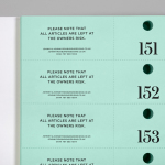
The conceptual foundation and aesthetic contrast present in the logotype manifests itself well and more broadly across the menus, packaging, coasters and signage.
There is a tension between heritage and modernity, and a more general sense of duality, which plays out in a variety of visually interesting ways. The loosely drawn sits next to the precise and geometric, panels of flat colour alongside patterns and watercolour texture, the square next to the round, areas of space and moments of detail, type next to image, the unbleached alongside the dyed, and a professional finish alongside personal flourish. These smaller moments of contrast contribute to greater contrast that exists throughout the restaurant, punctuating a predominantly black, white and steel interior with a conviviality.
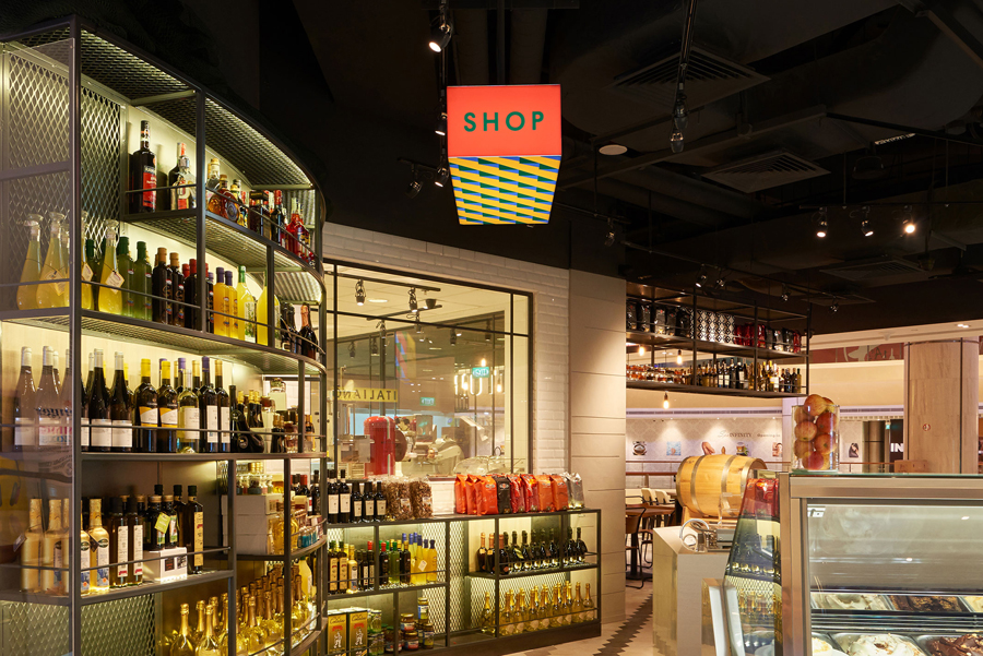
Illustration plays a significant roll. As described by Foreign Policy, these marry nonna (grandmother) patterns with those that are quintessential Italian as an homage to the owner’s hometown of Bologna, a city steeped in culinary tradition. These are well drawn, distinctive on their own, thoroughly unique in their combination and draw from relevant reference points that touch upon provenance and family.
As presented here, the identity appears busy, yet within the context of interior feels balanced, introducing moments of colour and life to an architectural robustness. Where the illustration, pattern and material of print feel crafted and personal, the interior appears polished.

Particular highlights include the contrast of illustrative style across the boxes and coasters, as well as interior signage. Foreign Policy make great use of the three-dimensional qualities of the signs by mixing flat panels of colour and modern geometric sans-serif typography one side and patterns on another.

The project also includes illustrated menu, a guide to Bologna and insight into Italian food culture. These add a contextual depth to the food, contribute to an overall sense of authenticity in a personable manner, and gives consideration to the mind.
These are perhaps the most awkward component of the project, which is not helped by the distracting manner in which they have been documented. These exist somewhere between a storybook and a children’s A-Z in their simplicity. The juxtaposition of watercolour image—which has plenty of character and detail—geometric type and approach to typesetting, although united by colour, is jarring and unexpected, but perhaps the most thoughtful.


The result is conceptually well-founded, at times aesthetically challenging (dissonance is a useful tool to capture attention but can feel uncomfortable at times, particularly typographically) and smart in its consideration of the restaurant’s interior, with thought given to stimulating the imagination. Identity adds to, rather than replicates interior, leverages moments of difference but weaves these together using a colour palette of warm hues drawn from Bolognese food and its iconic brick roofs.

Although the concept of past and present, as it manifests itself through pattern and typographical contrast, is not unusual, this is appropriately rooted in the family heritage of the restaurant’s proprietor and the authentic Italian origins of its menu and products in a compelling, expressive and well-rounded way. This is confidently explored through form, type and a storytelling component, and secures visual interest through richness and continuity, and in other places, simplicity and abruptness. The playful and irregular meets the architectural, professionalism meets the personable, and heritage feels current. More from Foreign Policy on BP&O.
Design: Foreign Policy. Opinion: Richard Baird. Fonts Used: Platform