The Best of BP&O — Brand Identities of 2015
Opinion by Richard Baird Posted 29 December 2015
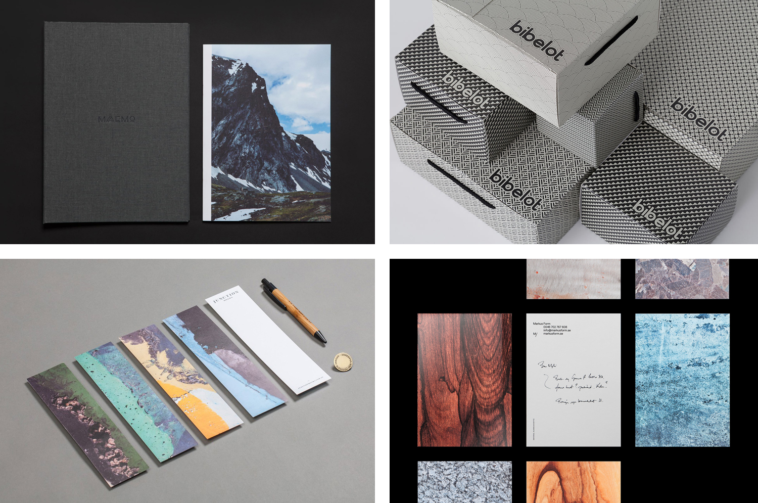
2015’s brand identity design highlights included Clase bcn’s work for furniture business Enea and Woodland Wine Merchant by Perky Bros, Heydays’ responsive signage for Fosnavåg Konserthus and Kurppa Hosk’s visual language for Swedish design store Designtorget. However, there were five projects that stood out, and have made it into BP&O’s Best Of Series. This feature brings together the most interesting, unexpected or unusual projects published on the site throughout 2015 for another opportunity to be seen and shared. These balance a strong concept with a compelling aesthetic and communicative intention that appropriately plays with photography, colour, texture, layout, form, type and print finish.
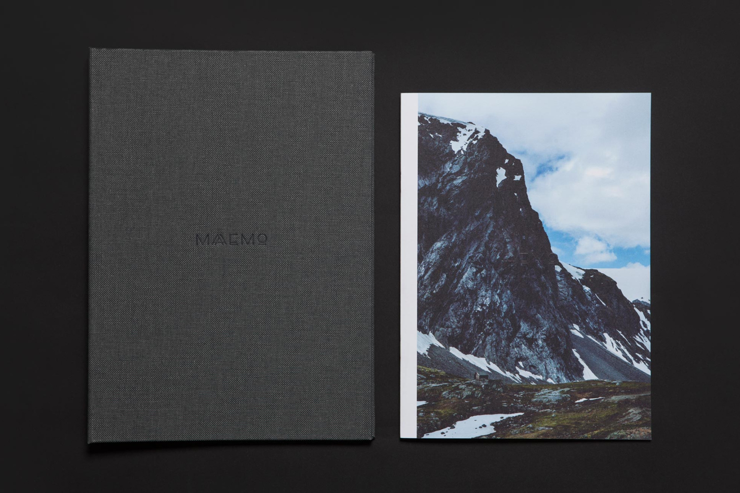
Maaemo by Bielke & Yang, Norway
Design studio Bielke&Yang worked with Norwegian two Michelin starred restaurant Maaemo to develop a holistic brand identity solution informed by the philosophies and creative practices of its unique dining experience and culinary expertise.
The studio’s brand identity design system, which encompassed website, custom typography, colour, the tone and content of images, and the tactile finishes of welcome notes, magazines, business cards, folders and menu design, was created to collectively reflect, contribute to, and communicate Maaemo’s unique philosophy. A philosophy that sees innovative dishes created from organic and seasonal ingredients, farmed in a way that is sensitive to the ecology of their environment, and prepared with an original and creative mindset.
See more of this project here
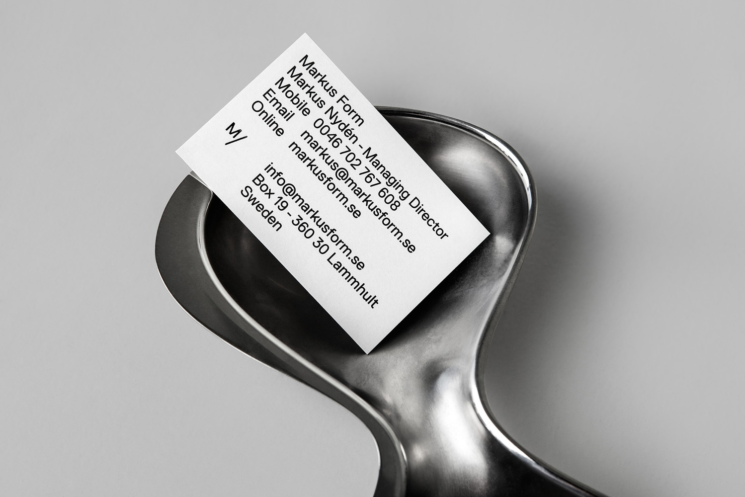
Markus Form by Lundgren+Lindqvist, Sweden
Markus Form is a contemporary furniture company, founded with the intention of revitalising Sweden’s furniture industry, and with an ambition to produce relevant, practical and easy to match designs that are durable and sustainable. The company’s furniture will also draw on a significant Swedish and Scandinavian design culture and heritage that unites ergonomics, functionality, craftsmanship and a good working knowledge of materials, whilst also being individualistic. Markus Form describe their philosophy as one that takes on greater challenges than those posed by form and finish, and acknowledges furniture as an architectonic component that has to handle scale and other spatial conditions and addresses everyday needs.
These values are the basis of Markus Form’s brand identity, developed by graphic design studio Lundgren+Lindqvist, and expressed using reductive, geometric, typographic shape and its consistent application, an appropriate use of space, proportion and layout, detail and the absence of detail, print finish and the distinctive and contextual qualities of unusual product photography.
See more of this project here
Junction by Seesaw, Australia
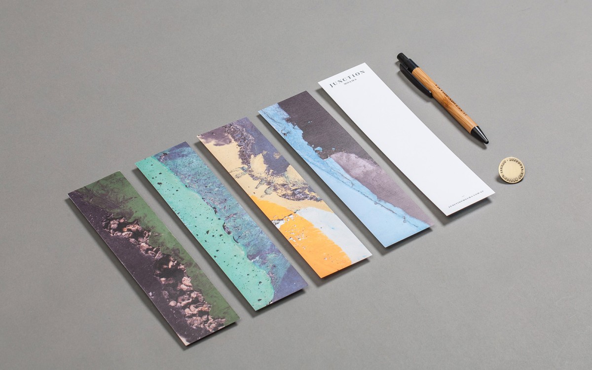
Junction is a bar and restaurant set within the tourist district of the Australian twin-towns of Moama and Echuca, both of which have histories that began in the middle of the 19th century, and grew to share a border along the Murray River. Originally a wooden tavern built by James Maiden in 1840, and named the Junction Inn—a reflection of its location at the confluence of the rivers Campaspe and Murray—it was place were travellers and settlers would converge. Its humble beginnings are now honoured with a new permanent structure, a seasonal menu made from local produce, a variety of craft beers, wines and cocktails, and by continuing to serve as a meeting point.
As part of a new brand strategy, developed and then visualised as a brand identity system by Melbourne based design studio Seesaw, the Junction Inn has been shortened to Junction, and expands on the concept of meeting points, not just of people or rivers, but of past and present, the town and the outback, regional taste and craft brews. This manifests itself across a rich interior design and visual identity treatment which included menus, stationery, signage and business cards, bound by a variety of material textures, high quality hand crafted finishes and a subtle urban quality.
See more of this project here
Helsinki Philharmonic Orchestra by Bond, Finland
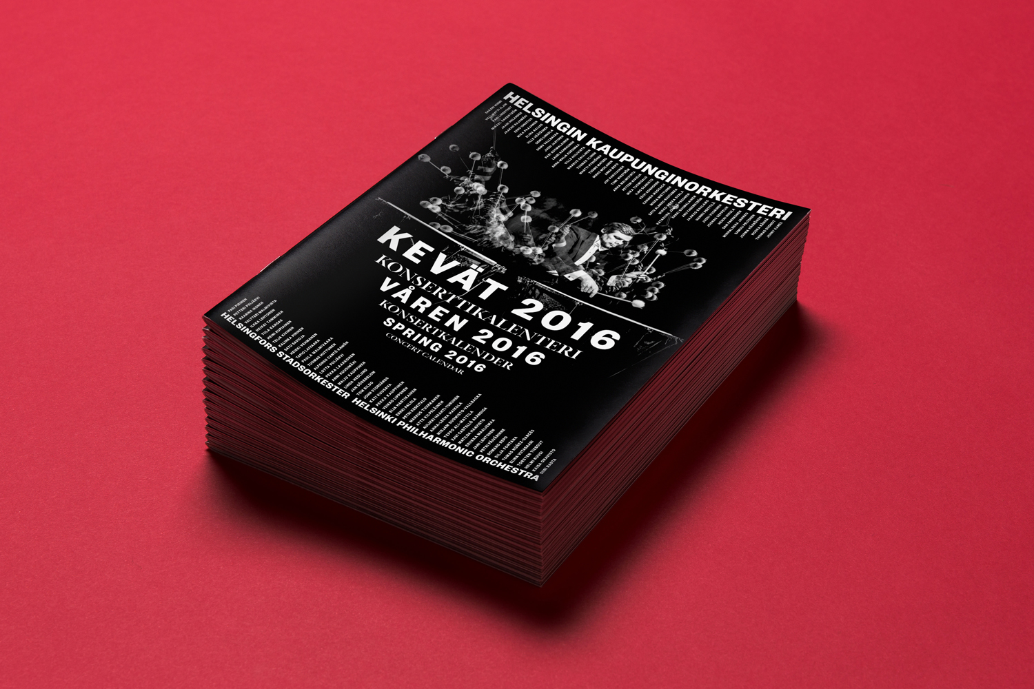
Helsinki Philharmonic Orchestra is a 102 strong ensemble, currently led by chief conductor John Storgårds, with its primary venue being the Helsinki Music Centre. It has a significant history, beginning as the Helsinki Orchestral Society in 1882 and acquiring its current name following a merger with the Helsinki Symphony Orchestra in 1914. In 2016 the orchestra will have its first female chief conductor following the appointment of Susanna Mälkki.
With a desire to strengthen its image and consolidate its overall brand experience, the orchestra worked with Finnish graphic design studio Bond, who in turn collaborated with photographer Marko Rantanen, to create a new visual identity that would communicate the energy and power of its 102 musicians, and that would extended across programmes, stationery, business cards, campaigns and signage.
Read more of this article here
Bibelot by A Friend Of Mine, Australia
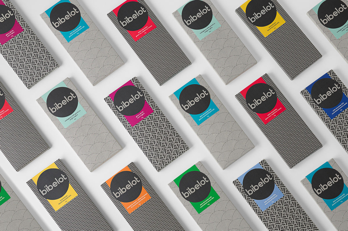
Bibelot is a luxury European-inspired dessert boutique in Melbourne with a coffee bar, chocolate shop, high tea salon, gelaterie and artisinal patisserie. It features an interior of long marble counters, a light spotted stone floor, spot lighting, cornicing, black and white walls, as well as bronze and tiled detailing.
Informed by the sense of place and the permanence that underpins Bibelot’s concept, reflected in its classic interior flourishes, graphic design studio A Friend Of Mine developed a brand identity that links interior, signage and packaging, makes a connection with craft, through traditional monochromatic mosaics and a geometric sans-serif logotype, and draws out, using bright spot colour panels, the colourful detail, distinctive flavour and variety of its confectionery.
Read more of this article here


