Maaemo by Bielke&Yang
Opinion by Richard Baird Posted 21 September 2015
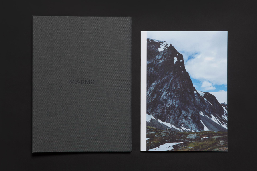
Design studio Bielke&Yang have worked with Norwegian two Michelin starred restaurant Maaemo to develop a holistic brand identity solution informed by the philosophies and creative practices of its unique dining experience and culinary expertise.
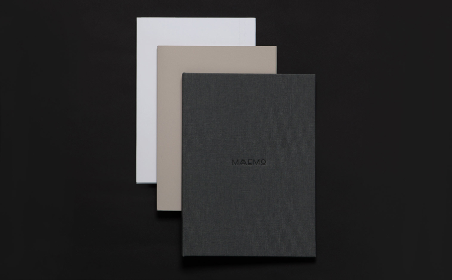
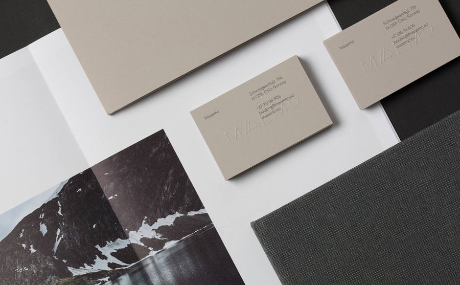
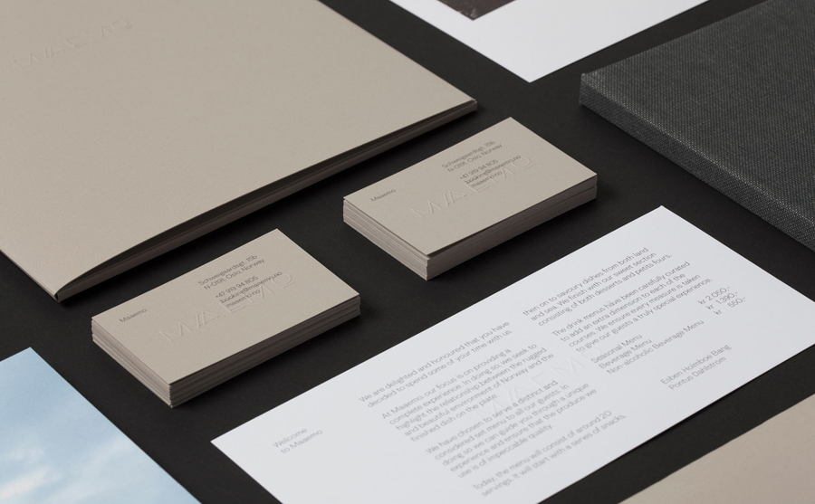
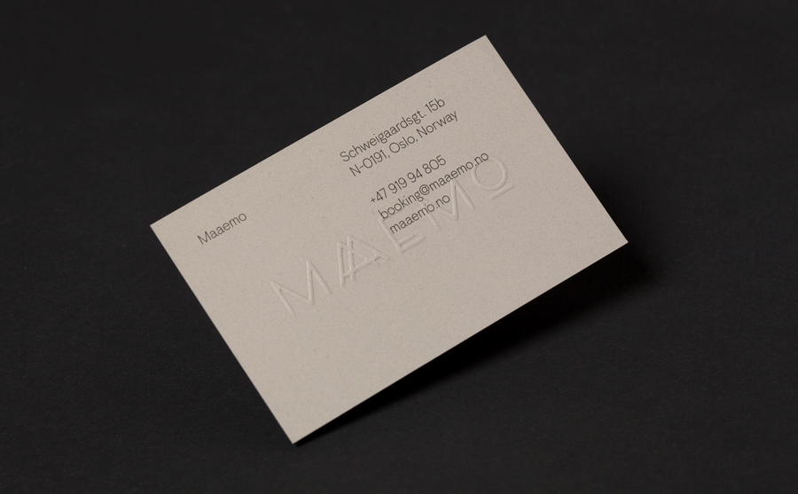
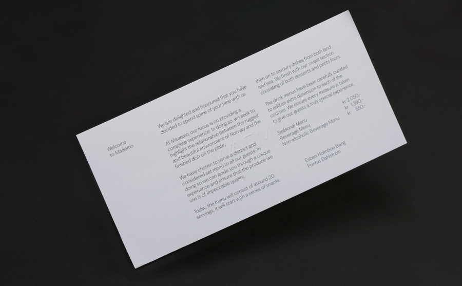
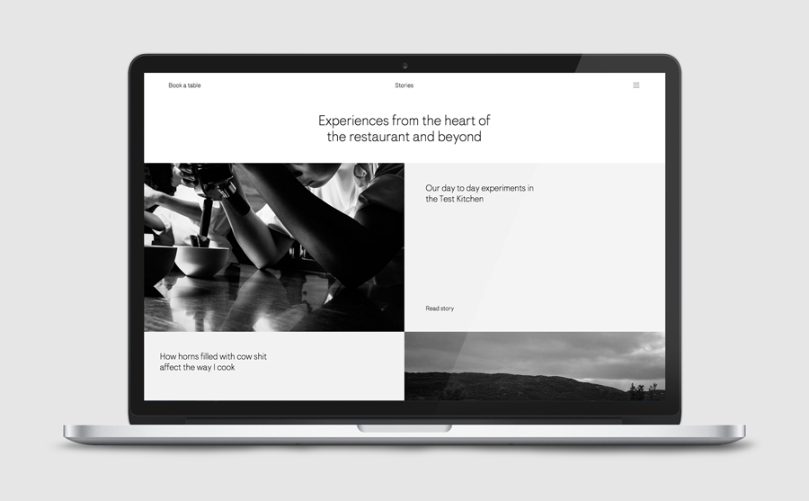
The studio’s brand identity design, which encompassed website, custom typography, colour, the tone and content of images, and the tactile finishes of welcome notes, magazines, business cards, folders and menu design, was created to collectively reflect, contribute to, and communicate Maaemo’s unique philosophy. A philosophy that sees innovative dishes created from organic and seasonal ingredients, farmed in a way that is sensitive to the ecology of their environment, and prepared with an original and creative mindset.

Each element that makes up Maaemo’s visual identity was crafted, managed, and brought together by Bielke&Yang. A design studio whose process and concept-driven approach very much reflects Maaemo’s own. So while not immediately apparent, the relationship between high quality culinary experience and design practice runs throughout the identity.
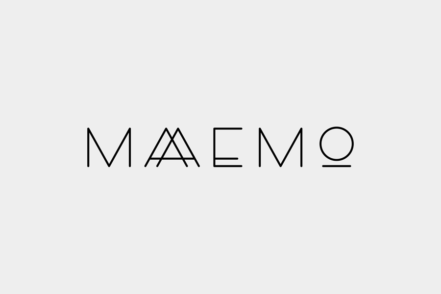
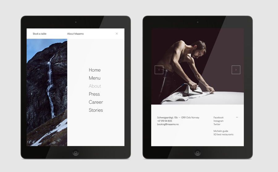
What makes Bielke&Yang’s approach and solution so distinctive and representative of Maaemo’s high quality ingredient choices, refined processes and attention to detail is, and perhaps most subtly, drawn out through a custom font developed in collaboration with boutique type foundry Colophon. The font’s simple characters, light line weights and crafted origins share the values of clarity and honesty that underpin the restaurant’s menu and dining experience, and most importantly, is unique to them. These are also the founding principles of Maaemo’s logo, a recognisable and consistent asset retained and originally designed by Uniform.
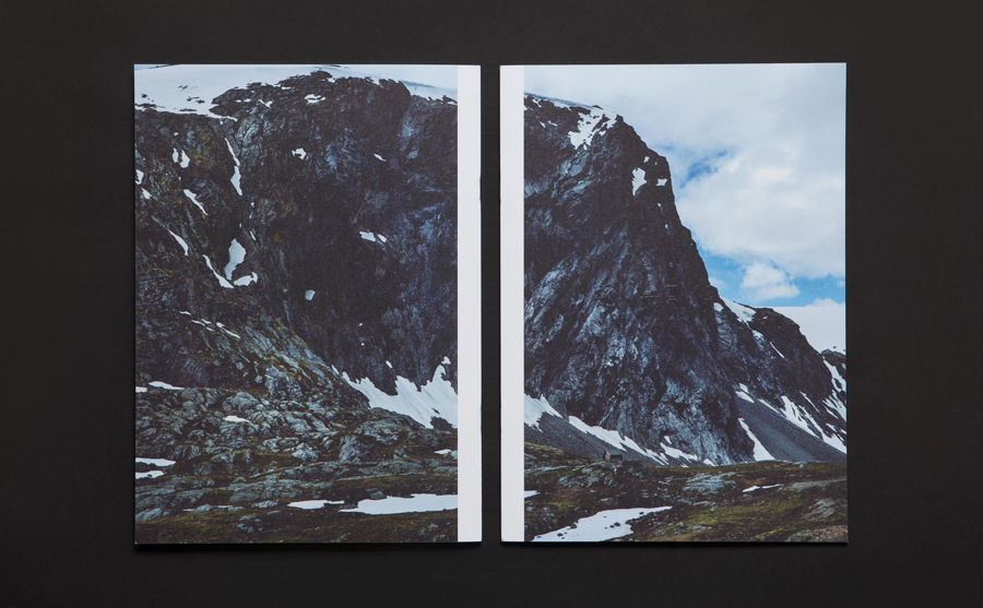
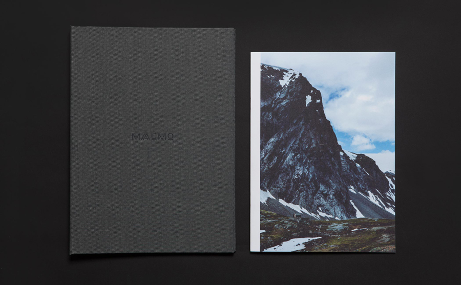
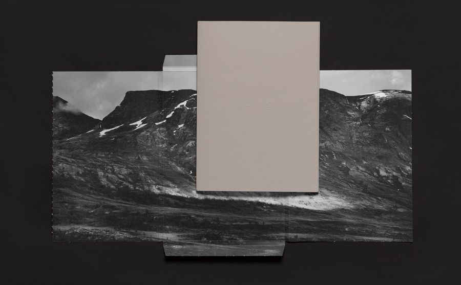
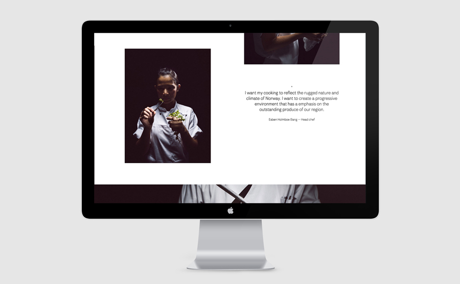
Bielke&Yang’s approach to images, captured by photographer Tuukka Koski and used generously in print and online, clearly look to establish a strong relationship between the cool winds, biting rain and rising mountains of the Norwegian landscape, the high quality ingredients of Maaemo’s dishes, and its deep appreciation and respect for natural beauty, ecology and sustainable practises.
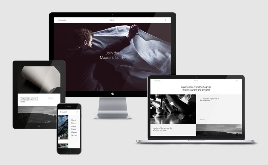
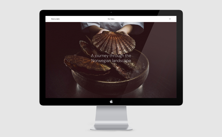
Rather than spoiling the many culinary surprises that have taken Esben Holmboe Bang many years to perfect, Bielke&Yang’s website design takes its lead from Tuukka Koski’s striking images, connecting guests to the raw and harsh climate of Norway and the ingredients that bare its torment. The website’s unique structure encourages visitors to delve deeper, to discover more about the restaurant’s space, current and seasonal menu, and to learn about the people that have helped to make Maaemo the world-renowned restaurant it is today. This connection to nature also proliferates print, providing a layer of contextual detail to ingredients and dishes.
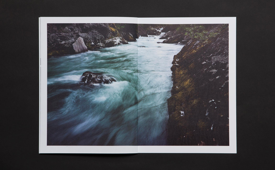
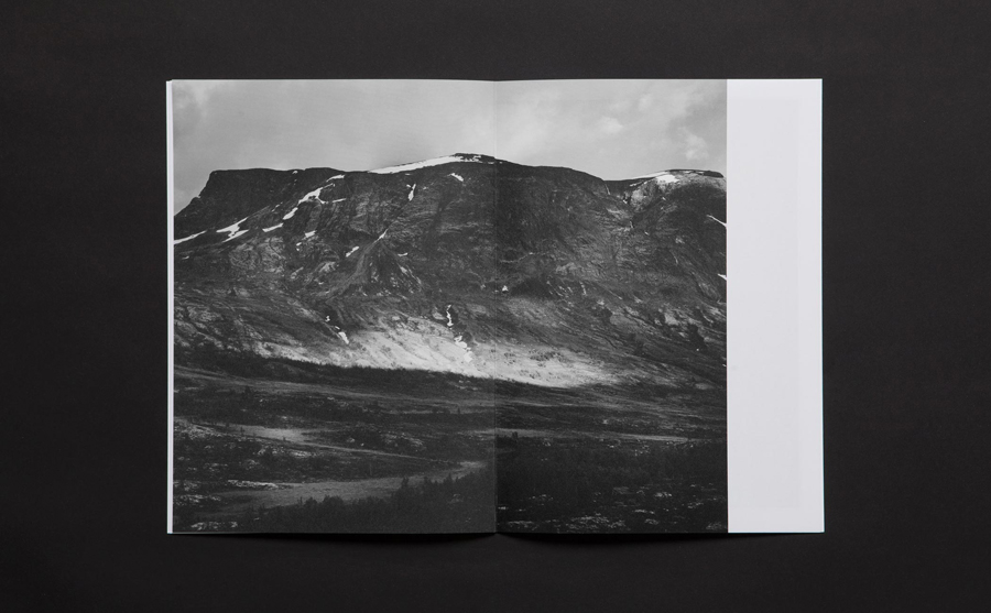
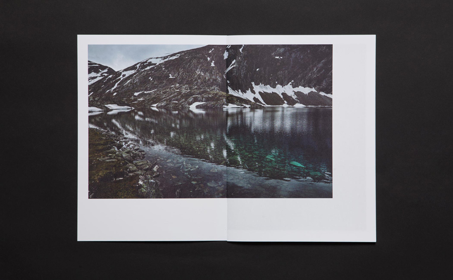
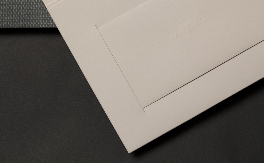
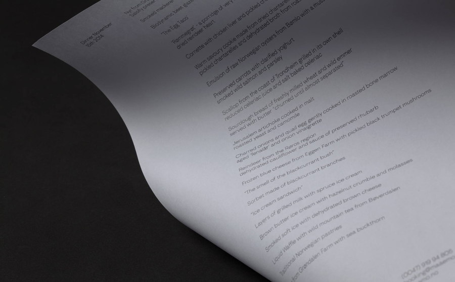
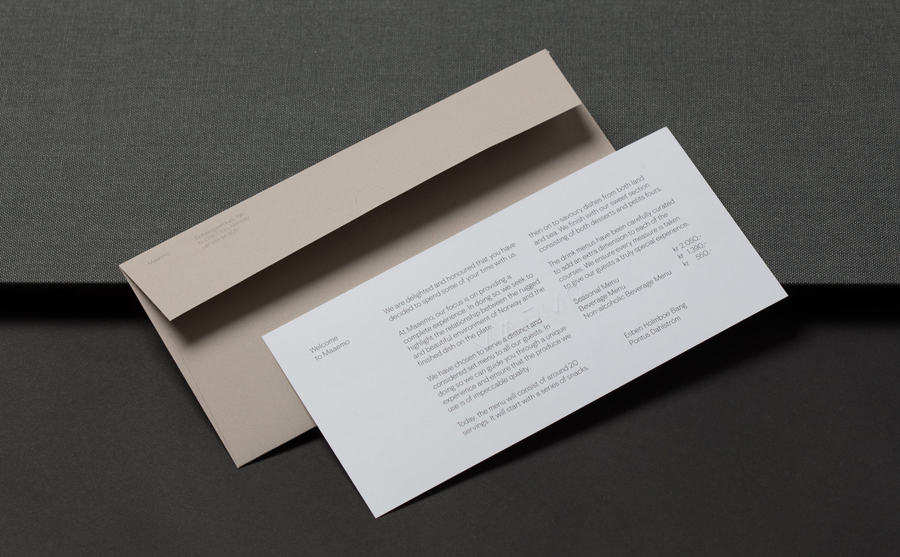
Maaemo’s welcome notes, guest package and menus compliment the rich, organic textures of Tuukka Koski’s photographic work with the physical detail and handmade qualities of open binding, fabric covers, embosses, perforations, uncoated papers, folds and original shapes. These are experience-led, hold a number of surprises, and are products of processes that are firmly rooted in the traditions and craftsmanship of print production. Processes not far removed from the development and preparation kitchens at Maaemo. More from Bielke&Yang on BP&O.
Design: Bielke&Yang. Photography: Tuukka Koski. Opinion: Richard Baird
