Solrug by Bielke & Yang
Opinion by Richard Baird Posted 24 May 2016

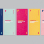
Solrug is a high-quality, ready-cut, Finnish sourdough rye bread created for the Norwegian market by Magnus Högnäs, a Finnish expat living in Norway, and in response to the county’s poor wholemeal choice. The bread is dense with a strong flavour, low in sugar and salt but high in fibre and protein, and produced by Finnish bakery Leipomo Rosten Oy using only natural ingredients. Solrug’s packaging, designed by Oslo based graphic design studio Bielke & Yang, draws on and plays up to the bread and brand’s Finnish origins, through a bright panel of Finnish stereotypes, drawn by Finnish illustrator Rami Niemi.

As a small business with a unusual product from a neighbouring country, and in a market dominated by familiar products from well-established chain stores and brands, Bielke & Yang looked to create something fun, unexpected and completely different. Much like their work for Taco Republica, stereotypes are at the heart of what is a convivial image, emphasising provenance in a way that is recognisable to Finnish expats, and unique and memorable to those of Norway.


The approach forgoes many of the conventions of the category. For a natural and wholesome product, colours are bright rather than earthy, and where tradition and craft often dominates, a youthful character and modernity is favoured. As such, Bielke & Yang’s desire for the unexpected and completely different is effectively addressed.

Rami Niemi brings his distinctive and contemporary style to a new market. The panel is eye-catching from a distance with plenty of cheerful and lighted-hearted detail up close, and moments of simplification where necessary. Composition suits the shape and structure of product while logotype delivers contrast in its typographical simplicity. A clear bag allows the texture and colour of the bread to clearly express its quality, and provides an important counterpoint to the tone of the illustration. It is nice to see that the packaging is as much of a Finnish and Norwegian collaboration as it is with the product. More from Bielke & Yang on BP&O.
Design: Bielke & Yang. Illustration: Rami Niemi. Opinion: Richard Baird.