BP&O Collections — Best Awards Finalists 2016
Opinion by Richard Baird Posted 10 August 2016

The Best Awards is an annual celebration of interactive, graphic, product and spacial design work from New Zealand and Australia, run by The Designer’s Institute. This year’s event will take place on Friday 14th October at Auckland’s Viaduct Events Centre where winning studios will be awarded a Gold Pin for best in category, a Supreme Pin for best in discipline or a Purple Pin for those considered to have lifted the bar of design.
Other awards include The John Britten Black Pin, which will be given to an individual for their leadership, vision and achievements nationally and internationally, and The Designer’s Institute of New Zealand Black Pin for Outstanding Achievement. This will be awarded to a member who has made a lasting and valuable contribution to the design profession and design culture in New Zealand. The judging process and criteria can be seen here.
To coincide with the publication of these finalists BP&O looks back at those projects reviewed on the site and up for awards in October. Finalists include Inhouse, Marx Design, Garbett, Studio Alexander, Studio Round and Studio South. Congratulations from BP&O to all the studios up for awards.

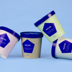
Bruce Juice by Marx Design, New Zealand
Bruce Juice is a 100% raw, cold pressed, fruit juice and plant milk brand new to the Australian market. It launched this year with five juice and vegetable blends, Red, Redder, Orange, Greener, Golden and Nutter, an almond milk, and a packaging and visual identity treatment by New Zealand based graphic design studio Marx Design.
Using a mix of illustration and texture, loose hand drawn logotype and custom typography, bright but natural colour and plenty of white space, and by balancing visual impact and communicative clarity, familiarity and originality, Marx Design helped Bruce Juice to realise their desire to establish a contemporary and playful brand personality that would also secure a strong health-focused market positioning.
See more of this project here


The International by Studio South, New Zealand
The International is a new apartment complex, located not far from Auckland’s Albert Park, with 88 luxury residencies. The building, a repurposed former office, is currently being transformed into an iconic structure with a contemporary exoskeleton of elongated beams. To promote the building and help sell apartments off-plan, the graphic designers at Studio South worked with the developer behind The International to create a holistic brand identity and marketing package.
Alongside a variety of printed assets, which included brochures, stationery, business cards, event invitations and floorplans, Studio South were also involved in the spatial design of an apartment showroom, informed by the earthy tones of Rufus Knight’s interior design and taking their cues from luxury brands.
See more of this project here
M11 studio by Inhouse, New Zealand
M11 studio is a luxe salon, located in the heart of the fashion, shopping and entertainment district of Newmarket, Auckland, that references the refinery of a Tom Ford fashion boutique. It has a well-proportioned, spacious, linear and light filled interior of large mirrors, strip and spot lighting, white and black walls, gold fixtures, concrete surfaces and robust furniture developed by architects Young + Richards and designer Lauren Hare.
This mix of contemporary space and luxe service is expressed through the structure, colour and materiality of the salon’s brand identity, created by graphic design studio Inhouse, in the form and construction of the logo, the finish of printed collateral, the application of window graphics and the material of exterior signage.
See more of this project here

Happy Maple by Garbett, Australia
Happy Maple is a Sydney-based bakery dedicated to producing small batch 100% vegan donuts, baked not fried, made from gluten, tree nut and peanut free recipes. Orders are by phone, e-mail or through their pop-up stores. There is no website, just a social media presence with lots of donut images, a personable approach to communication, and a cheerful brand identity created by local graphic design studio Garbett.
See more of this project here

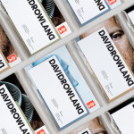
Studio South, New Zealand
Studio South, formerly APLUS, is graphic design studio working within the fields of brand identity and packaging from their office in the city of Auckland, New Zealand. In conjunction with a new name and site launch, which coincides with the expansion of studio space, South have also developed a new visual identity treatment. This extends across business cards, folders and headed paper, a project brochure, launch invitation and promotion materials.
See more of this project here

Basement Theatre by Studio Alexander, New Zealand
Basement Theatre is an independent, underground, community theatre located on Auckland’s Lower Greys Avenue. It was established in 2008 as a place to showcase new voices, fresh perspectives and emerging young talent, and to provide these with the space to develop their performances. The theatre has played host to dancers, visual artists, poets, musicians, comedians and everything in between.
Taking their cues from the unique basement location, and a brief that called for a bold, playful and edgy identity, Studio Alexander built a system around a simple but smart logotype with a step component, the impact of fluorescent inks, tinted photography, rotalics and plenty of contrast.
See more of this project here

Loving Earth by Round, Australia
Loving Earth is an Australian business, established in 2007 by Scott Fry and Martha Butler, that produces a variety of chocolates, snacks, cereals, butters and spreads. All of Loving Earth’s products are made from high quality, organic and fairtrade ingredients, and include ranges that are gluten, grain, dairy and sugar-free. Although taking advantage of a growing multi-million dollar industry, Loving Earth’s values are grounded by a genuine passion for environmental sustainability and individual well-being, rather than wealth, which is expressed, at length, online.
Loving Earth worked with Melbourne based graphic design studio Round to redesign its raw chocolate packaging. This replaces a low impact but earthy design with one of visual interest that effectively uses colour, form and type to make a better and more compelling connection with raw ingredient, emphasises flavour profile and secures a far more idiosyncratic quality.
See more of this project here

The True Honey Co. by Marx Design, New Zealand
The True Honey Company (TTHC) dedicates itself to the production of mānuka honey, a monofloral variety produced in Australia and New Zealand from the nectar of the mānuka tree. It has a unique colour and texture, and a high level of Dietary Methyglyoxal, an organic compound with antibacterial and antiviral properties.
With a price range starting at 60.00AUD and rising to 230.00AUD per jar, and working in a market flooded with sub-standard honey and dishonest marketing, communicating the value of product and the commitment of TTHC to quality and ethical production through an impactful and engaging brand identity and packaging design was paramount. This task was given to Auckland-based graphic design studio and packaging specialists Marx Design who collaborated with Think Packaging and writer Kate Phillips.
See more of this project here

The Practical Man by Garbett, Australia
The Practical Man is an online retail destination for men’s sports style and fitness, activewear and equipment, but also editorial content that covers reviews, fitness-focused travel guides and in-depth insight into new brands. It curates a catalogue of world-leading products that exist at the intersection of fashion and sports performance, designed by innovative and passionate brands with progressive approaches.
Australian graphic design studio Garbett worked with The Practical Man to develop a brand identity and visual language that would expresses their unique perspective on men’s performance style. This extended to tags, business cards, packaging, a series of still life images and website developed by Sons & Co.
See more of this project here