The Practical Man by Garbett
Opinion by Richard Baird Posted 18 December 2015
The Practical Man is an online retail destination for men’s sports style and fitness, activewear and equipment, but also editorial content that covers reviews, fitness-focused travel guides and in-depth insight into new brands. It curates a catalogue of world-leading products that exist at the intersection of fashion and sports performance, designed by innovative and passionate brands with progressive approaches.
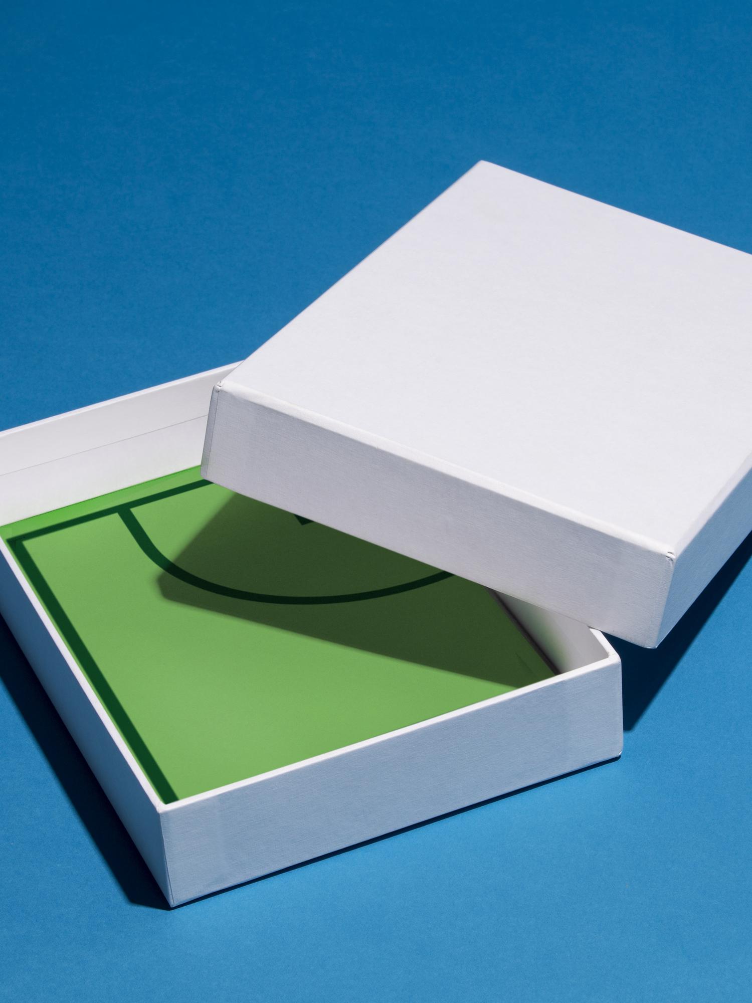
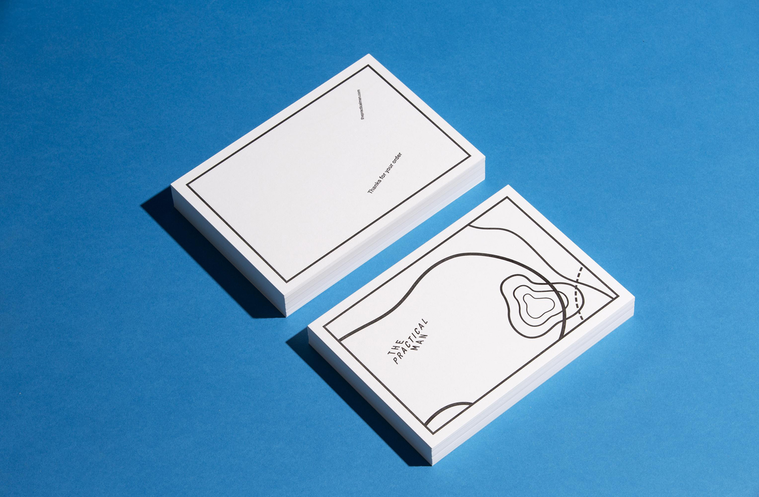
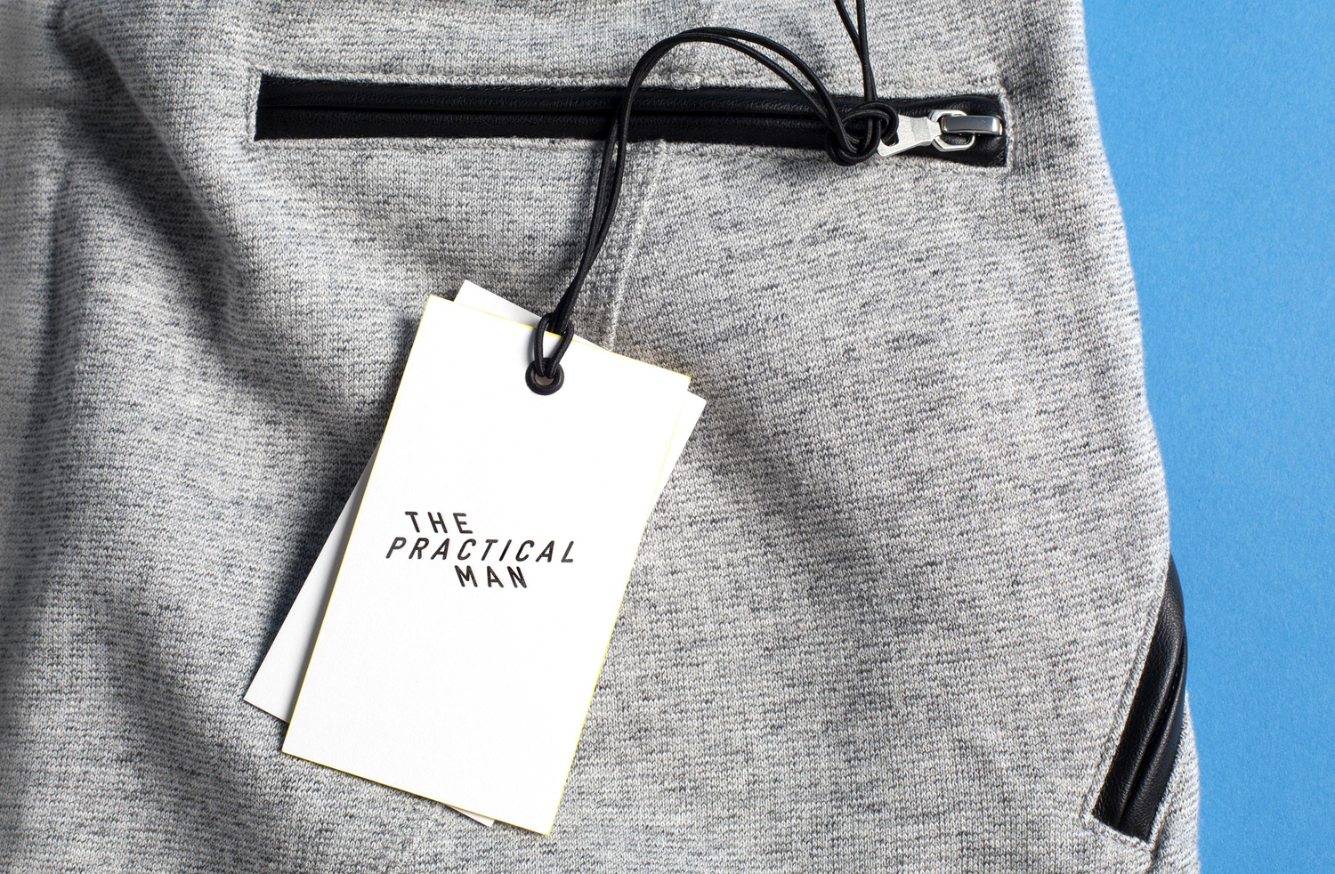
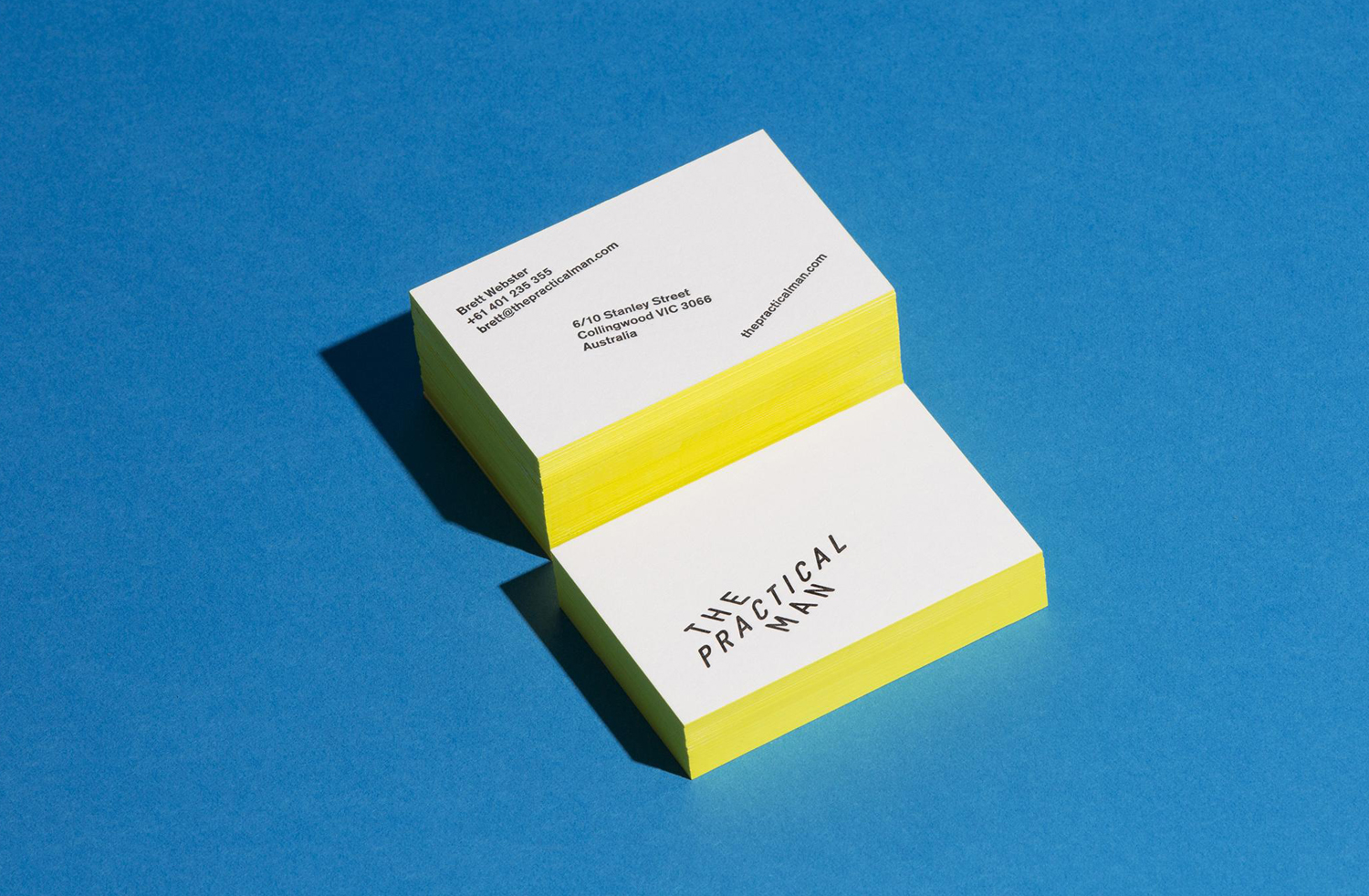
Australian graphic design studio Garbett worked with The Practical Man to develop a brand identity and visual language that would expresses their unique perspective on men’s performance style. This extended to swing tags, business cards, packaging, a series of still life images and website developed by Sons & Co.
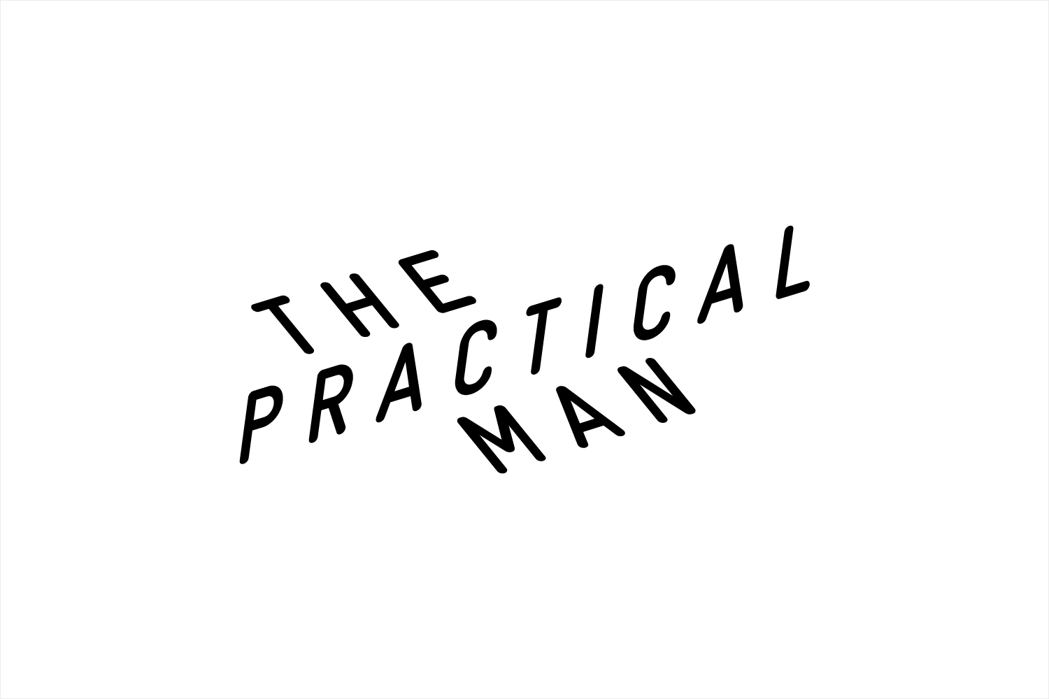
Garbett’s approach draws visual impact and satisfies a clear communicative intention—the meeting of sports utility and fashion—from the significant contrast of the mechanical qualities of type, an economy of ink and board, and the bright and creative flourish of still life campaign images.
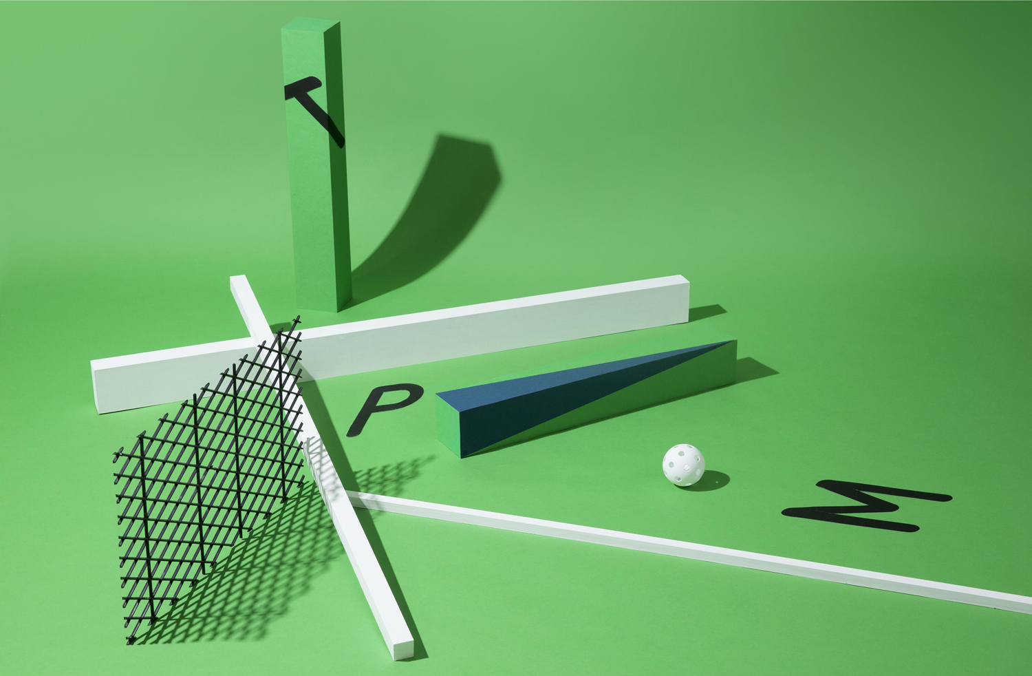
The logotype, although its letterforms are rooted in the functional, is not without character. Its typesetting plays with a sense of movement and three-dimensional space, and secures distinction and individual value from a monospaced and monolinear uniformity whilst also touching upon the principles that link many sporting activities.
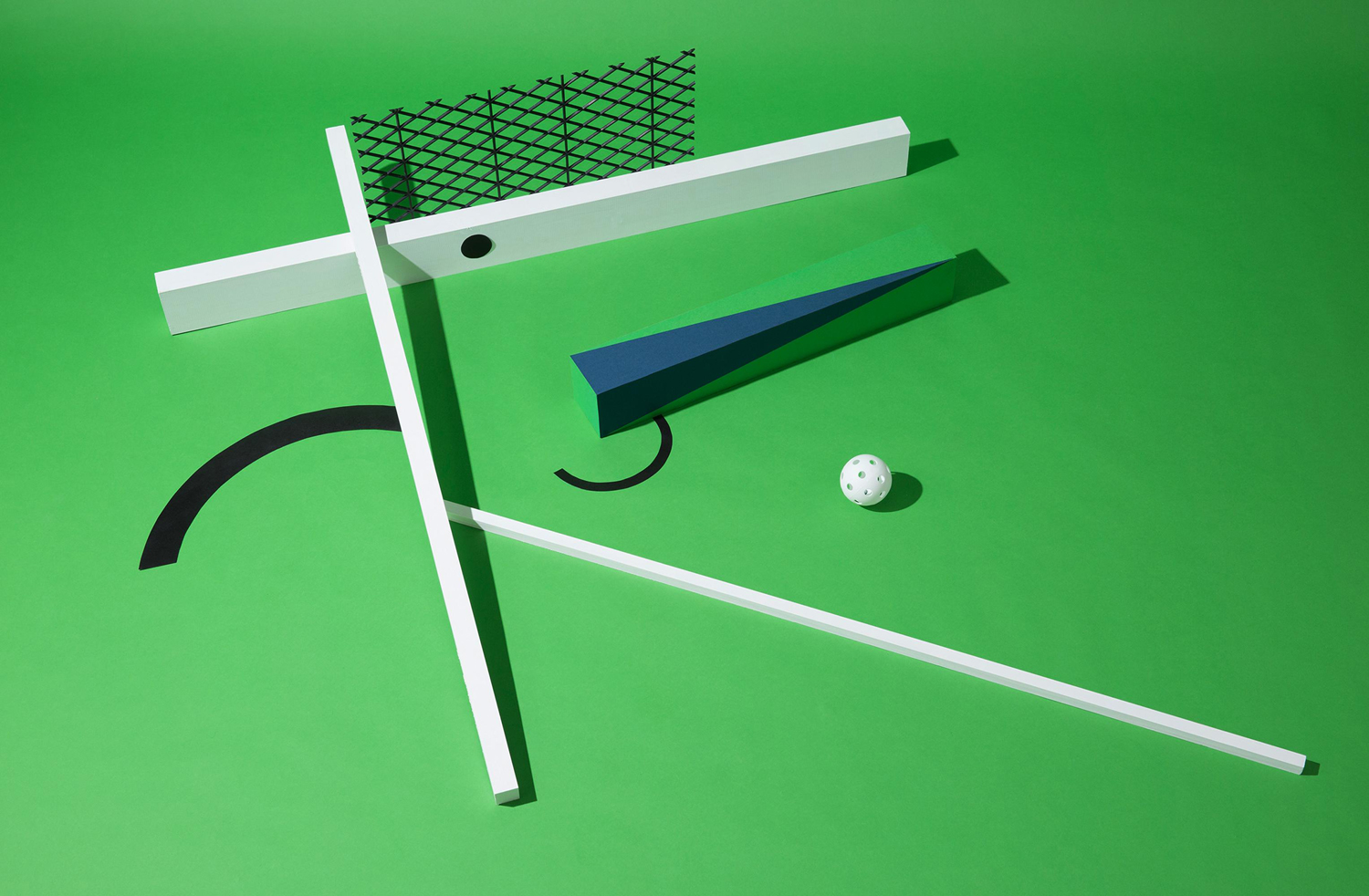
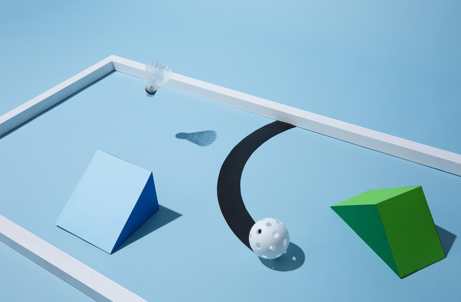
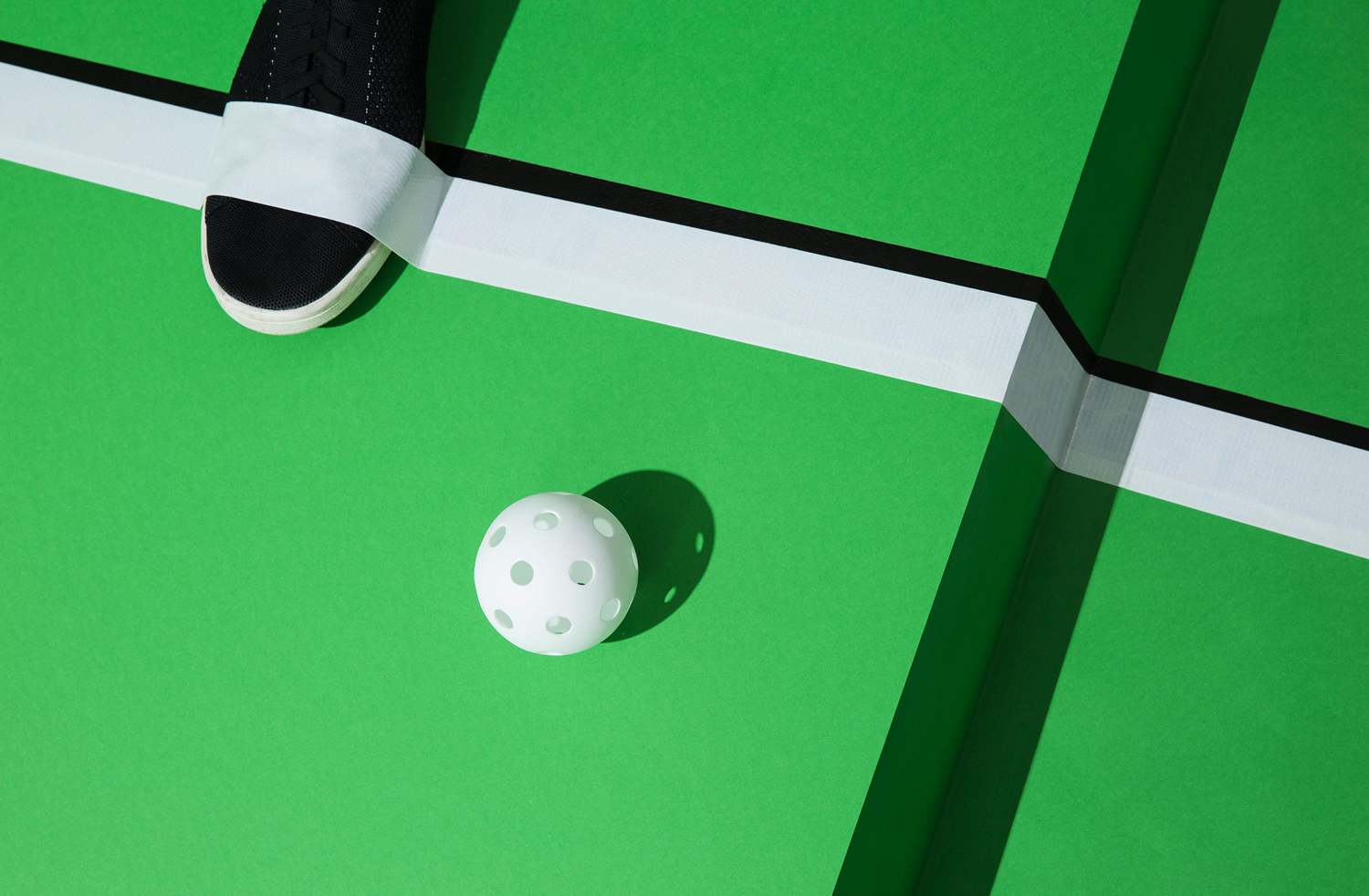
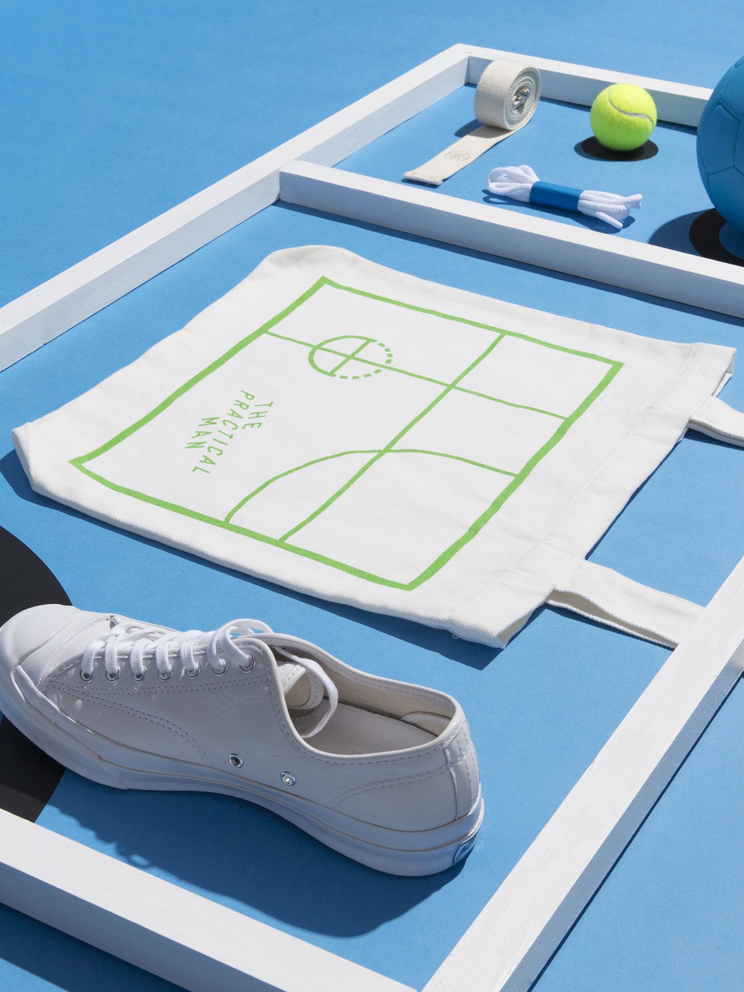
The space and movement hinted at by type is successfully explored and expanded upon more explicitly throughout a series of still life images. These effectively utilise depth, structure, light, shade and colour to add a bright and convivial detail where logotype and printed assets are reductive and serious, and juxtapose playful face making alongside the curved, dashed, solid and intersecting lines associated with sports strategy, a particular highlight.
As The Practical Man retails products of other brands, the images function as a strong ownable set of assets, independent of product, that help to distinguish the retailer as a brand in its own right. Here, familiar and universal sports paraphernalia become proprietary and visually compelling, to be used within the context of digital and print advertising.
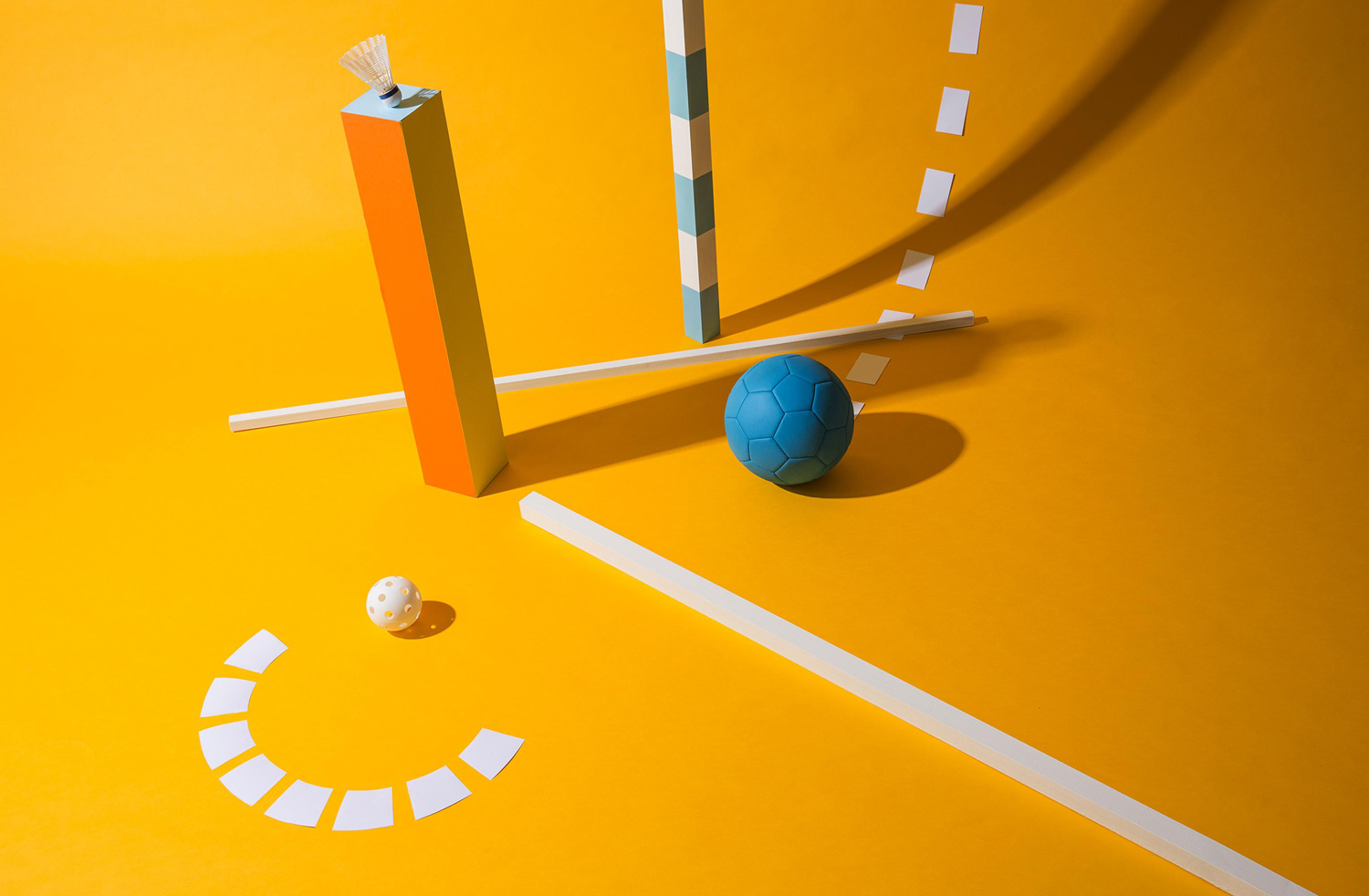
Where sport is often frenetic, still life feels an unusual yet memorable direction, grounded by a clear communicative intention. Space and the suggestion of movement link the utility of type with the more creative aspects of image, sportswear functionality and fashion retailing. This also plays out online with a website of grids, heavy lines and monospaced type, and in print through material choice and print finishes. More from Garbett on BP&O.
Design: Garbett. Website: Sons & Co. Opinion: Richard Baird. Fonts Used: GT Pressura.

