IDES by Swear Words
Opinion by Richard Baird Posted 16 August 2016
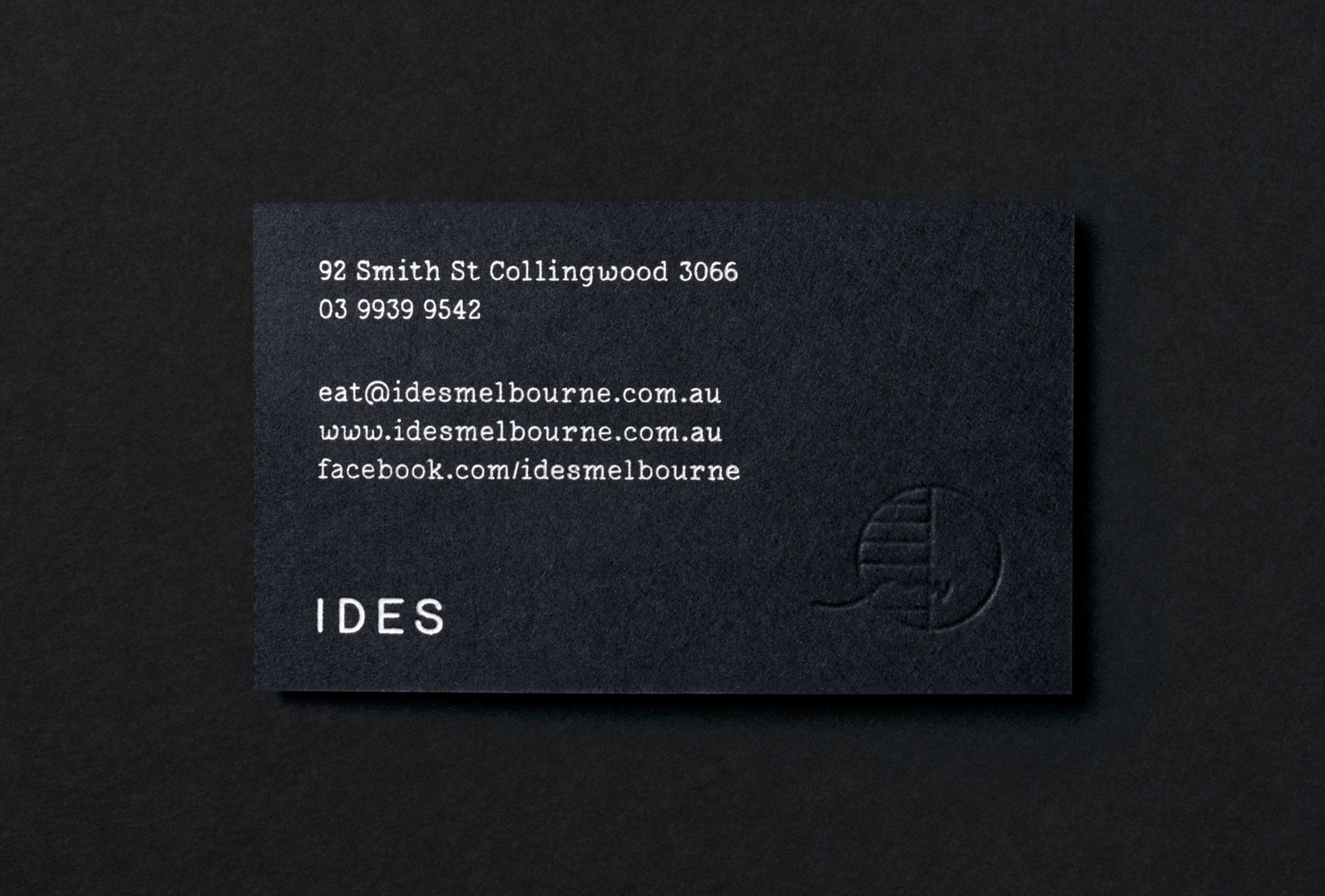
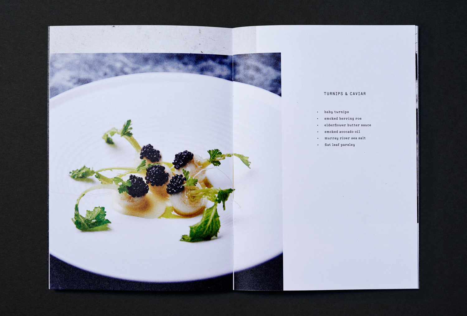
IDES began as a monthly pop-up restaurant with an inventive approach to cuisine, created by former Attica sous chef Peter Gunn. A year into the business, and to coincide with the development of a permanent space in the Melbourne suburb of Fitzroy, Peter Gunn worked with graphic design studio Swear Words to develop a new visual identity that would more effectively express the level of quality and service at IDES. Swear Words’ work manages to capture a sense of the immediacy of ideas and the quality of the final dishes through a juxtaposition of typographical utility, materiality, form and image across business cards and menus.
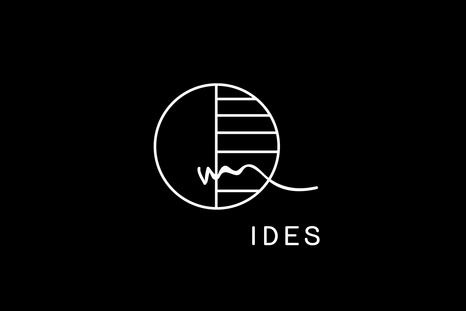
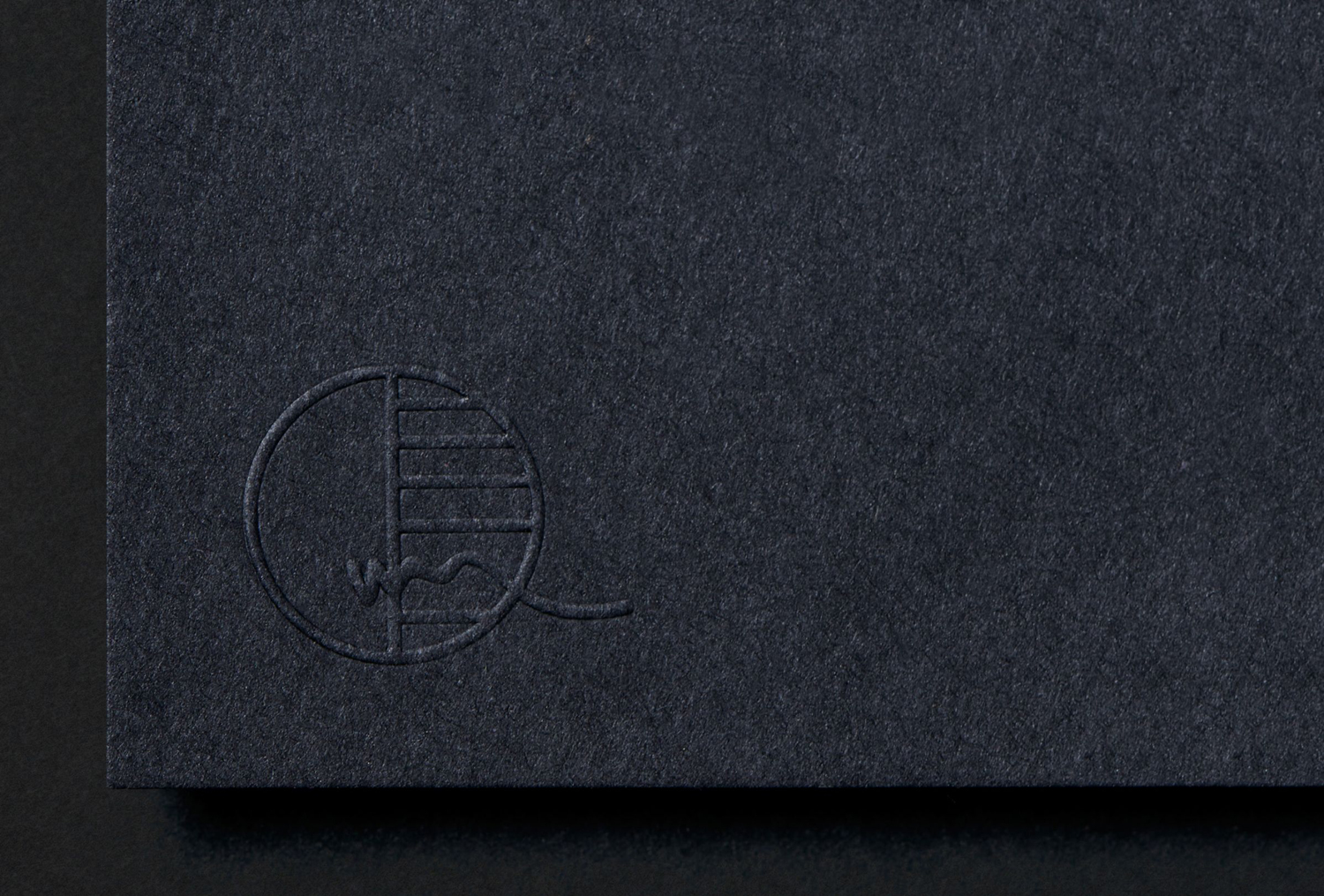
The logo takes its cues from the “ides”; the middle of the lunar month when IDES would run its events, and diagrams that represent the mid-point of the lunar phase. During the presentation of the concept, Pete Gunn added a scribbled line as an expression of the “pursuit of creation, not perfection”.
Although these references are interesting and well-founded, it is the meeting of structured and organic forms of the logo; appearing as a mix of the pragmatic and spontaneous, authorship and process, that works particularly well within the context of a professional kitchen.
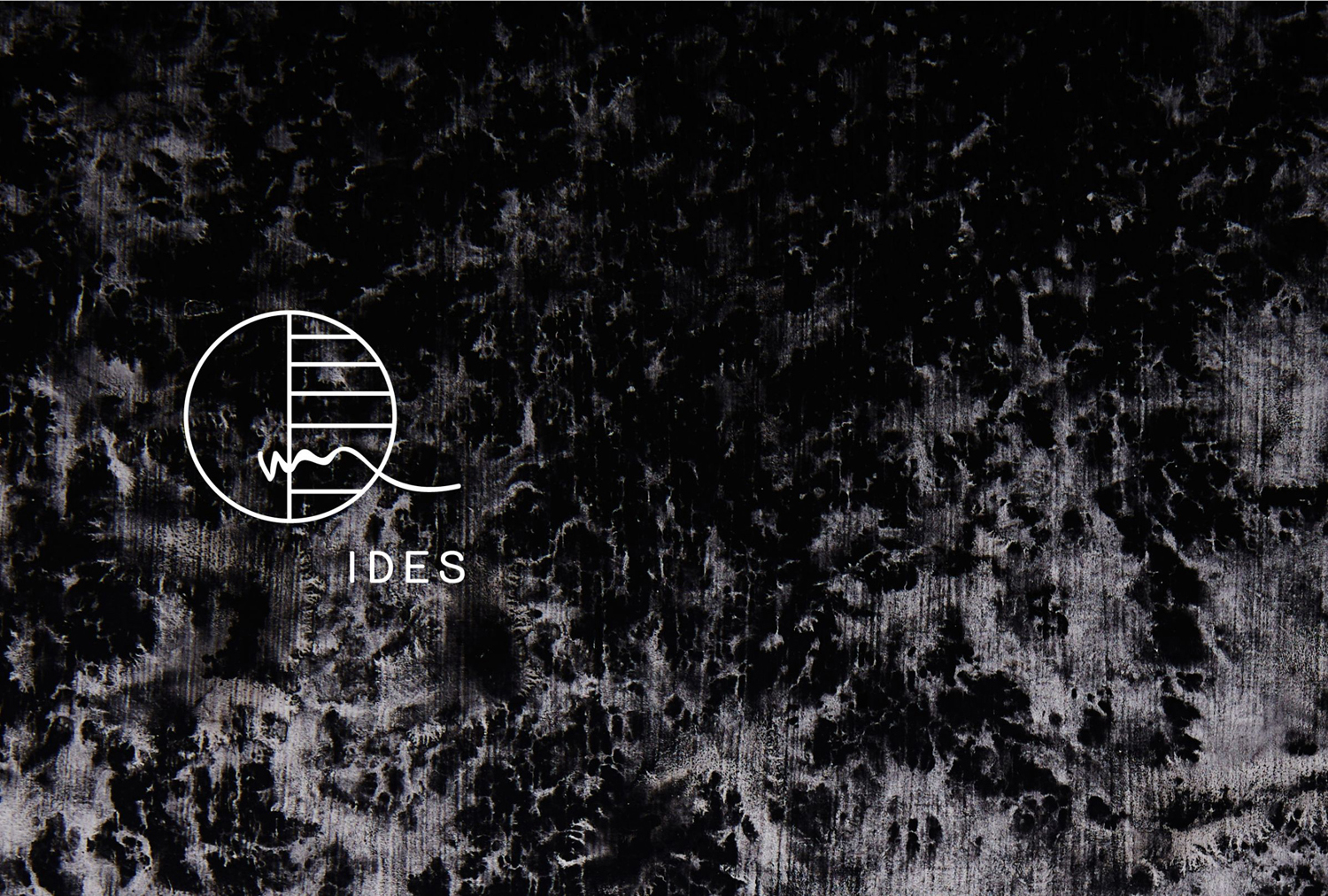
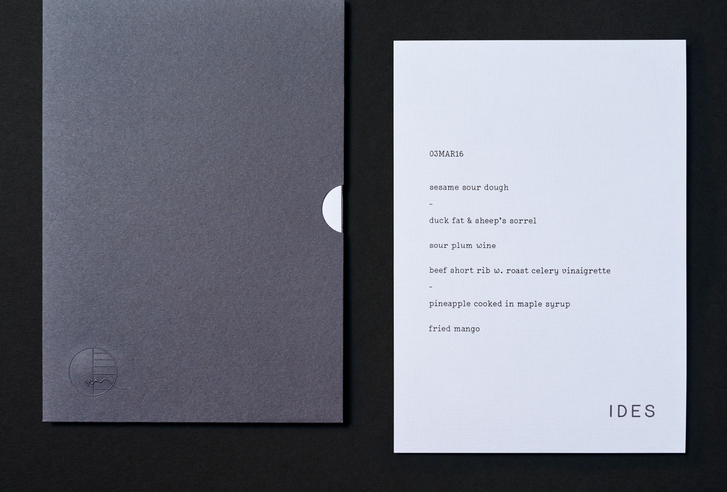
There is a pleasant use of contrast, bridging IDES’ move from the one-off to permanent residence, the immediacy of ideas, frequent changes and an eventual refinement. This is clearly articulated in the juxtaposition of the low-fi mechanical origins and convenience of type choice, set alongside the permanence and investment in high-quality materials and print finishes. These include the surface texture of uncoated Notturno and Keaykolour Sombre Grey boards, blind emboss and white block foil print finish.

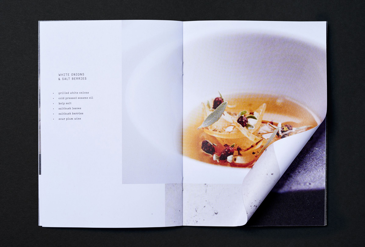
Lacrima from Milieu Grotesque is a particular highlight. On first pass there is a monospaced mechanical utility to it, a reflection of its inspiration; a specimen of the IBM Selectric Typewriter, but is full of small details and character up close in the ink drop endings and swashes. It finds a good balance between the economical necessities of running a one-off event (quick and easy changes to menu for example) a nod to IDES’ origins, and the individuality you would expect from an established restaurant.
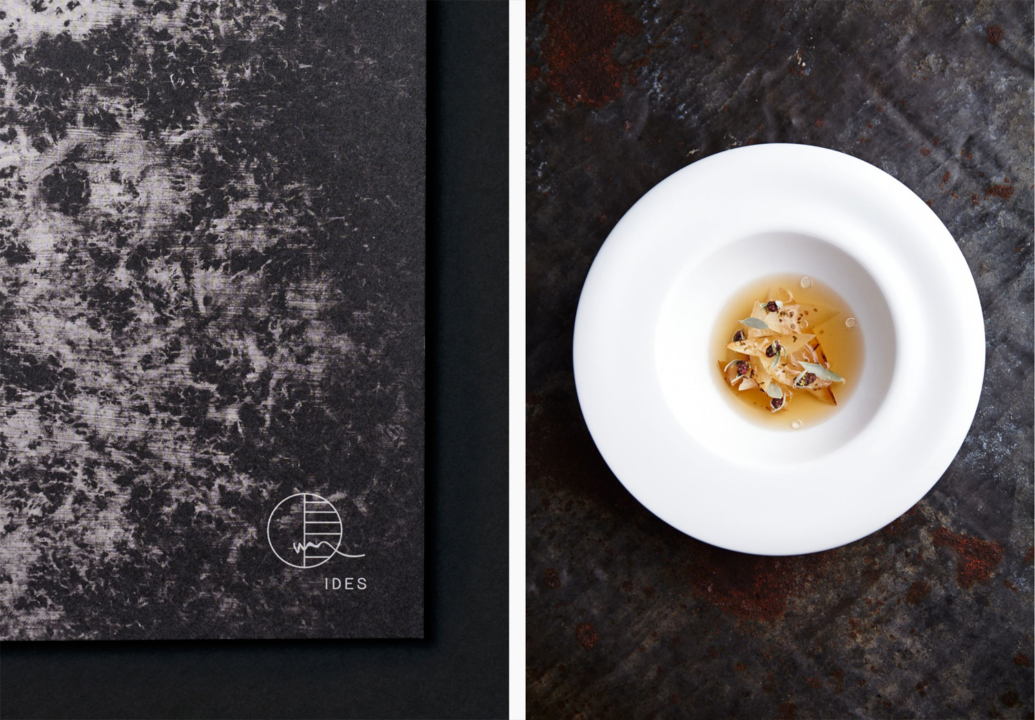
Contrast continues in the combination of dark and dyed board covers and light interior pages of the menus, and the disparate nature of type and typesetting, image and its art direction. Again, these feel rooted in the rough on-the-fly creation of one-off events, and the move towards the consistency and quality of a good restaurant experience. Although Lacrima is substituted for Source Code Pro, the continuity between website and printed materials is evident. More from Swear Words on BP&O.
Design: Swear Words. Photography: Rebecca Newman. Opinion: Richard Baird. Fonts Used: Lacrima.
Specifications:
The business cards feature Notturno, a black uncoated board from BJ Ball, with a white block foil print finish, while the menu covers are cut from Arjowiggins’ Keaykolour Sombre Grey and finished with a blind embossed logo.
