The Best of BP&O — Studios of 2016
Opinion by Richard Baird Posted 23 December 2016
2016 has been a great year for new brand identities and packaging. There have been a wealth of studios, well-established and fledgling, producing some fantastic work. New to BP&O this year was UK studio Zak Group, Copenhagen-based Kontrapunkt and New York studio Triboro.
This post, the last of four—also check out Packaging of 2016, Brand Identities of 2016 and Graphic Design of 2016—is made up of studios selected from those that had three or more features on the site over the last year. Small studios were listed alongside those with multiple offices in terms of quality and a commitment to documenting projects.
Four studios stood out for the diversity and extent of their work, and their balance of concept, clear communicative intention and compelling aesthetic. These have made it into BP&O’s Best Of Series, a feature that regular readers will probably now know brings together the most interesting, unexpected or unusual projects published on the site for another opportunity to be seen and shared.
Bedow, Sweden
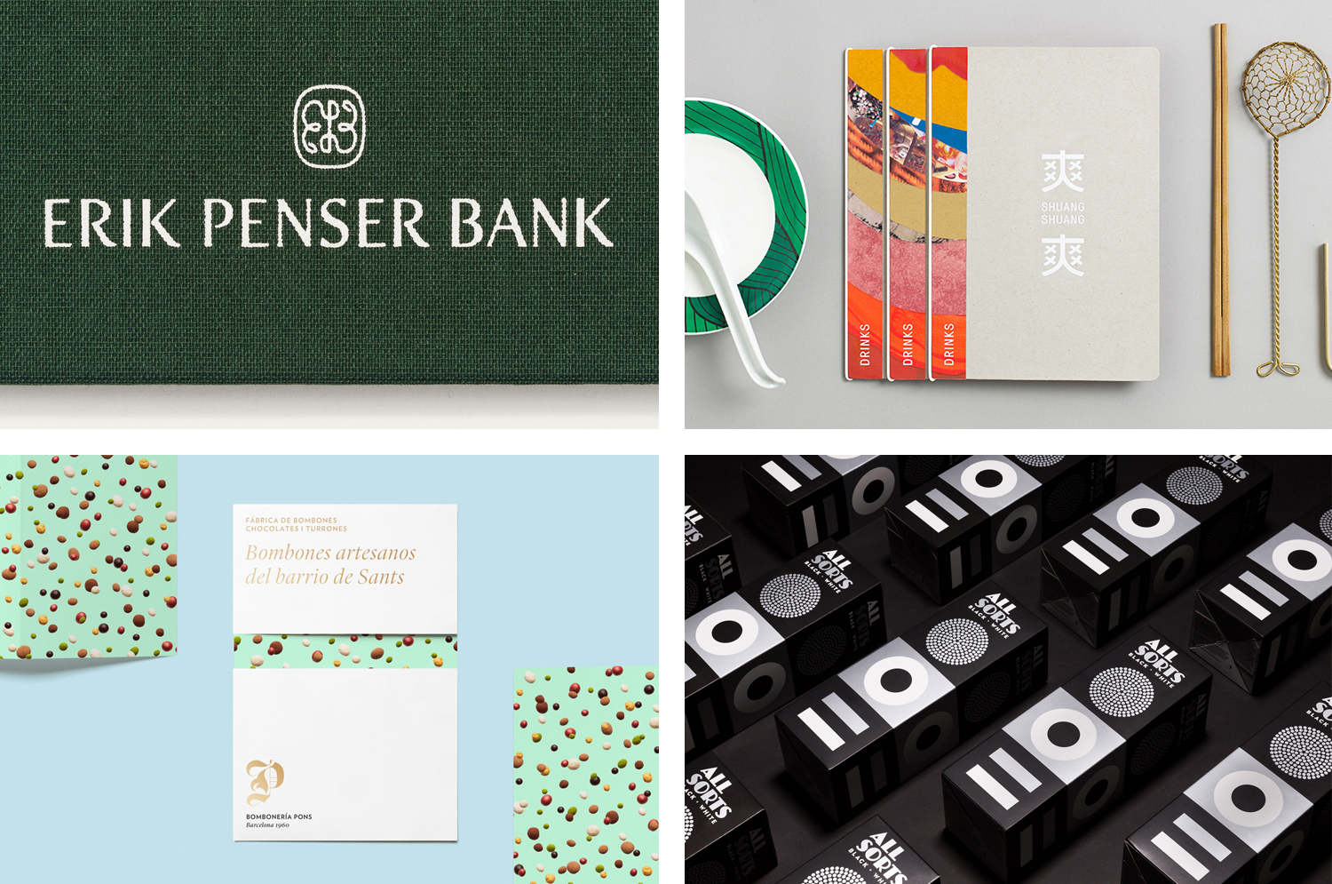
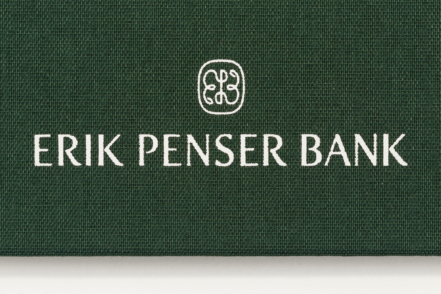
Bedow is a Scandinavian boutique studio with an office in the Swedish city of Stockholm, a decade of experience and a roster of international clients. Their work is characterised by its progressive attitude, moving beyond what might be considered a reductive Scandinavian style, and instead, works together moments of hand drawn and crafted detail with a good eye for space and simplicity. Bedow is a new entry this year with highlights that included the contrast of custom type and image for Erik Penser Bank, record sleeves for More Than Human and illustrative packaging for Biggans Böcklingpastej.
Bedow’s highlights from 2016:
Biggans Böcklingpastej
Erik Penser Bank
Boreal Network, Itasca Road Trip
Terri Timely
Mucho, New York, Paris, San Francisco & Barcelona
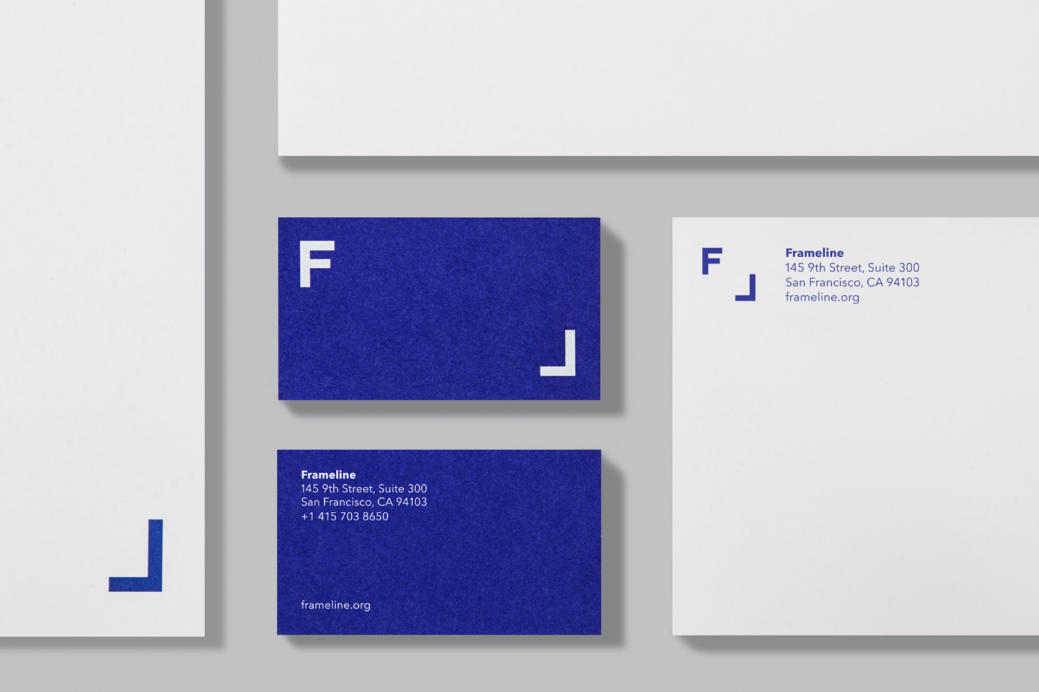
Mucho is an international graphic design studio with offices in Barcelona, Paris, San Francisco and New York. Although the studio has a broad and multi-disciplinary portfolio, it was their brand identity work that made it onto BP&O in 2016. This year’s highlights included their colour and framing device for Frameline, playful confectionery imagery for Bombonería Pons and the modular typographical brand identity for office planning business InsideSource.
Mucho’s highlights from 2016:
Bombonería Pons
Casa Bonay
Frameline
InsideSource
ico Design, United Kingdom
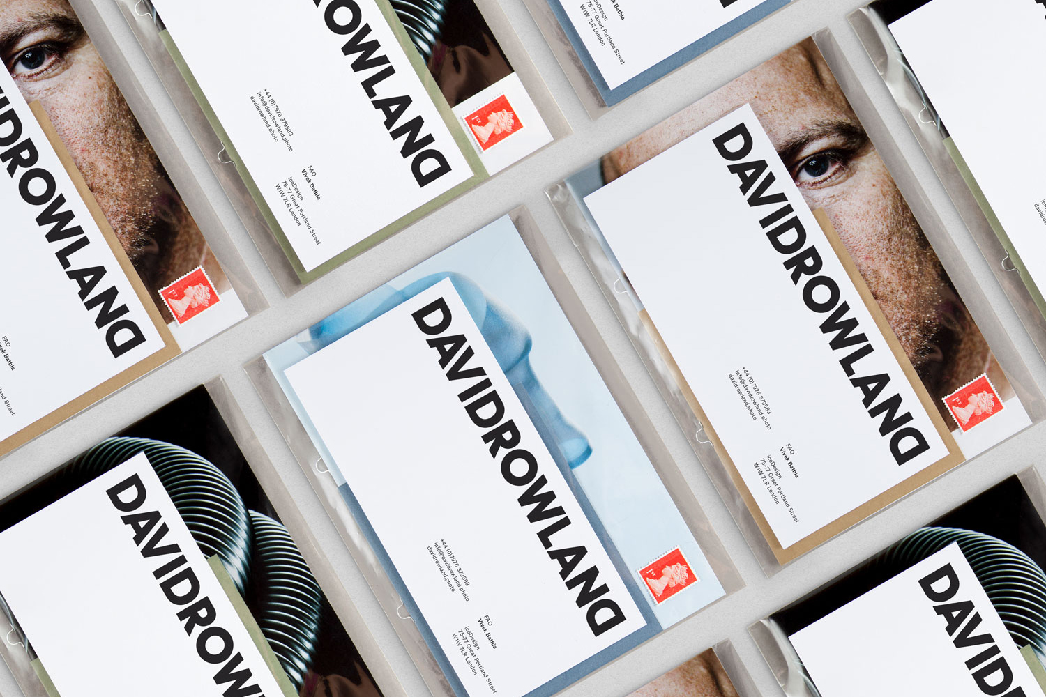
ico Design London-based design studio providing strategy and branding, digital and interactive services, environments and packaging to a broad client base, and has launched six global brands in the last three years. Its branding work featured on BP&O in 2016 stood out for its materiality, playful qualities and use of contrast. Highlights included the colour and collage of their work for restaurant Shuang Shauang, and the way this was worked into environment, and the contrast of hand drawn illustration and structural type throughout their work for Wenford Dries.
ico Design’s highlights from 2016:
David Rowland
Shuang Shuang
Wenford Dries
Bond, Helsinki, London & Abu Dhabi
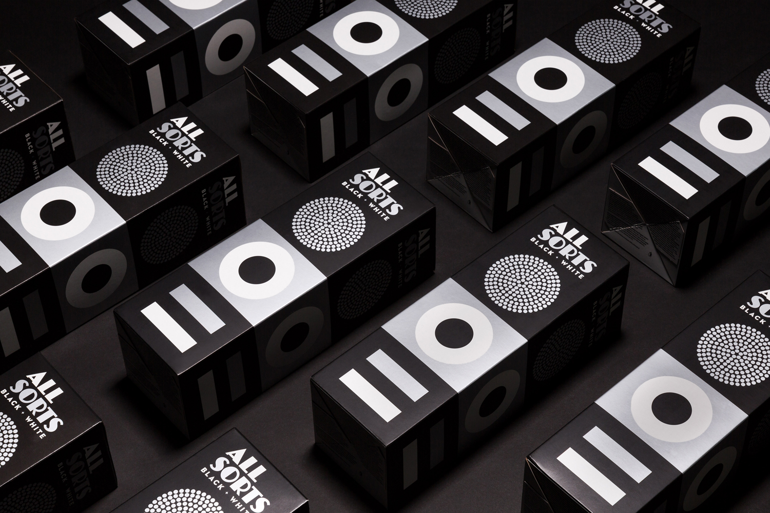
Bond is a Scandinavian design studio with offices in Helsinki and Abu Dhabi, and in 2016, opened a premises in London. Although this year has perhaps seen a little less colour from the studio in its branding and packaging featured on BP&O the move between the reductive and iconic and the hand drawn and cheerful remains distinctive and memorable. Highlights included their brand identity for craft beer bar Moi Helsinki, an update to their packaging for liquorice brand Allsorts and interior design for Roster which features an impressive space of custom furniture with a vintage twist.
Bond’s highlights from 2016:
Roster Bar & Restaurant
Allsorts Black & White Edition
Moi Helsinki
Coffee & Co.
