The Best of BP&O — Brand Identities of 2016
Opinion by Richard Baird Posted 22 December 2016
2016’s brand identity highlights included Franklyn’s work for Kimski, which featured some playful and idiosyncratic illustrative detail, Triboro’s colourful imagery for New York restaurant Sauvage, and Sagmeister & Walsh’s brand identity and mural for Otium. However, there were five projects that stood out, and have made it into BP&O’s Best Of Series.
This feature brings together the most interesting, unexpected or unusual projects published on the site in 2016 for another opportunity to be seen and shared. These balance a strong concept with a compelling aesthetic and communicative intention that, between them, appropriately plays with photography, colour, texture, layout, form, type, print finish and on one occasion, also extends to interior design.

Arco by Raw Color, the Netherlands
Arco is a family run contemporary furniture design and manufacturing company that currently rests in the hands of fourth generation family members and has a respectable 110 year history. Arco has tables and chairs at the heart of its collection and specialises in woodwork, a reflection of its location in Winterswijk, an area of dense natural woodland in East Netherlands.
Raw Color worked with Arco to revise its brand identity with a focus on its unique location and local production. While logotype remains the same a juxtaposition of solid colour and rich seasonal image, the contemporary humanist qualities of type and a collective tone of voice work well to visually articulate the material quality and forms of Arco’s collection, its location at the heart of a forest and the Arco family of craftsmen.
See more of this project here


Faust by Snøhetta, Norway
Faust is a high-end shoemaker with its first signature store located in Oslo’s Barcode area. The shop is a small but impressive space consisting of five concrete niches and large carved wooden doors.
Snøhetta worked to create a cohesive interior and brand identity experience that acknowledged the craft of shoe making, something that has remained unchanged for centuries and, in reference to name and the legend of Faust, is based around a historical reference point, drawing on a period where all shoes were handmade and bespoke, for inspiration.
Snøhetta’s work stands out for its continuity between the hand crafted and traditional forms of interior design; one of vaulted doors and wood panelling, and the period and bespoke calligraphic qualities of visual identity. These are elevated by a Scandinavian restraint and juxtaposition of wood paneling alongside concrete, and period type embossed onto high quality papers. It is rich in ideas but thoroughly modern in their implementation.
See more of this project here

Helsinki City Museum by Werklig, Finland
Helsinki City Museum, through its collection of objects and images, provides visitors with historical insight into the everyday lives and personal experiences of the people of Helsinki. It is free to enter and features 2400m2 of exhibitions and public spaces, a cafe, inner courtyard, areas to relax and conference rooms.
To coincide with a move to a new space; created by interior architecture office Kakadu and located in the oldest part of the city, the museum worked with Werklig to develop a new visual identity based around the Museum’s vision that “Everyone has the opportunity to fall in love with Helsinki”.
Werklig’s concept is bold and contemporary in its visual expression yet informed by some genuine historical artefacts, and the modern renovation of 18th century buildings. Although type is perhaps the more obvious articulation of this, colour is the most surprising, making an authentic connection with place, while logo channels something of Glaser’s I ♥ NY in its simplicity and directness.
See more of this project here

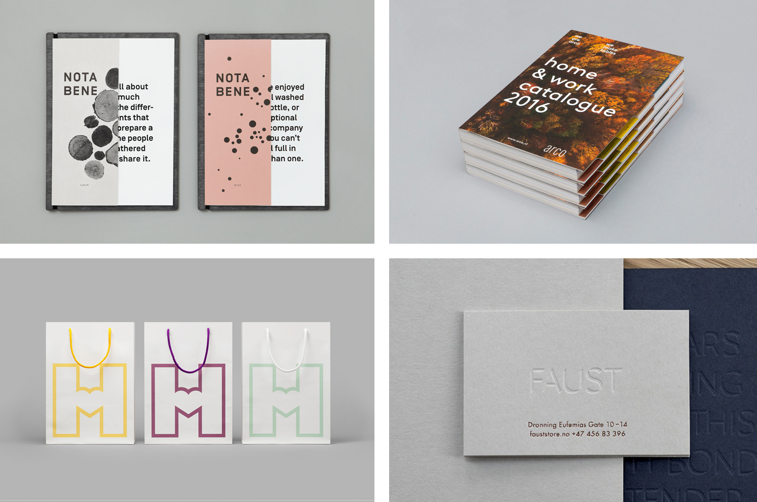
Nota Bene by Blok, Canada
Nota Bene is a restaurant, located on Toronto’s Queen Street West, with a menu made from locally-sourced and seasonal ingredients. It was opened by chef David Lee and business partners Yannick Bigourdan and Franco Prevedello in 2008, and was awarded “Best New Restaurant” by Toronto Life and enRoute Magazine soon after.
To coincide with the restaurant’s 2016 relaunch—which saw David Lee take sole ownership and the unveiling of a fresh menu and interior—Nota Bene worked with Canadian graphic design studio Blok to develop a new visual identity. This was inspired by David Lee’s approach to food and the restaurant’s new environment; a marriage of organic detail and contemporary materiality.
Blok’s brand identity for Nota Bene mirrors the concept of interior and the essence of what good food is; disparate ingredients that can be individually discerned yet brought together in surprising and creative ways. This is effectively expressed through modern reductive typographical form alongside the rich crafted detail of wood prints and the pairing of colour.
Read more of this article here

BIFAN 2016 by Studio fnt, South Korea
Bucheon International Fantastic Film Festival (BIFAN) is an eleven day event that takes place each year in a number of locations throughout the South Korean city of Bucheon, a satellite city of Seoul. It celebrates world cinema; specifically those dealing with the themes of love, fantasy and adventure, plays host to international, Asian and national premieres, and includes, alongside the 320 films from 49 countries, a variety of performances, concerts and art and design exhibitions that draw their inspiration from the films being screened.
BIFAN 2016 was the largest festival to date, and featured a revised brand identity, designed by Studio fnt. This is notable for its broad but cohesive nature, the aesthetic continuity that exists between custom type, mark and illustration, helped by colour, and the subtly of a concept; one of opposing forces. This manifest itself in the geometric shape of printed materials and the organic construction of logo, the precise lines of type and the hand drawn qualities of illustration. These are neat ideas, however, it is Jeeook Choi’s imagery offers much of the visual interest, drawing out and expressing the fantastical element of the festival.
Read more of this article here