The Dayrooms by Two Times Elliott
Opinion by Richard Baird Posted 22 March 2017

The Dayrooms is a multi-label womenswear store, located in the London district of Notting Hill, created by Aytan Mehdiyeva and Zumrud Mammadova. The store gives a UK platform to emerging Australian designers and is an expression of Aytan and Zumrud’s shared passion for fashion and travel, and Aytan’s love of photography, textiles and Australian craftsmanship. This is reflected throughout The Dayroom’s graphic identity, developed by Two Times Elliott, not only in the simple but carefully crafted intersection of reductive graphic expression and material detail, but in the concept of curated moments, expressed through language, image and objects.
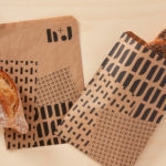
Building on their work for The Dayrooms’ retail space, Two Times Elliott also went on to develop graphic identity, spacial creative and brand direction for The Dayrooms Café, an Australian-inspired organic café located in the London boroughs of Holborn and Notting Hill. Assets included loyalty cards, coffee cups, takeaway bags, branded tissue paper and website.

Although there is an unmistakable material beauty to the project, well-suited to a tightly curated fashion boutique, and working as an appropriate expression of the founder’s interest in craftsmanship, it is the concept of curated memories and moments that is a particular highlight.
Two Times Elliott describe this as taking a narrative approach and shares something in common with a personal journal, blending images and words to capture and evoke a series of moments. The choice of language across the store window and bags, and the direction of images within the context of business cards, tags and small stickers provide a space for patrons to place themselves within these moments. It is a neat idea that also functions to introduce moments of contrast to solid pastel colours and plenty of space.
Photography, in its cropping, content and colour grading, is close to something you might see proliferating online travel journals and IG accounts. It is smart enough to balance unidentifiable but warm locales with a feeling of the familiar, is open enough to speculatively draw on the memories of patron’s own travel experiences yet touches upon the Australian provenance of the labels the store carries. This conjuring of moments continues through to copywriting, and influencing the choice of objects in store. This lends a distinctive and conceptual weight to the work where graphic expression is kept to a minimum.


Typography plays a neat role in segmenting ideas. An uppercase, monolinear sans-serif logotype effectively links a variety of printed materials alongside colour and material, a serif calls out a series of moments across bags and window decals, and slab serif, some form of typewriter typeface, delivers information across labels and business cards with a journal-like immediacy. These function in a similar way online, dividing header, menu items and content, respectively.


Graphic expression and physical detail are effectively weaved together. There is a simplicity and effortless beauty to these, with a variety in structure, material texture and print finish to keep it interesting but modern in its restraint. Paper choice and print finish deliver a materiality in line with The Dayroom founder’s interest in craftsmanship while a colour palette of grey, pink and gold work together something of the urban location, the personable and the premium.


The Dayrooms Café
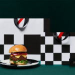
Continuing along the conceptual route applied throughout The Dayrooms’ retail space and identity concept, the café expresses its Australian influences through ingredients, interior design and graphic identity. These evoke a sense of place, particularly within its contrasting London locations, using light woods, tiling, woven light shades, light breezy blue and foliage. This informs print and website which features leaf silhouettes, the combination of a natural green, clear sky blue and early evening pink, and landscape photography online.
Where name establishes a continuity between retail and café, the approach to logotype design provides a strong visual contrast and clear differentiation, not just through disparate typeface choices, but in baseline, with the The Dayrooms Café effectively using a curved line and an accompanying postcode to allude to the multiple locations.


Both retail space and cafe share a similar material quality in boards and print finish, and are connected in the use of antipodean-references, largely imagery, as well as typefaces online. The result is a pleasant balance of continuity and differentiation, responsive to the different spacial experiences and associated activities. More work by Two Times Elliott on BP&O.
Design: Two Times Elliott. Print Production: Nirvana CPH. Opinion: Richard Baird.


What do you think of Two Times Elliott’s brand identity for The Dayrooms & The Dayrooms Cafe? Get the conversation started on Twitter. Never want to miss a post? Sign up to BP&O’s once-weekly newsletter here.