Carlsberg Black Gold by Kontrapunkt
Opinion by Richard Baird Posted 4 July 2017

Carlsberg is a Danish beer brand founded in 1847 by J.C. Jacobsen. It is part of the Carlsberg Group portfolio which also includes Tuborg, Kronenbourg and Somersby cider, as well as Carlsberg Export and Carlsberg Black Gold. Carlsberg has a significant heritage. And, like many other beer brands, has largely conveyed this using the visual language and associated legacy of the beer bottle label, which then made it on to cans.
Carlsberg has begun a steady move towards a more current visual expression. This is characterised by a concise communicative intention and a stylistic minimalism. This can be seen, initially, in the packaging design of the Carlsberg can for the German market, created by Copenhagen-based studio Kontrapunkt, and in the redesign of Carlsberg Black Gold, also by Kontrapunkt. Black Gold is a dark pilsner, brewed in the same manner as Carlsberg’s premium variety, only for longer, giving it a richer flavour profile and higher alcohol content. This difference is conveyed immediately using a black and gold print finish.

There is a clear sense of legacy, aesthetic continuity and universality in the traditional, oval, beer bottle label. However, its stylistic prevalence in the market, its common approach to heritage, and lack of contextual awareness across cans, although recognisable and communicative, struggled to give Carlsberg something of a contemporary relevance, or convey a real point of difference, particularly when challenging consumer behaviour. Strategically, the new design responds to this and the continued preference for and saturation of intricate stories told by legacy brands through numerous motifs by reducing these down to a few key expressions.
With the intention of delivering difference and with the desire to articulate an immediate and concise visual story, Kontrapunkt took three well-established visual cues and released them from the oval. This makes the most of the canvas, and the associations and stylistic qualities of each asset. The letter-craft, impact and familiarity of the Carlsberg wordmark, which holds up really well, a genuine legacy in J.C Jacobsen’s signature and the quality and provenance of a Danish Royal Appointment, marked by text and crown.
These assets are linked by the distinction, flavour cues and aged quality of a black and warm gold. This makes a connection to the designs of the 80s and 90s, to the extent of exactly colour matching the gold, and effectively moves the can away from a cold silvery-gold. The all black top, which gives the can a dipped quality, as a rare addition rather than part of a process of reduction, feels justified in its balance of simplicity, impact and differentiation.


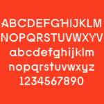
Warmer colour and an improved balance, and a better use of proportion alongside orientation draws the eye. Lettering maintains a continuity of brand and leverages an associated heritage and sense of craft, which continues through to a custom slab-serif. Spacing and a communicative simplicity speak of a modern brand with a quiet confidence in its history and profile, and a distinction and quality of product where the market is full of story motifs.
The strength of the work lies, not in the creation of new assets, but in the sensitivity given to those that have been well-established or have existed, at some time, within the continuity of Carlsberg’s visual language. Relying only on proportion and contrast, arrangement and space, colour and finish to derive an immediate visual disruption, sense of modernity yet a continuity of legacy and a reassurance of quality. More work by Kontrapunkt on BP&O.
Design: Kontrapunkt. Opinion: Richard Baird.