Edition by South
Opinion by Richard Baird Posted 28 September 2017

Edition is a new property development by LEP Construction. It will be located in Parnell, a suburb of Auckland, New Zealand, and made up of 18 luxury apartments designed by architects Monk Mackenzie with a eye for flexible space and changing natural light. Edition will make the most of a sloping site, feature three levels cantilevered above ground and create what are described as “view shafts” from street right through to the harbour beyond. This modern structure, and sensitivity to its context, is complimented by a luxury interior design, created by Bureauxe, of both contrast and continuity, in materials, surface textures, colour and form.
Graphic design studio South were commissioned to create a visual identity for Edition that would assist the real estate team in presenting the project to potential buyers, and help, in conjunction with the building’s distinctive structural and interior design plans, elevations and renderings, to distinguish Edition within a crowded luxury apartment market.
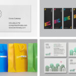
With the intention of capturing the essence of the building, and informed by the spacial, visual and material language of Monk Mackenzie, South created a brand identity of light and reflection, moments of contrast and correlation, and a recurring rectangular motif. This links a variety of marketing materials that included brochure and brochure sleeve, sales book and box, invitation, floorpans, buyer gift and business cards.

Edition is said to be inspired by modernist forms. And features a distinctive rectangular Italian glass brick façade. It plays with light through reflection, and in the choice of material the intersection and interaction of structure and its surroundings. This is effectively distilled down and conveyed by South’s visual identity design through, rather than a conventional marque, a rectangular clear glossy motif, implemented across a variety of uncoated papers and boards from Arjowiggins. The interplay, afforded by the use of a clear high-build UV varnish, and difference between uncoated substrate and smooth finish, finds a pleasant balance of a compelling stylistic distinction and communicative intention, a way to express something of the building’s character and design, ahead of its build.


A secondary motif, with the same proportions as those of the glossy rectangle, establishing a clear continuity, explore light and shade through the transitional qualities of blue gradients. Where the varnish was largely a physical detail, this second component adds a strong graphic component that explores related ideas.
Edition was designed to optimise sunlight, across the day and throughout the changing seasons. There is a variety to these panels that although abstract, introduce a more visceral impression of experience, rooted in light moving through modern architectural space. This is given an unusual twist in the use of a blue, a colour unique to the market place, and thoroughly current. The changing nature of compositions, and their use as panels across print materials and as posters, introduce a welcome variation and artistic expression throughout marketing materials. The proportions of the rectangle holds these different ideas together, and its relationship to glass bricks further emphasised by the buyers gift.


Alongside the more common mix of brochures, floorpans and business cards there are the sales book box and buyers gift. The former containing an iPad (and presumably a digital presentation) and the latter, a gift certificate and a symbolic blue brick. As you would expect from a luxury development, these convey modern luxury through a materiality that blends a familiar tactile value in weight (and hopefully solid construction), clean intersections between box and foam inserts, the quality of dyed uncoated papers and clearly defined finishes that include a double hit of digital white and a high-build spot UV.


The relationship between space, text and image, the use of reductive typographical forms, the interplay between photography, the use of proportion and juxtaposition follow a more familiar pattern, one associated with modern property developments and architectural practice. That is not to say that these are poorly done, quite the contrary, these are very well-composed with a structure and variation that is engaging, only that these do not quite have the same distinction, nuance and restraint as the covers, sleeves and boxes.


Colour, structure, shape and finish work together to establish a clear visual continuity and immediate distinction, far more sophisticated and compelling than logo-centricity, both stylistically and communicatively.
It expresses the material qualities of the building and its modernist influences, draws on the unique impression that will be given by the Italian glass brick façade through shape and glossy finish, and uses colour to differentiate and reassure in the combination of bright blue, concrete grey, black and white.
The blue, while immediate and striking, feels largely well-moderated, appearing as a small ribbon, as a full rectangular panel of colour or as a gradient within imagery, tempered by the neutrality of black, white and grey. Modern luxury comes through not only in the material details but in the ideas that inform these. More from South on BP&O.

Material & Print Specifications:
Brochure:
Cover: Black, PMS 072U & high-build spot UV on Sapphire Laser Offset 250gsm
Text: CMYK, PMS 072U on Sapphire Laser Offset 150gsm
Shortcut: CMYK, PMS 072C on Impress Gloss 128gsm
Brochure Sleeve:
Black, PMS 072U & high-build spot UV on Sapphire Laser Offset 250gsm
Invite:
Invite: Black, PMS 072U & high-build spot UV on Sapphire Laser Offset 300gsm
Cover: PMS 072U & high-build spot UV on Sapphire Laser Offset 250gsm
Sales Book Box:
Double-hit digital white & high-build spot UV on Arjowiggins Pop’Set Black 120gsm wrapped hard-board, bright blue ribbon, foam insert
Buyer Gift:
Certificate: Double-hit digital white on Arjowiggins Curios Matter Adiron Blue 270gsm
Gift Box: Double-hit digital white & high-build spot UV on Arjowiggins Pop’Set Black 120gsm wrapped hard-board, foam insert
Floorpans:
Black, PMS 072C on Impress Gloss 148gsm
Business Cards:
PMS 072U & high-build spot UV on Splendorgel 400gsm
Design: South. Opinion: Richard Baird.