Volcano At Home by Commission
Opinion by Richard Baird Posted 13 October 2017

Volcano At Home is an ethically traded coffee range, roasted in small batches by a dedicated team, and sold in 100% compostable Nespresso-compatible pods. The range has been created for the retail, subscription and wholesale markets and is available in three varieties, Bold Morning Shot, Balanced All Day and Reserve Rich And Sweet. Volcano At Home is the latest venture of London-based independent coffee roasters Volcano Coffee Works and features a distinctive packaging design, developed by Commission, that draws on the science, craft and character of the brand and its products.

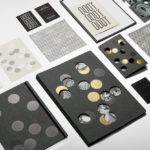
The 8 Nespresso-compatible pods sit in a card tray made from a single sheet of 100% recycled fibre board, folded double to use as little material as possible, maintain structural integrity and occupy less space. The trays slide into a sleeve of either red, orange or black card with a foil embossed illustration, variety name and coffee strength indicator in black, gold or silver. For the subscription service, these are posted out in robust white corrugated board boxes sealed with a branded sticker.


Commission’s packaging for Volcano At Home is concise and cheerful. It effectively plays with image, type, colour and structure to deliver both an immediate visual impact and satisfy a clear communicative agenda. It does a lot with little.
The disparate qualities of illustration and type—the former taking a jovial and distinctive approach to conveying coffee experience and brand character, and the latter playing with utility and some of the science that forms the basis of brand—works well to intensify their intentions, yet feel well-resolved in their monolinear lines, shared colour and print finish.
There is a neat duality to the “Pods” illustration that ties in with a boldness of flavour and the power of coffee to wake. The value here is in the creative expression, in the simplicity and quality of its drawing and its prominence.

The texture of dyed uncoated boards, the gloss of a block foil, and a structural robustness layer graphic expression with a material value, imbuing packaging with a sense of modern luxury, ideas and physical quality, and mindful approach to material volume and afterlife. There is also a subtle book-like quality to this that plays with association.
Character comes from, not only the approach to illustration, but also in the choice of colour. The red, orange and black feels fitting within the context of the Volcano At Home name, calling to mind the fire, molten rock and basalt of volcanos. It also serves to distinguish, and plays with conventions of quality in the combination of gold and black, and leverages the associated waking energy of a bright red and orange of the morning sun.
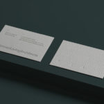
Type leverages something of a utility, rooted in the science said to be employed by the roastery. Proportion and uppercase characters lend type a volume, again rooted in the waking power of coffee, and used in a way that gives packaging a book-like quality. The typesetting across the front of the sample, which is also used on the inside of the individual varieties, seems a touch haphazard, but rooted in the boldness of flavour, loud character and conveys a little of the roastery’s story.

Structurally, packaging is convenient, distinctive and mindful in its material makeup, built in a way that is interesting stacked like a book or presented flat, and standard in its shape for posting. Although the images may give the impression packaging is large, it is compact, so the use of strong singular graphics, the proportion and formatting of type, solid colour and finish, draw visual impact and conceptual weight from something that is relatively small. More work by Commission Studio on BP&O.
Design: Commission Studio. Opinion: Richard Baird.