The Best of BP&O — Graphic Design of 2017
Opinion by Richard Baird Posted 19 December 2017

As BP&O continues to build out its reviews to include work beyond graphic identity and package design we take a look back at the campaigns and catalogues, books and magazines published on BP&O in 2017. Highlights included Bedow’s work for Anna Bjerger, Collin’s campaign for Exploratorium: After Dark and Toko’s design for Maven Publishing’s Chasing The Sky. However, there were five projects that stood out, and have made it into BP&O’s Best Of Series.
This feature brings together the most interesting, unexpected or unusual graphic design projects published on the site during 2017 for another opportunity to be seen and shared. These balance a strong and appropriate concept with a compelling graphic and material response that hold up individually or sit well within an pre-established graphic identity system. These are BP&O’s favourites, and are presented in no particular order.
Graphic Design Shortlist 2017
Sydlexia by BBDO Dubai, UAE
Rain, Gravity, Heat, Cold by Blok, Canada
Folk+Form by Snøhetta, Norway
Norwegian Structure by Bielke & Yang, Norway
Anna Bjerger by Bedow, Sweden
Whitlam Place by Studio HiHo, Australia
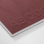
Abodo by Richards Partners, New Zealand
Ekta Sketchbooks by Lundgren+Lindqvist, Sweden
Chasing the Sky by Design By Toko, Australia
Exploratorium After Dark by Collins, United States
Real Review by OK–RM, United Kingdom
L’Heure du Cocktail by Tony Brook, United Kingdom


Folk+Form by Snøhetta
Vestre is a Norwegian family owned and run urban furniture design and manufacturing business founded in 1947 by Johs. Vestre. Although Vestre’s catalogue is extensive and diverse, it typically features colourful detailing and modern forms, holds true to the founder’s vision of designing and manufacturing for longevity, and has a social and sustainable-dimension.
Snøhetta, who previously worked with Vestre on the development of a new production facility in 2013, and were involved in the refurbishment of their headquarters and showroom in 2017, continue to collaborate with the manufacturer, this time on Folk+Form. Folk+Form is an exhibition and two-volume book that brings to life the Vestre family legacy and published to coincide with the company’s 70th anniversary.
Through exhibited work, art pieces, film, text and photography, presented across exhibition and book, Folk+Form pays tribute to the design and manufacturing of Vestre, and its continued commitment to making high quality, sustainability and accessible urban furniture for both the national and international markets.
In Short – Although the copy sent to BP&O did not fair well in the post, and perhaps not as robust as it perhaps could have been, its division of story and outcome (product and historical context) across two books, unified by a compelling material and graphic expression gives a complete and compelling insight into Vestre, and forms a clear continuity between its past and present, exhibition, headquarters and print.
See more of this project here

Ekta Sketchbooks Vol . I–III by Lundgren+Lindqvist
Ekta Sketchbooks is a three volume book collection dedicated to the work of Ekta, the moniker of Swedish animator, sculptor, designer and illustrator Daniel Götesson. Limited to 300 copies and available from ll’Editions these present—through pages thickened by collages, drawings and layers of paint and tape—moments of creative relief, and represent the context for the endless experimentation that characterises Ekta’s process and output. What is particularly distinctive about Ekta Sketchbooks is that many of the pages have the quality of original works. These reference the past, offer glimpses into Ekta’s future output, and have been bound into three volumes with embossed and gold stamped covers, and united in a personalised fabric covered slip case, designed by Scandinavian studio Lundgren+Lindqvist.
In Short – Lundgren+Lindqvist’s approach works well to foster a closer connection to artist through the immediacy and evocative qualities of image, the intellectual and explorative nature of words, and the customisation of each of the slip cases by Ekta. There is a strong and evident relationship between design craft and the materiality employed by the artist, but also a interesting use of contrast between the dark colour and utility of notebooks and the expressive and colourful quality of artwork.
See more of this project here

Whitlam Place by Studio Hi Ho
Whitlam Place is a collection of eleven residencies located in Fitzroy, Melbourne, developed by Milieu Properties and completed this year. The residencies are described as being ideally positioned within a leafy pocket of the city’s most vibrant cultural precinct, and feature views of the adjacent Whitlam Place gardens, Fitzroy Town Hall and city skyline. the residencies were designed to engage with the historic surroundings through the texture of their oxidized exterior and the use of oversized glass panels.

Whitlam Place is the product of a two-part design philosophy and strategic action of extended reflection and considered response. This is expressed by two documents, created by Studio Hi Ho, that made up part of a wider marketing campaign. The first document, Reflection, outlined the thinking, inspiration and rationale of the project through essay and image. The second, Response, presented the outcome through renders and a material expense rooted in the residencies quality, detail and richness of form.
In Short – Property developments are often marketed through their material outcome. The structure, the space, the interior finishes, and perhaps a contextual response and sensitivity. It is not often that such value is placed on the process; the ideas, philosophies and aesthetic sensitivities that informed outcome. This reflection and response, an equality of process and outcome, is intelligently articulated by Studio Hi Ho, not only in the resolution of content; a smart blend of illustration, essay, archival and commissioned image, but in the contrasting shapes, colours and finishes of the two documents.
See more of this project here

Superkül: Rain, Gravity, Heat, Cold by Blok
Superkül is an Canadian architectural studio with a portfolio described as having an understated boldness, subtlety and spacial richness, and a process that intends to find the essence of each project and remain true to this throughout design and development. Superkül has won many awards and is considered one of Canada’s most progressive architecture firms.
To celebrate its first ten years Superkül worked with Blok on a book that would serve as both a collection of work but also as a tool to articulate the firm’s unique philosophy and design approach. This beame an exercise in discovery and a clarity of positioning, which was then conveyed materially through subtle paper transitions, finishes and printing techniques.
In Short – The strategic value stands out here. The opportunity to, through a distinctive blend of essay and conversation, images and materiality, to formalise, in a compelling, engaging and all encompassing way, the philosophies of the Superkül. It appears as an open and strategic activity which went on to inform, one year later, the development of the the architecture studio’s visual identity, also designed by Blok.
See more of this project here

Sydlexia by BBDO
Sydney Dyslexia intends to challenge the misconception that dyslexia is a learning disability, and instead, move the conversation forward, to more appropriately address it as a learning difference. Sydlexia is an innovative and pioneering platform, created by Sydney Dyslexia, to help aid this change, and offers new techniques and training methods to help facilitate what they describe as “dyslexia correction”.
Dyslexia is the most common learning disorder. It affects 1 in 10 people worldwide. It is indifferent, and its challenges are felt by those from all walks of life. Sydlexia worked with BBDO Dubai to create a campaign that would engage a diverse group of people.
Taking their cues from the universal notion of dyslexia as a learning difference that breaks up and rearranges letters and words, BBDO finds a convivial, modern and universal expression that draws a lot of visual and cognitive equity from simple typographical play, the fracturing of words and the process of their reconstruction.
In Short – BBDO manage to find a balance between a distinctive and modern graphic impact within its various contexts that would appeal to adults, with a material play suited to children. These two are linked by a concept that reconstitutes fragments words through action, engagement and collaboration.
See more of this project here