University of the Arts Helsinki by Bond
Opinion by Richard Baird Posted 1 October 2013
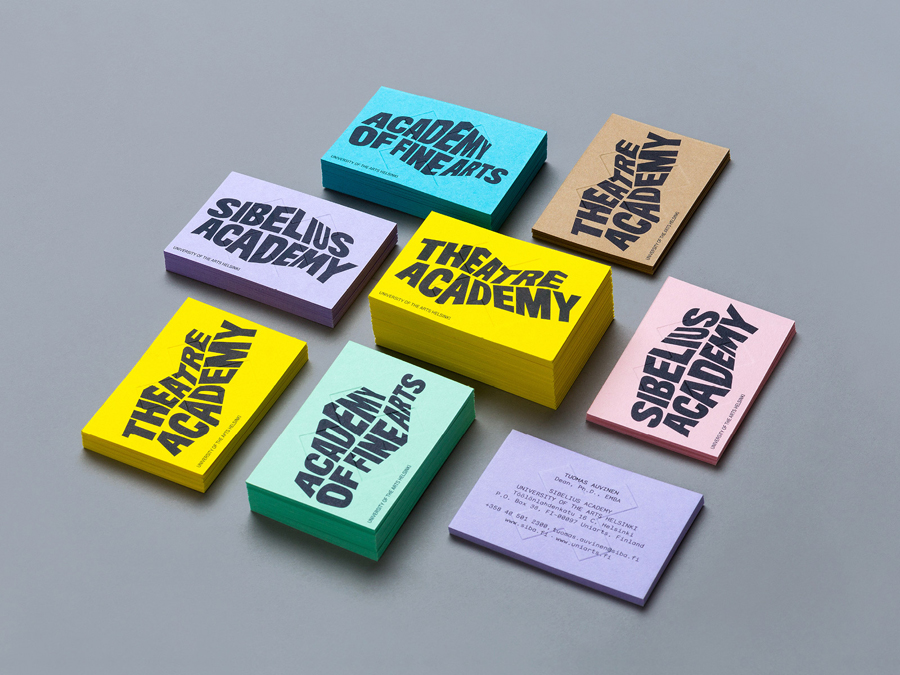
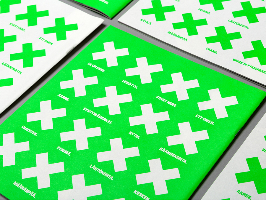
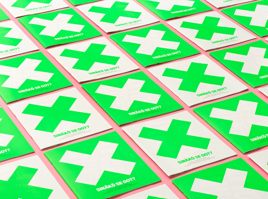
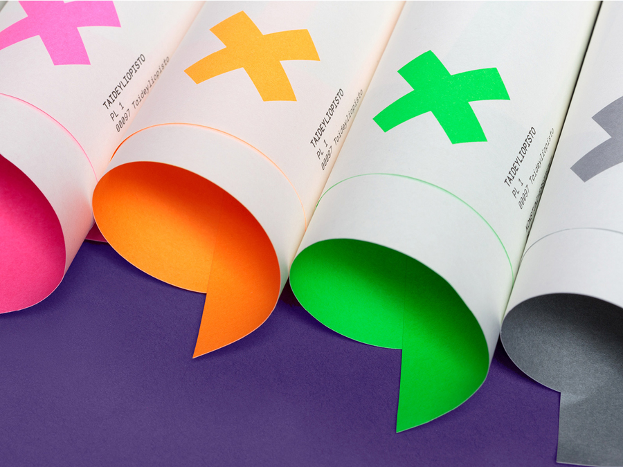
“The Finnish Academy of Fine Arts, Sibelius Academy and Theatre Academy Helsinki merged in the beginning of 2013 into the University of the Arts Helsinki. Bond created the complete branding solution for the new university. The strategy for the identity was to create a distinctive set of logotypes based on a common design language, and to introduce an anchor symbol that acts as a point of connection between the university mother brand and the three academy brands. The simple and bold ‘X’ has plenty of meanings, just like art does. The symbol can be seen, for example, as a starting point, a destination, a meeting place, a location, a signature, an unknown force, a warning, an irritant, a question and a solution.” – Bond
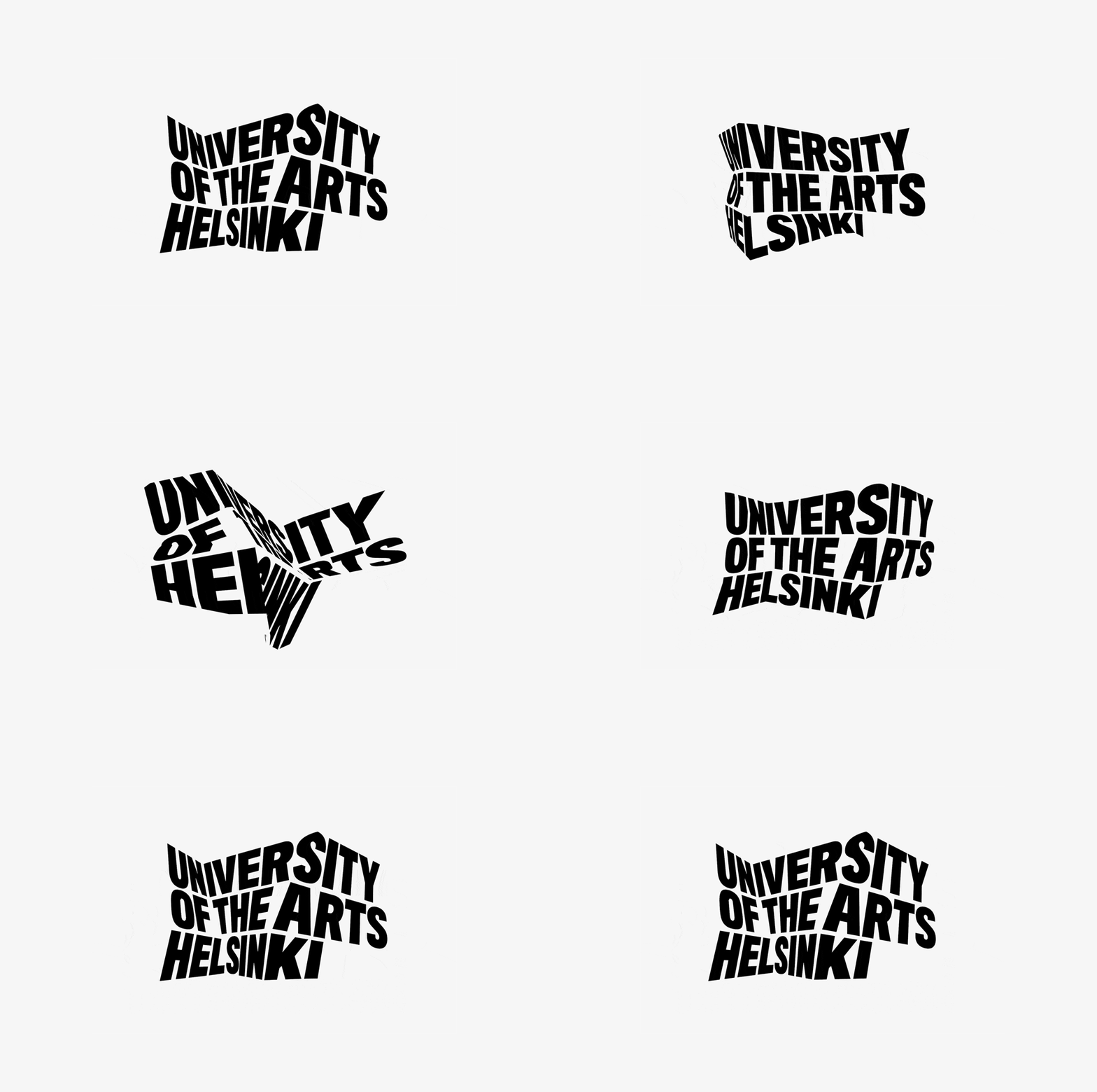
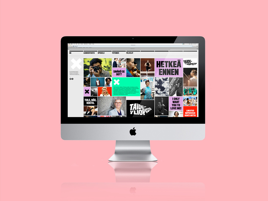
Bond has managed to infuse a huge amount of energy into this identity project that not only emerges from the frenetic logo animation but in the bright bursts of fluorescent colour in print and as paper throughout the collateral. The movement and quick frames of a bold uppercase sans-serif logotype gif deliver a loud and edgy personality, one that establishes a sense of enthusiasm, dynamic thinking and the idea of differing perspectives, themes that work well for modern creative education.
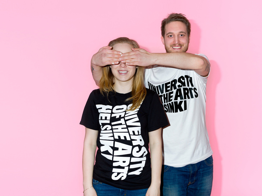
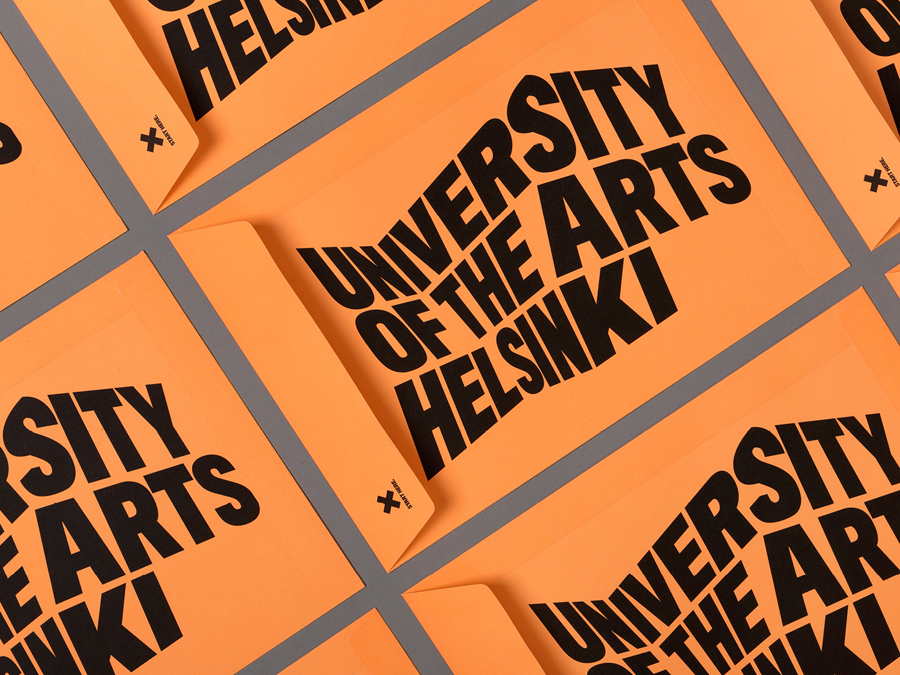
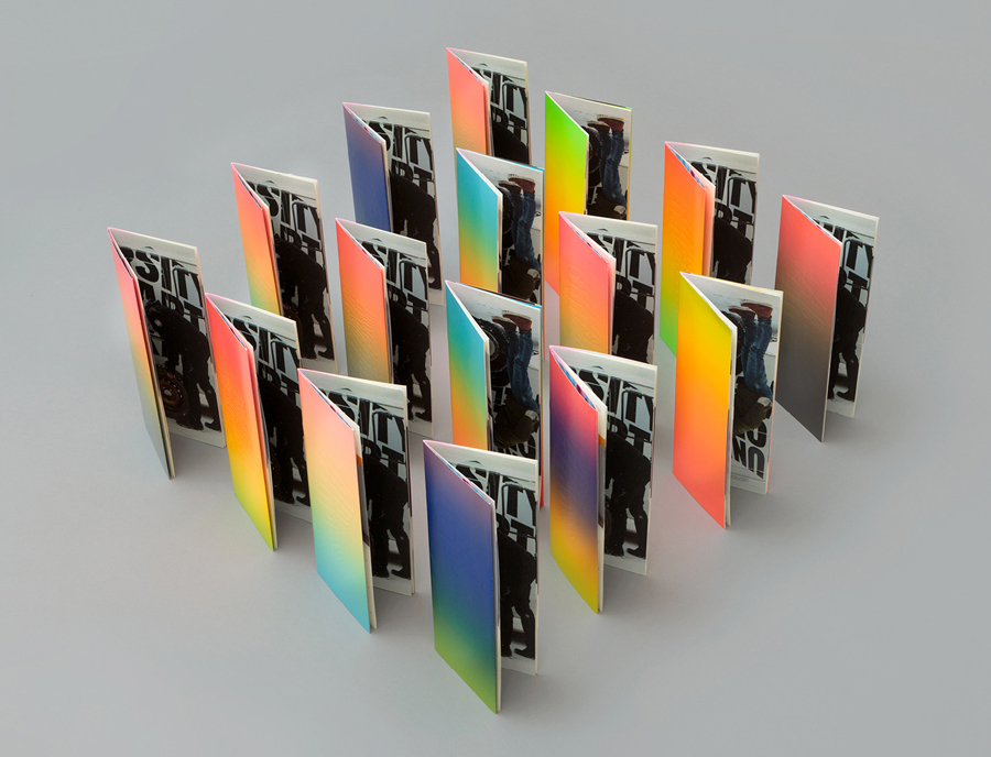
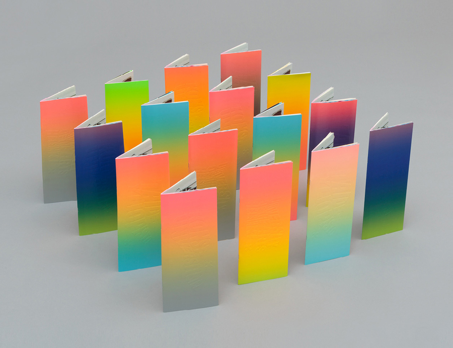
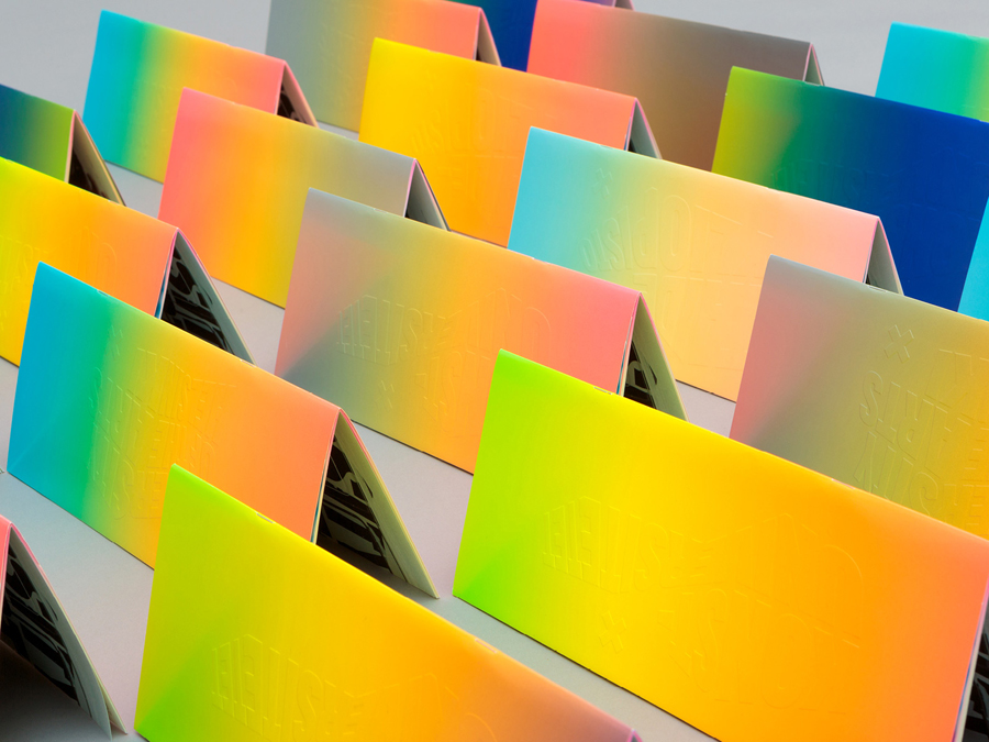
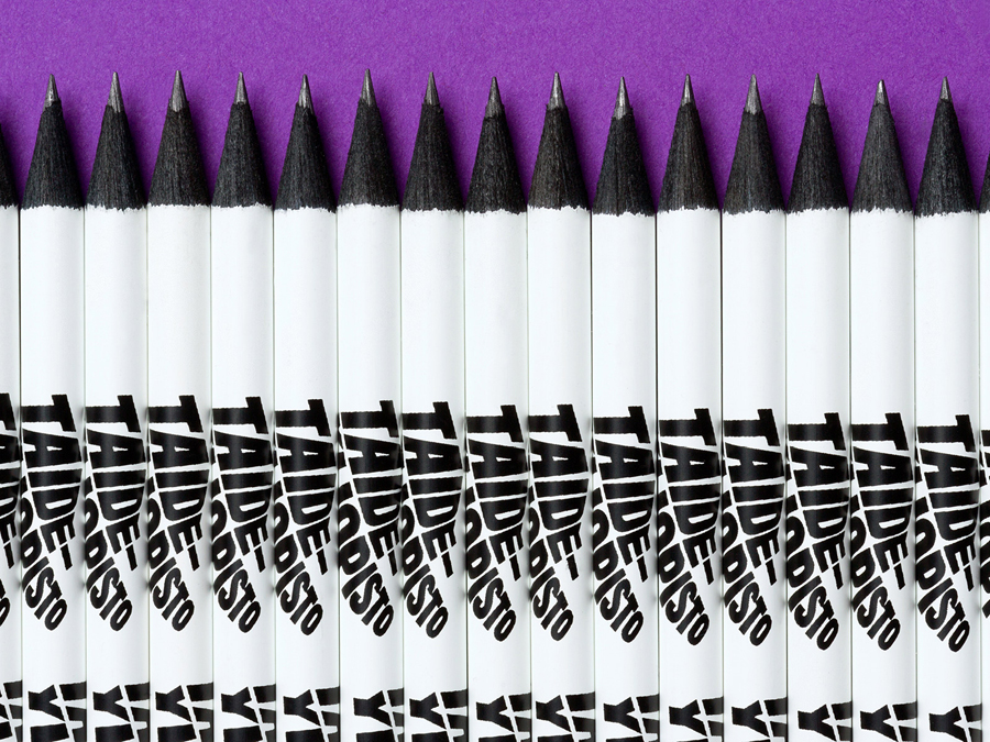
The logotype has been applied with variety across a number of printed pieces that includes brochures, stationery, posters, van livery and tote bags. Although these are absent on-screen motion, still carries a dynamic quality with each of the three academy brands appearing to be caught at different point mid-motion.
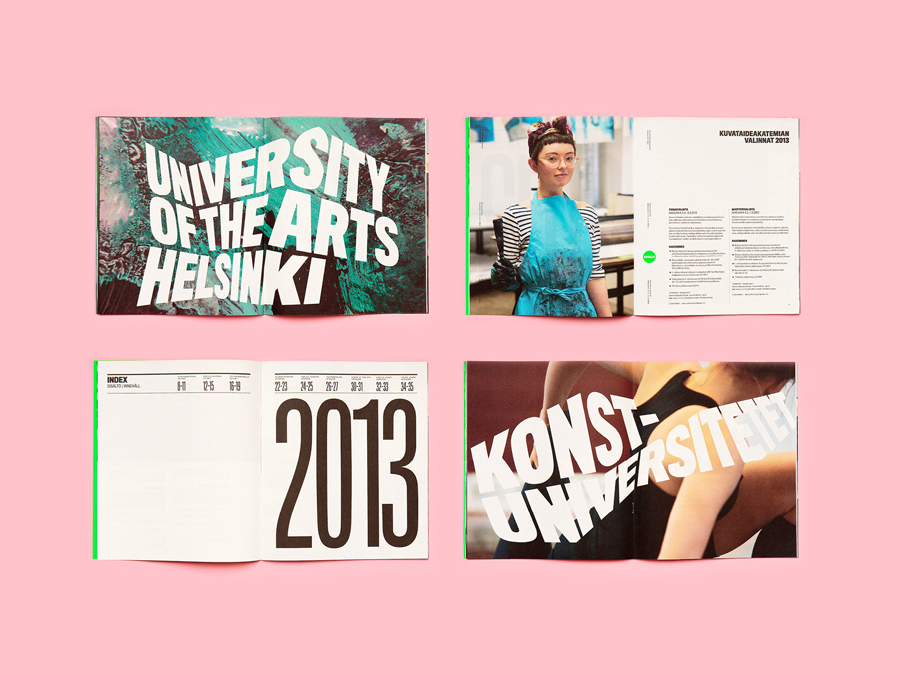
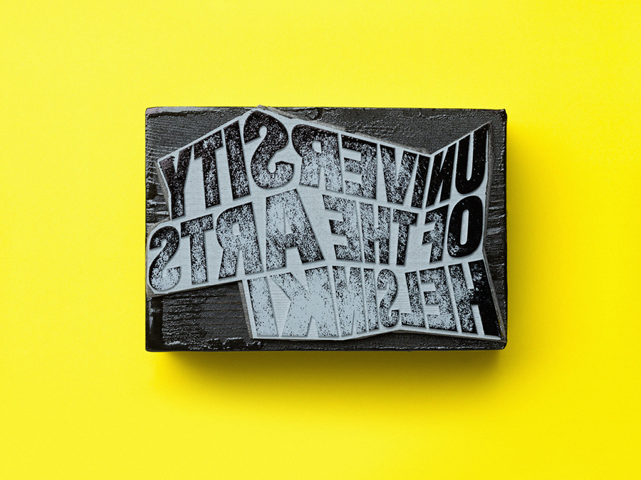
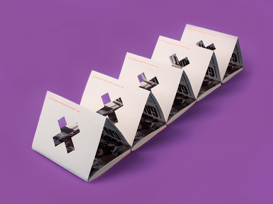
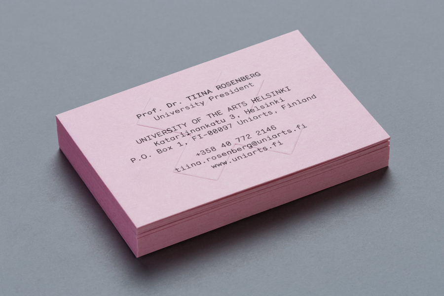
The X, while attributed multiple values by Bond in their introduction and having significant impact in its neon green finish and die cut detail, lacks the proprietary nature of the type, it does, however, keep the whole system from appearing too logo-centric as the type treatment appears similar between the different departments. In print, the creative contemporary energy of the neon inks are tempered slightly by more conventional pastel tones both as ink and as substrate detail. Alongside uncoated materials, debossed print and stamp based finishes these add a crafted dimensionality to the more progressive elements of the brand identity.




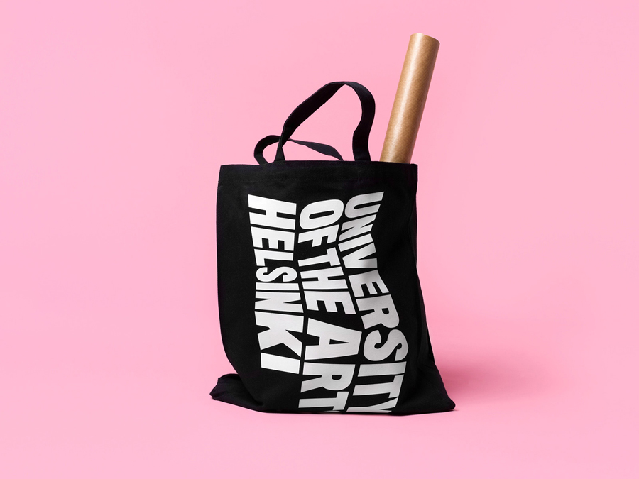
The logotype works particularly well as a screen printed detail across a tote bag, its facets appearing as creases.
