Intu by Heydays
Opinion by Richard Baird Posted 9 January 2014
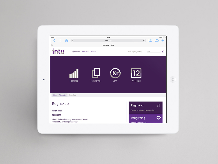
Intu is a Norwegian accounting and consultation firm and real-time technological solutions provider located in the town of Bodø. Design agency Heydays developed a new brand identity solution for Intu—which included naming, logotype, business cards, print communication, custom typography and website design—based around the link between the firm’s two key services and the software it uses to deliver these efficiently.
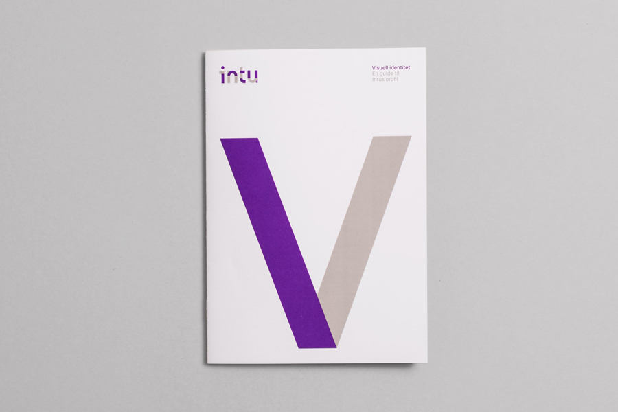
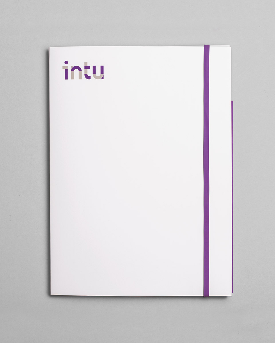
While Heyday’s solution leverages what is a familiar contemporary technological accessibility—simple monolinear iconography, an all lowercase sans-serif logotype and a limited colour palette—they have managed to infuse these with proprietary detail through a modular resolution of type and form, bold layouts, a bright single ink choice and a high quality print finish.
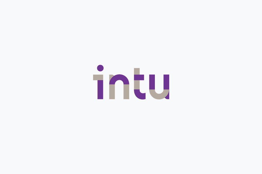
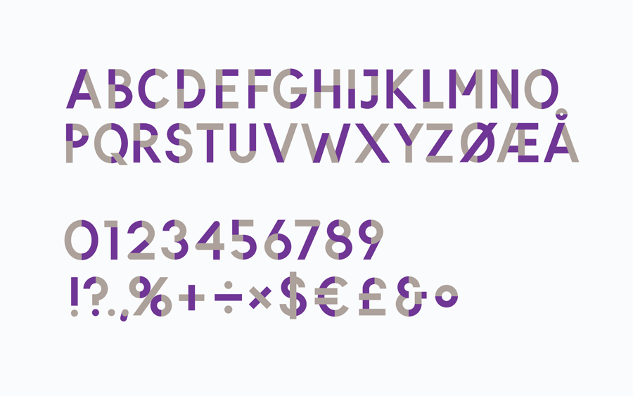
The logotype is well constructed, it has an all lowercase approachability, soften further by a couple of rounded terminals—a feature that occurs more frequently in the full character set—and the mirroring of the n to form the u.
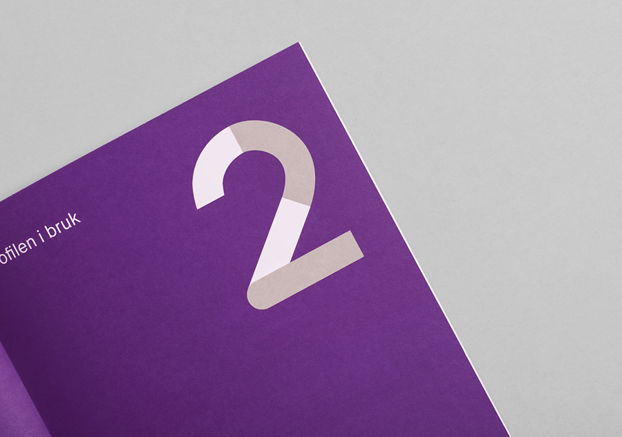
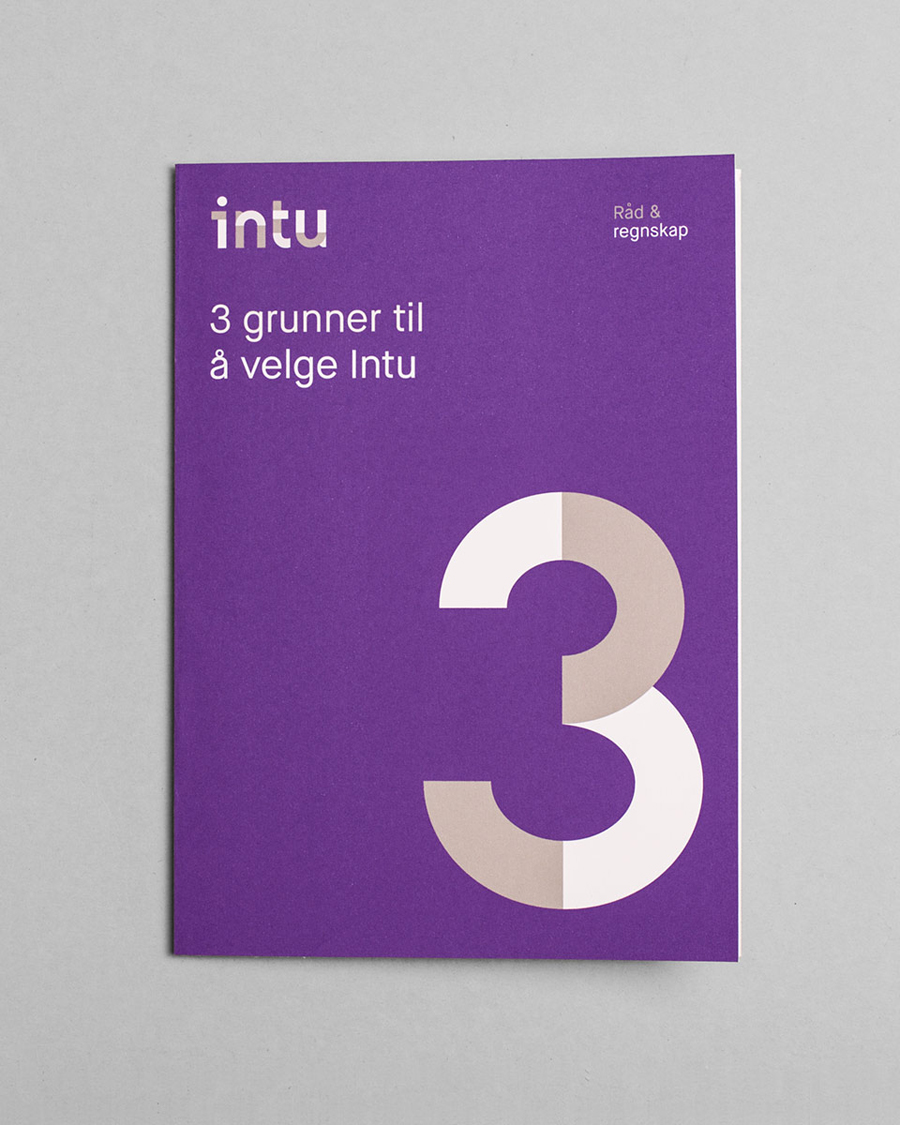
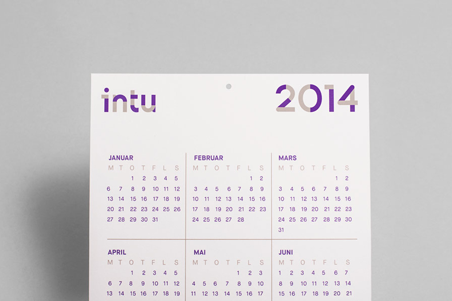
A two-colour modular quality—which then informs the rest of the brand identity—has an almost mechanical consistency and repetition that neatly reflects the themes of technological automation, consistency and reliability. Check out Sagmeister & Walsh’s work for Function Engineering to see similar. This extends to a broader set of characters, equally well rendered with a similar mix of flat and rounded terminals but with a contrasting uppercase authority.
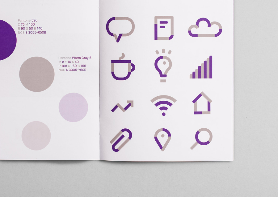
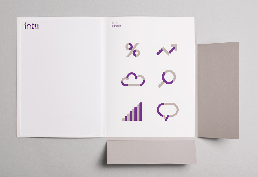
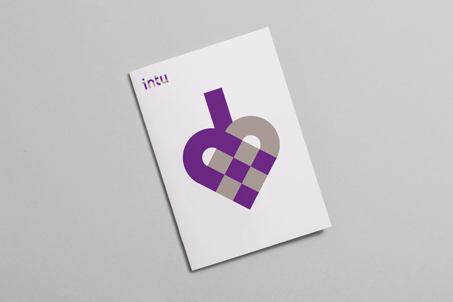
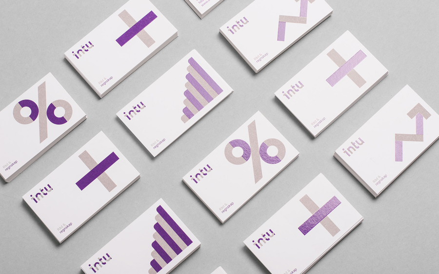
The wealth of iconography available today makes it incredibly difficult to appear proprietary, the combination of two colours, the module build and a heavier line weight compared to lighter trends, that alongside a similarly styled typeface appears distinctive. This is aided by a confident and what I would describe as an oversized execution in print that tempers the technological sensibilities of the type with clear/generic business related symbology.
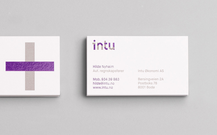
The technological accessibility and duality of the business established by type and icon also runs through the contemporary economy of a purple and cool grey colour palette. Again its a familiar approach but benefits from the bright hue you only really get with a spot colour, and the gloss of what looks like a blog foil. An approach to print not yet saturated within the industry and helps to elevate the printed elements beyond the conventional with a strong sense of quality and distinction.
