Space Division by Inhouse
Opinion by Richard Baird Posted 18 August 2014
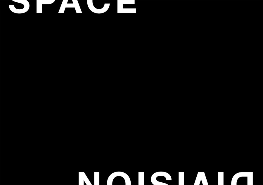
Space Division is an architectural studio established in 2010 with an office in Auckland, New Zealand. It looks to contribute to and positively impact on the lives and environments of its clients and the communities it serves by producing simple and succinct spaces.
The studio describe their projects as being inclusive and client-focused with physical constraints, budgets, time frames and compliance being carefully considered and incorporated into their work across commercial, urban infrastructure and residential architectural fields.
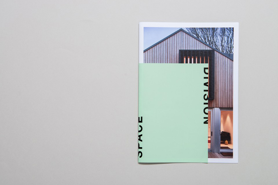
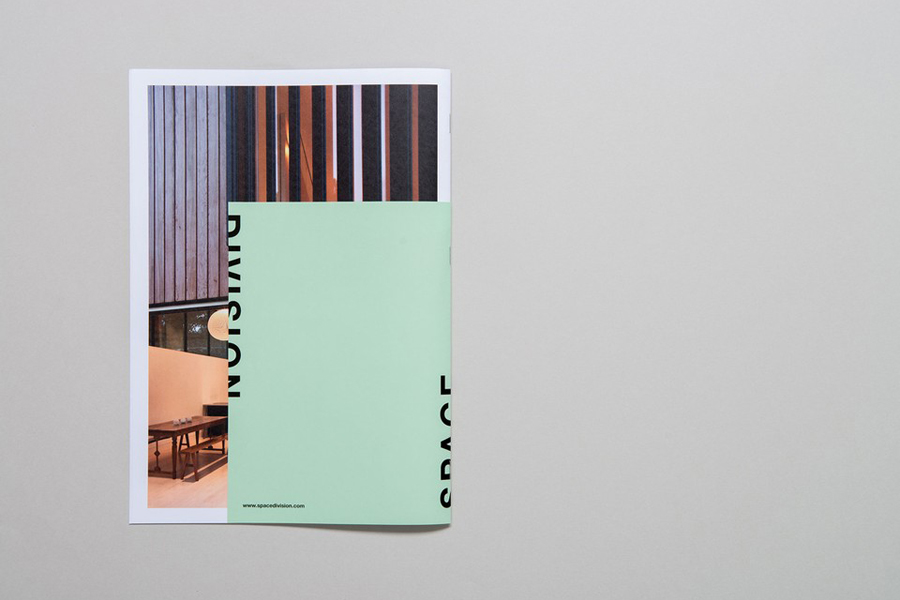
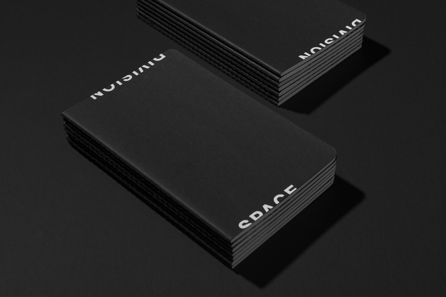
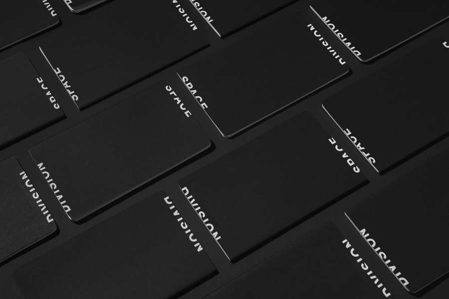
These values and project considerations, as well as Space Division’s agile, dynamic and easily scalable approach, is reflected in their name and new brand identity, created by Inhouse. This included a flexible logotype, stationery set, business cards, print portfolio, project photography and website.
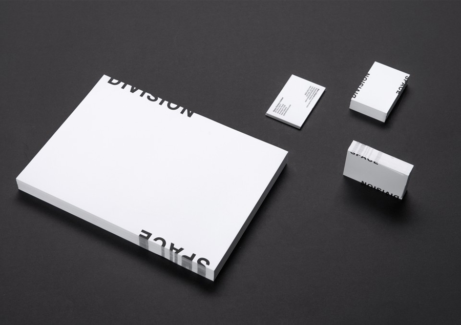
Inhouse’s approach effectively explores the theme of space, contemporary restraint and scalability, delivers aesthetic impact, and draws originality from ubiquity using very few assets. This is achieved by taking the architectural mainstay; the neutrality and utility of an uppercase sans-serif logotype and its single ink economy, and pushing it off the edge in print and online. This frames content and hints at the existence of a second plane in three dimensional space and expands and contracts depending on the logotype’s context.
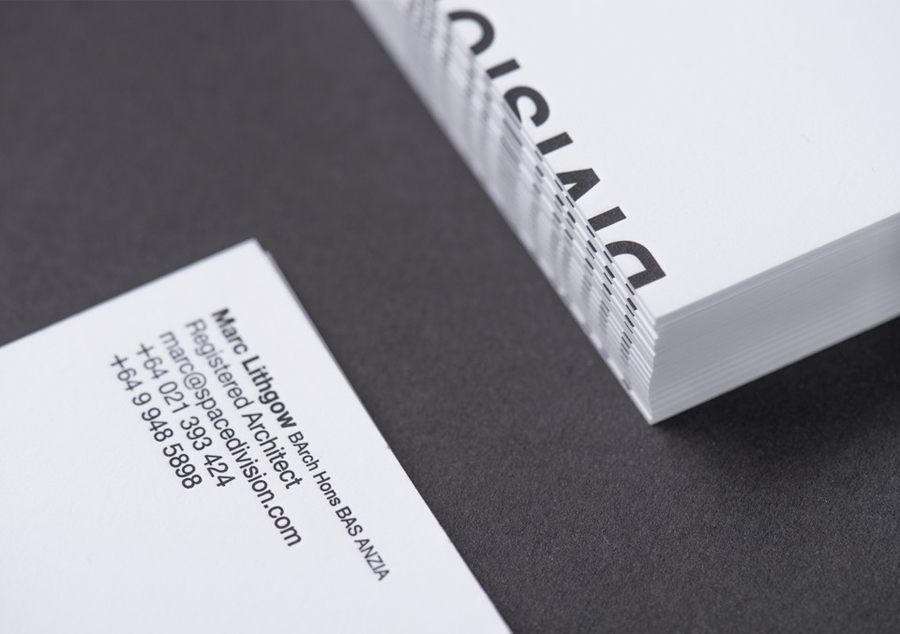
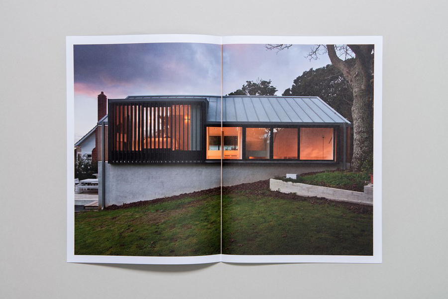
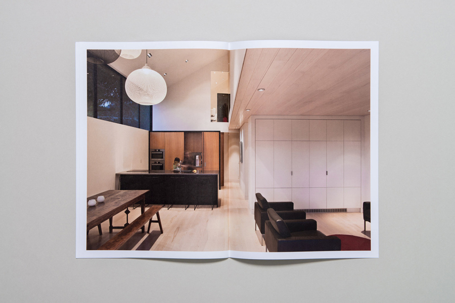
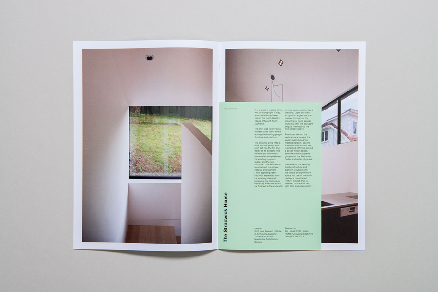
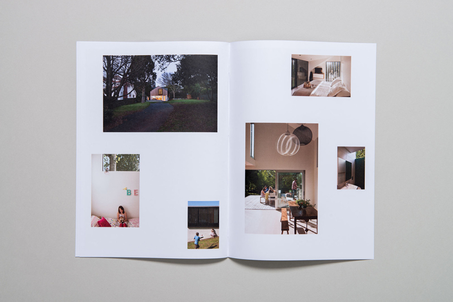
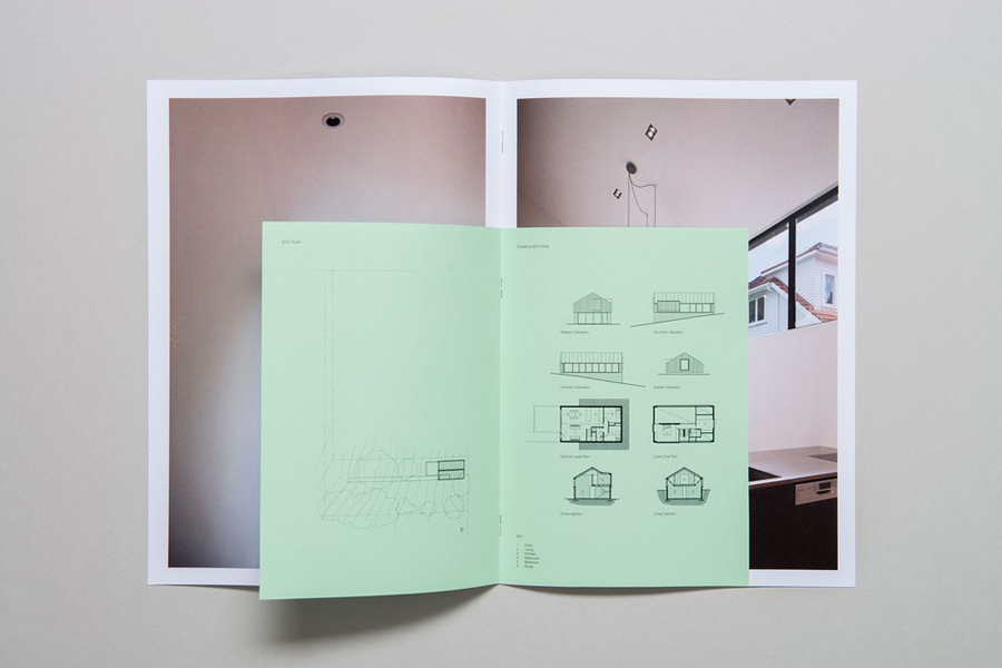
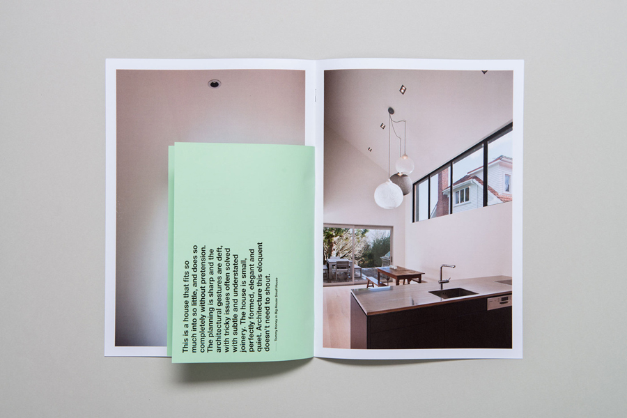
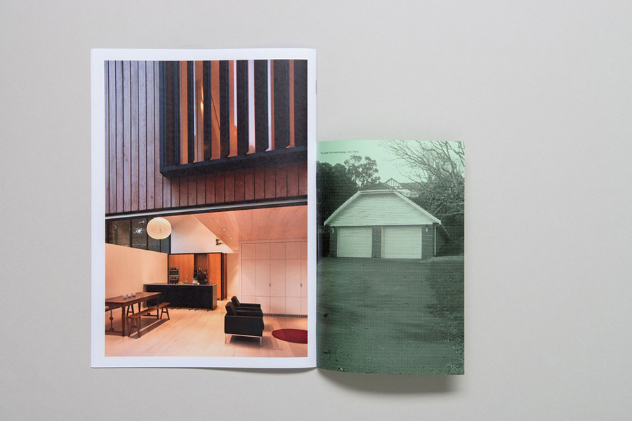
The concept of division is expanded upon in print through a contrast of large detailed photography alongside unprinted panels, green paper next to white, the use of two substrate sizes, a physical split between image and copy, and a business card that uses orientation to divide information. These choices, alongside good quality boards, dyed paper and print finish, manage to balance straightforward communicative functionality with an aesthetic distinction grounded by concept. More from Inhouse on BP&O.
Design: Inhouse. Opinion: Richard Baird.
