The Best of BP&O — August 2014
Opinion by Richard Baird Posted 31 August 2014
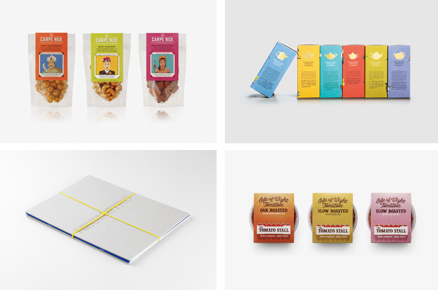
Highlights this month included Apartment One’s brand identity and digital work for Adlin Inc. and Fatherly, Believe In’s packaging treatment for Clive’s, Foreign Policy’s way finding and signage for Hay-Market and Trüf’s work for capital investment firm Echo. However, there were five projects that really stood out and have made it into BP&O’s top five, a feature that brings together the most interesting of each month for another opportunity to be seen and shared. Projects that make it into the top five effectively balance graphic design, print finish, material and/or structural choice, and have a communicative depth and clarity.
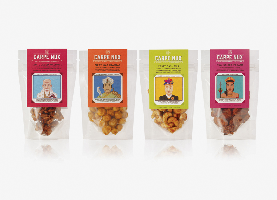
Carpe Nux designed by Designers Anonymous
Carpe Nux is a premium, sweet and savoury, fusion flavour nut brand inspired by global cuisine, hand-roasted in batches in the UK and created to invigorate what was perceived to be a flagging market. Flavours include Fiery Macadamias, Rum-Spiced Pecans, Zesty Cashews and Soy-Glazed Walnuts. London based Designers Anonymous were recently commissioned by Carpe Nux to help them communicate, through a new brand identity and packaging treatment, their international search for the perfect nut and the parallels they draw between their range’s flavour profiles, and historical figures whose legacy and stories expanded across borders yet remain relevant today.
See more of this project here
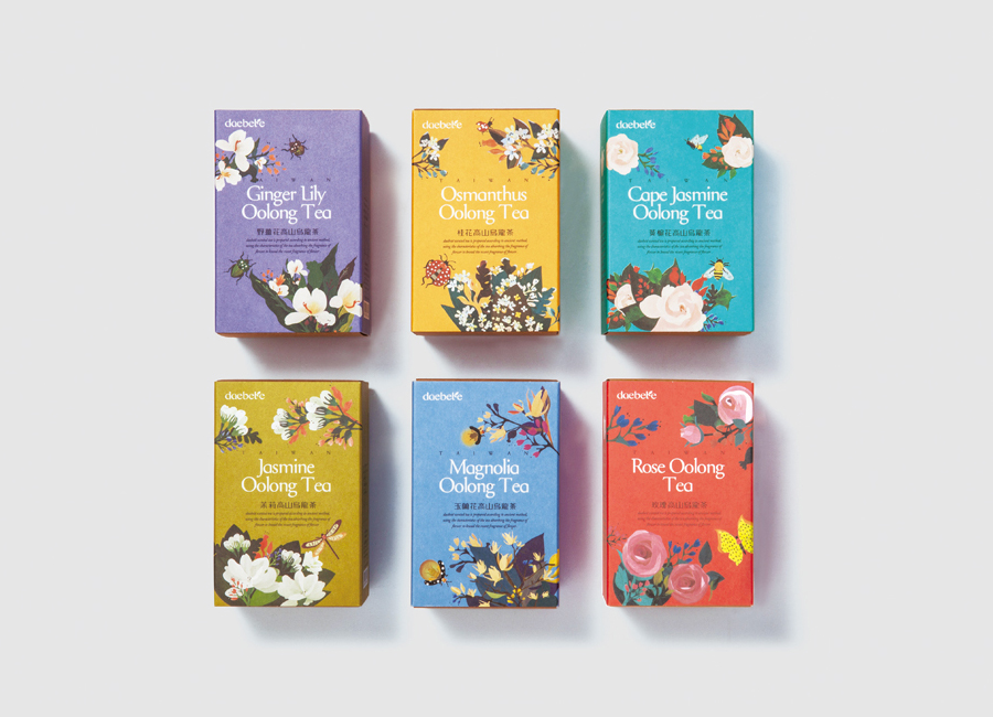
Daebeté Scented Tea designed by Victor Design
Daebeté is a floral infused tea range that uses a high-grade Taiwanese oolong variety, made using a unique process of withering, oxidation, curling and twisting, that has then been given a floral hint using ancient baking methods. This process creates a subtle yet sweet flavour profile that carefully balances the aroma of flowers with the flavour of tea. The packaging for the Daebeté range, developed by Victor Design, was inspired by the natural beauty and ecology of the flower growing regions of each infusion, conveys the craft of production, the tradition of tea preparation, quality and delicate flavour, through a good combination of illustration, typography, print finish and structural choice.
See more of this project here
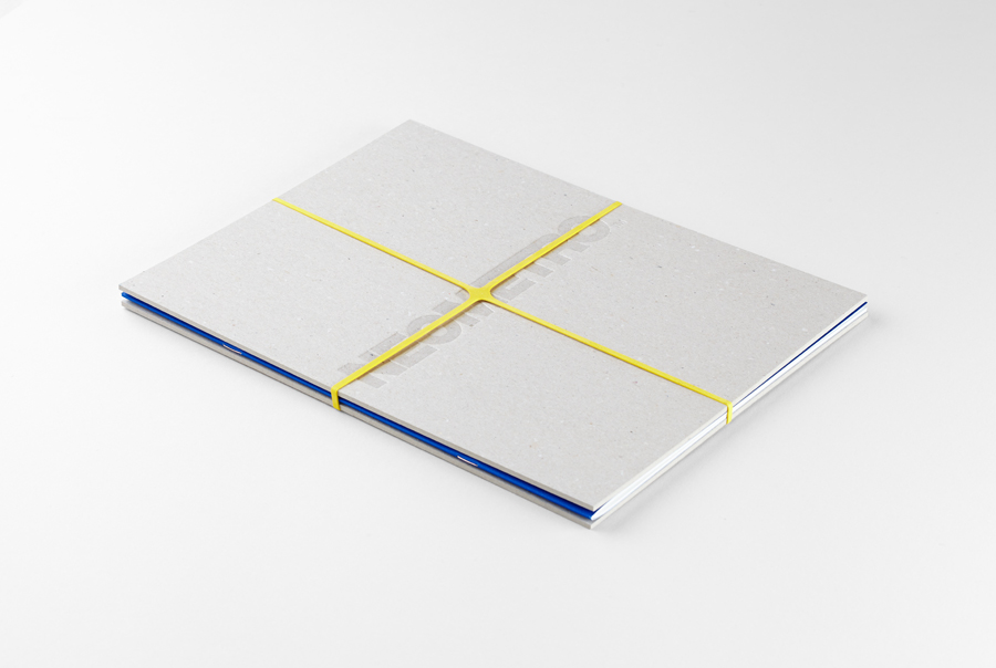
Neometro & Nine Smith Street designed by Studio Hi Ho
Nine Smith Street is the latest residential property project from Neometro, a company that describes itself as having a reputation as Melbourne’s most design-focused development group and recognised as one of the first holistic design and construction businesses in Australia. Neometro are dedicated to creating architectural buildings that are beautiful, functional and timeless, and have a sense of place and belonging. Neometro’s brand identity and that of its Fitzroy property Nine Smith Street, designed by Studio Hi Ho, effectively uses colour, type and substrate contrast to establish a solid foundation from which to communicate a variety of future property projects, reflect a design aesthetic rooted in a modernist heritage and the company’s commitment to new textures, finishes and materials.
See more of this project here
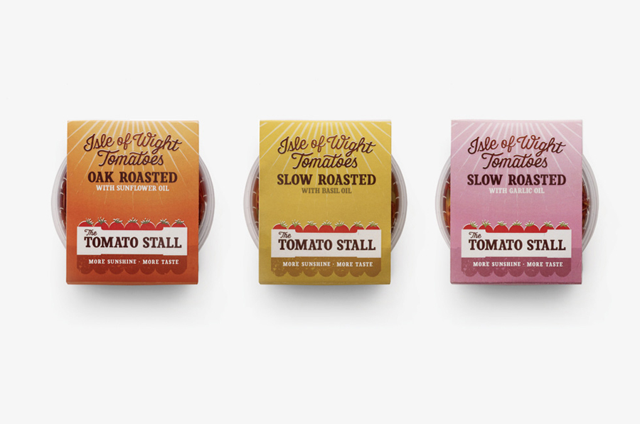
The Tomato Stall designed by Designers Anonymous
The Tomato Stall is a grower of speciality tomatoes whose distinct flavour is attributed to the increased sunshine they receive from being farmed on the southern English island of the Isle of Wight. From these, The Tomato Stall produces a range of ‘tomato inspired’ artisanal products that are stocked by farm shops and delis throughout the UK and sold from their own market stalls across London and the south. With a desire to appeal to ‘sophisticated foodies’ and achieve a more established market position capable of meeting the needs of big supermarkets, Designers Anonymous developed a new brand identity and packaging treatment that delivers a clearer brand story, has a strong sense of provenance and a contemporary crafted sensibility.
See more of this project here
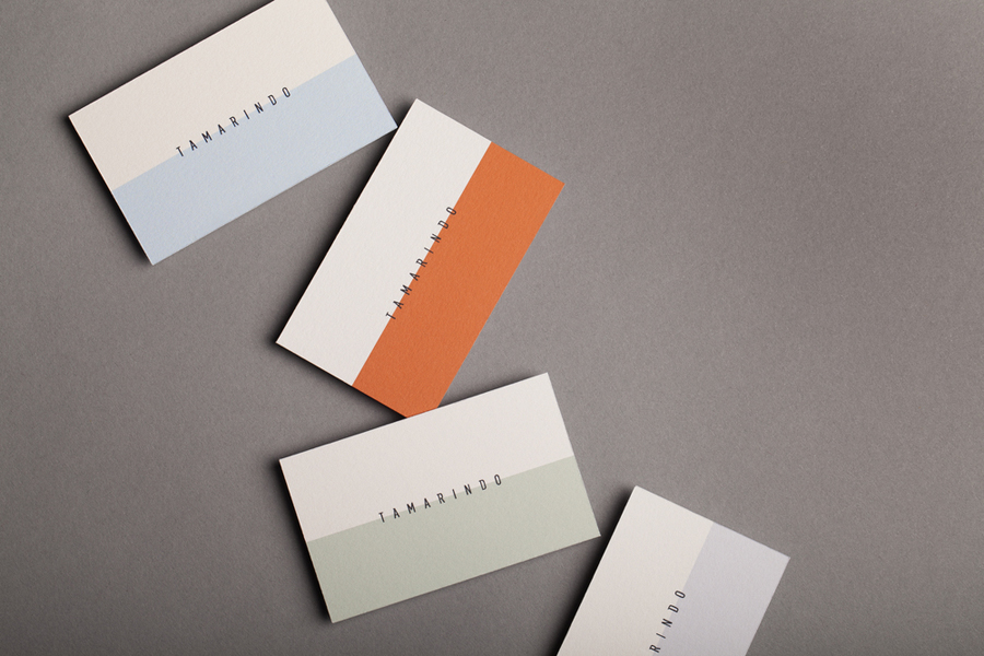
Tamarindo designed by La Tortillería
Tamarindo is a kitchen and bar with an international menu due to open in October 2014. Located in Ourense, Spain, Tamarindo was created as a refreshing alternative for local walkers who are used to traditional bars and restaurants, and is described as a place with two distinct moods and spaces, the casa cocina or house/kitchen, a place for coffee and a quick snack, and a bar for beer and tapas. The interior, created by architects and husband and wife team Ruben D. Gil and Gretta R. Valdés, features a combination of light wood ceilings, adobe walls, dim lighting and steel furniture. This contemporary interior and the dual nature of Tamarindo’s space is distilled down into its visual identity designed by Mexican studio La Tortillería and extends across a variety of collateral including stationery, packaging, menus, coasters, tote bags and custom glass bottles.
See more of this project here

