Sushi & Co. by Bond
Opinion by Richard Baird Posted 2 April 2015
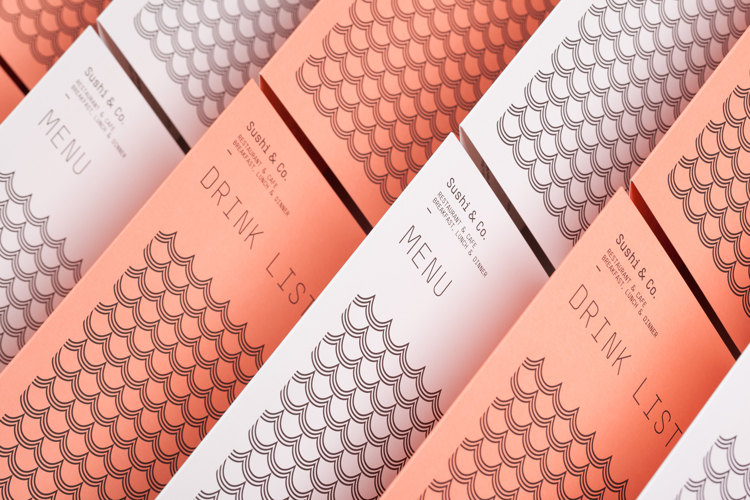
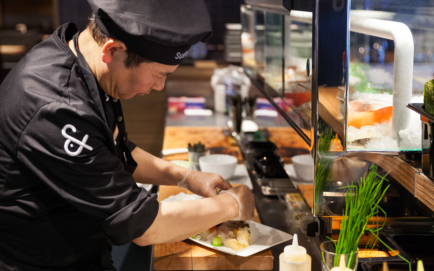
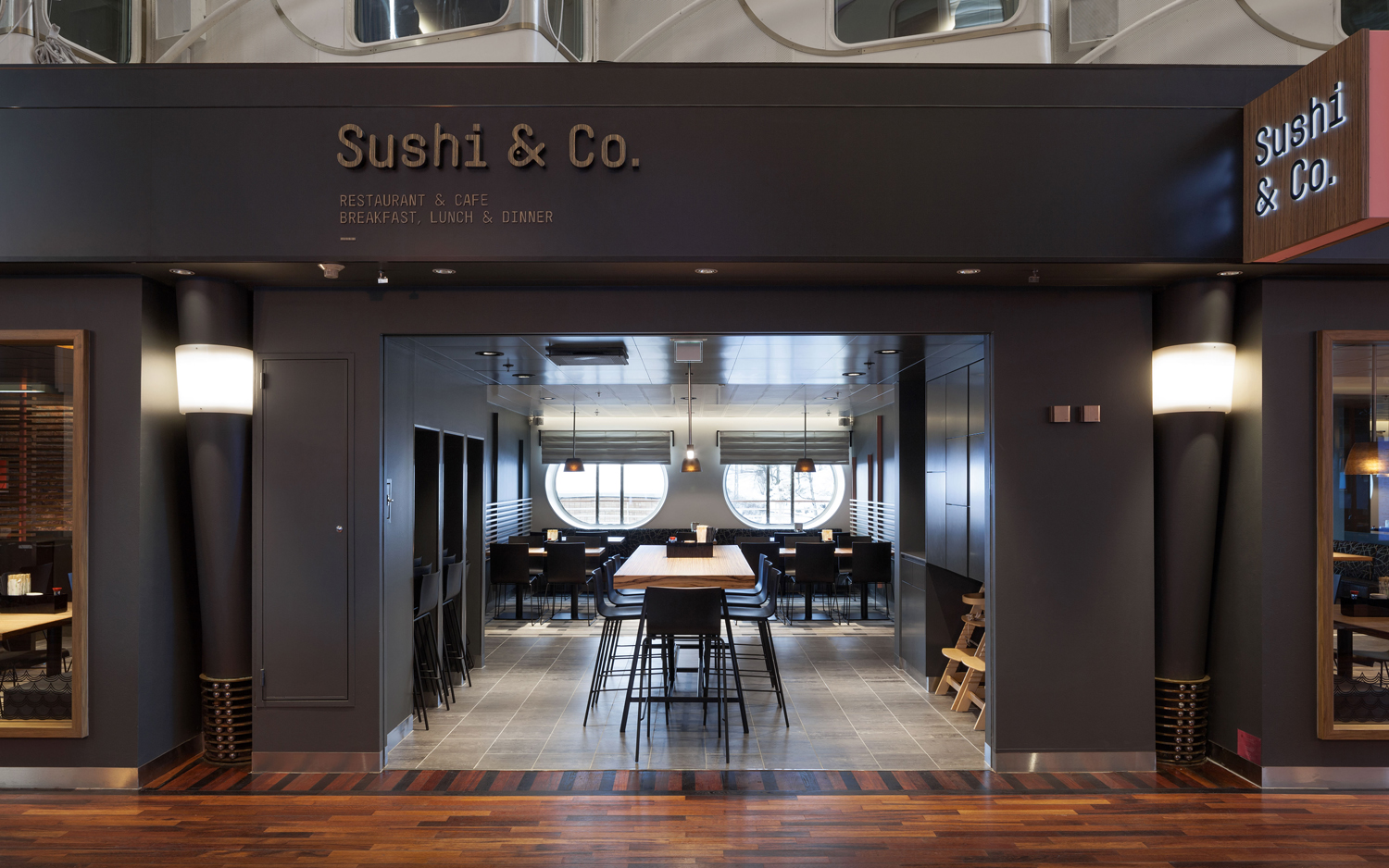
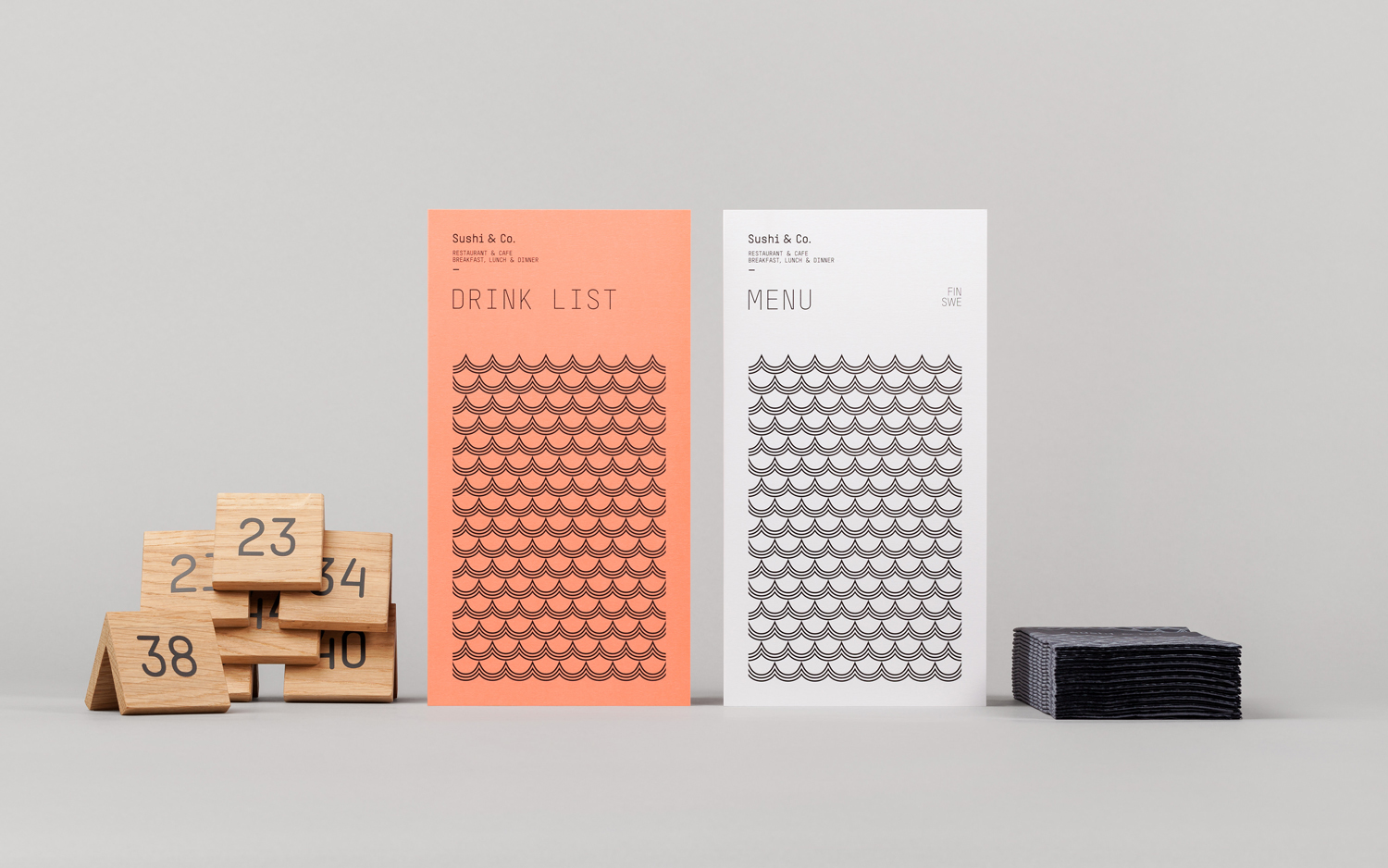
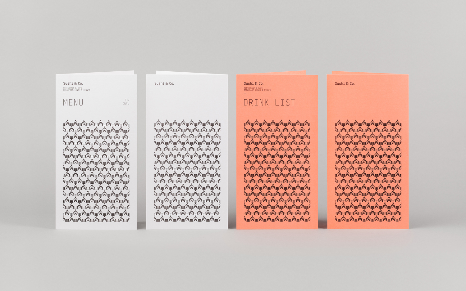
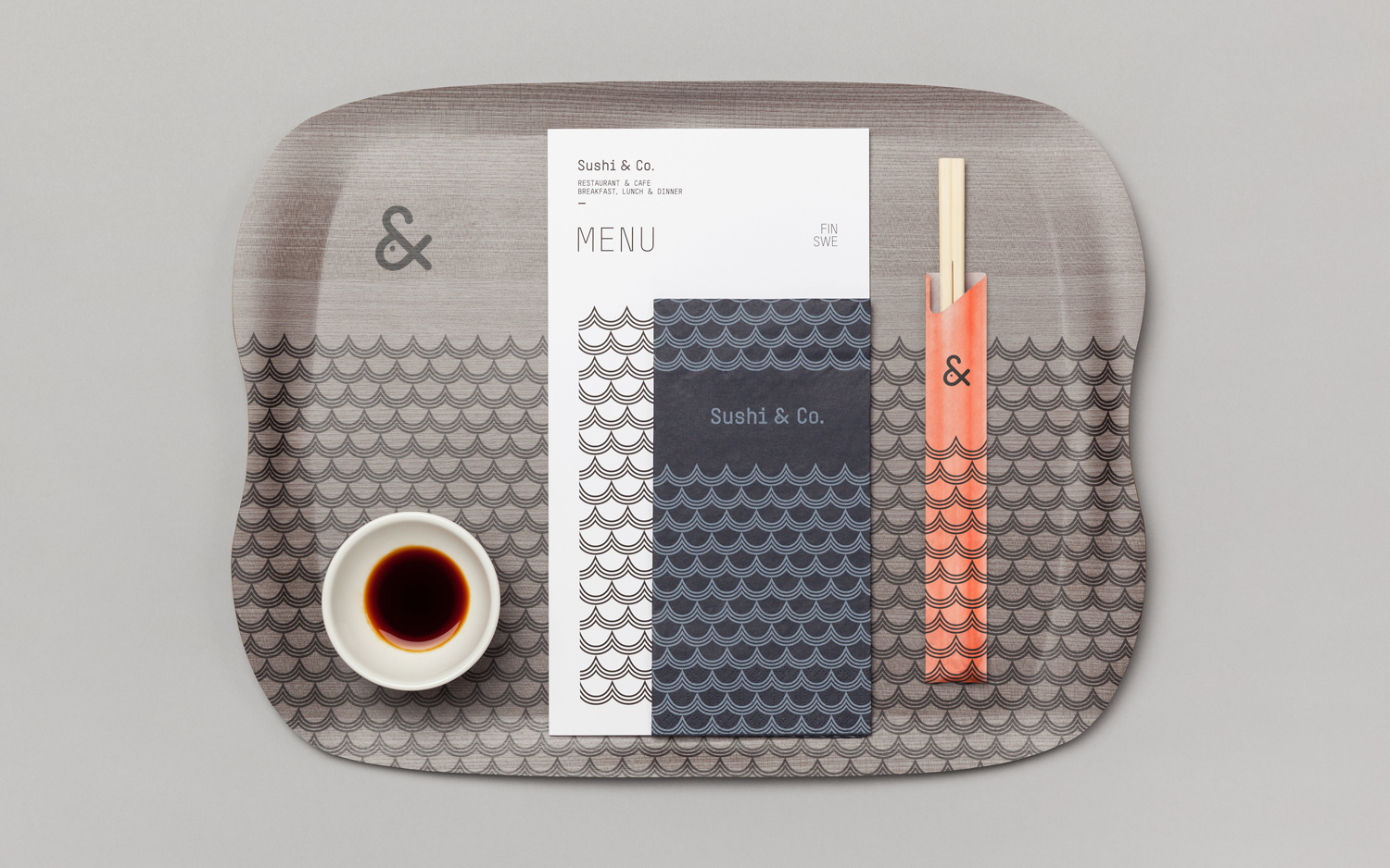
Sushi & Co. is a restaurant and cafe on-board a cruise ship taking guests to destinations along the Baltic Sea. It has a modern interior design that mixes dark and light wood furniture, features warm low hanging lights, organic patterned upholstery, cool grey walls, exposed brick panels, slate floors and a visual identity developed by Helsinki based graphic design studio Bond. Extending across menus, napkins, uniforms and signage, Bond’s visual identity leverages association, familiarity and the unexpected, through colour, form and type, to introduce a current Scandinavian simplicity to a more detailed but equally precise interior.
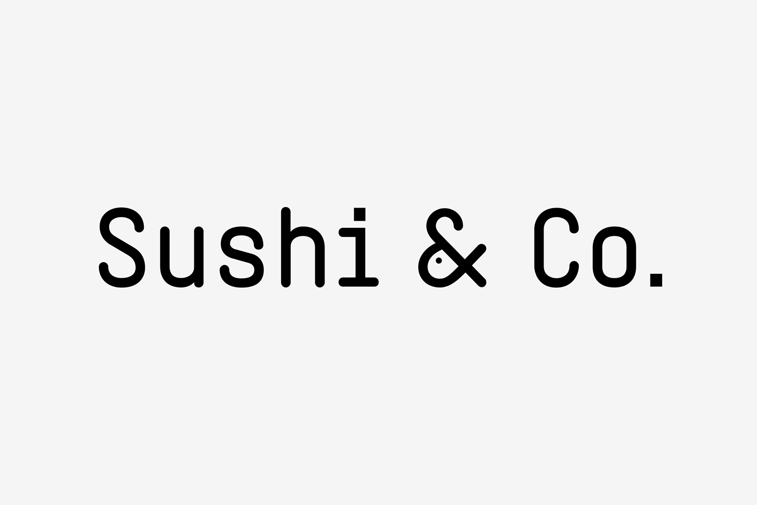
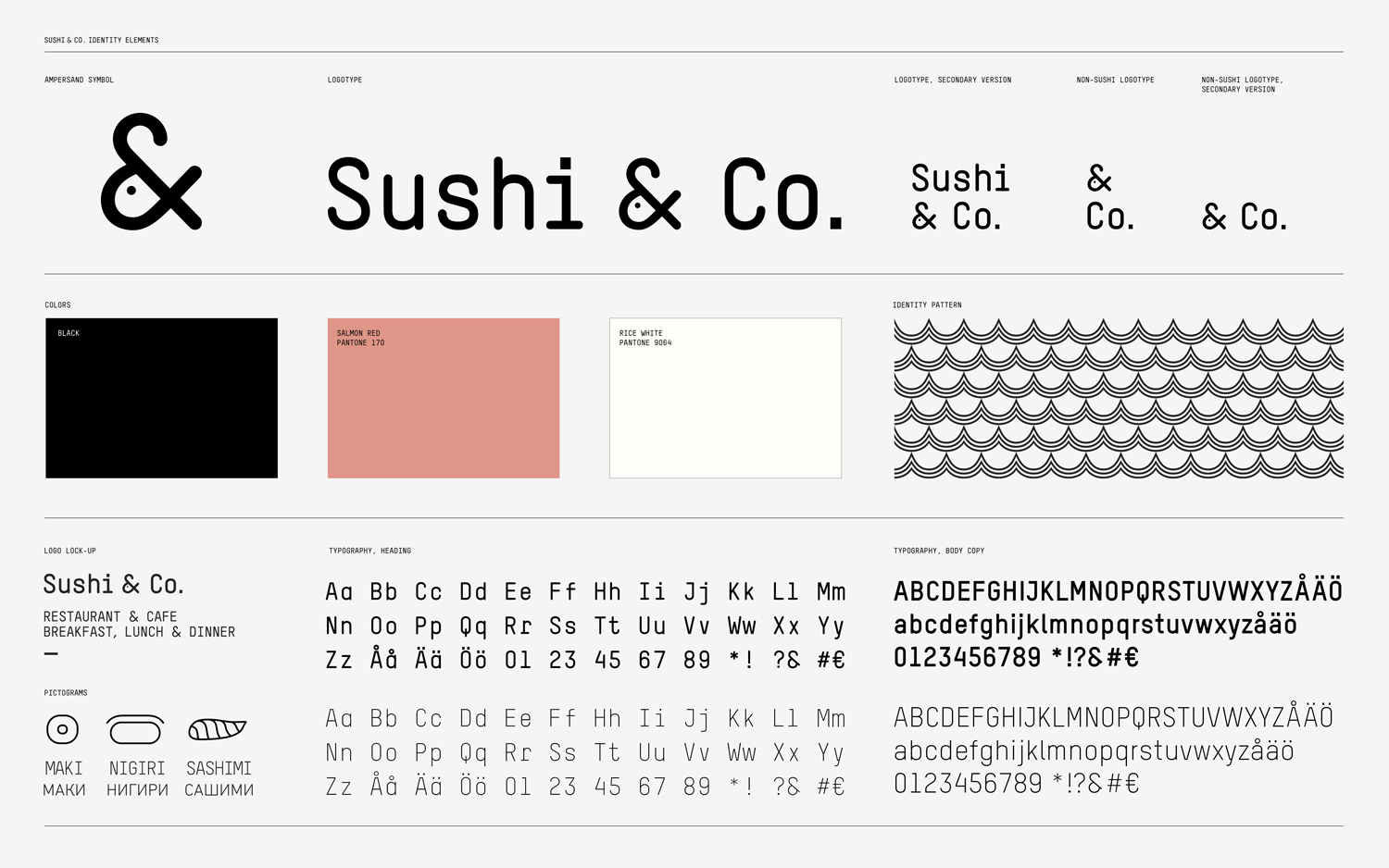
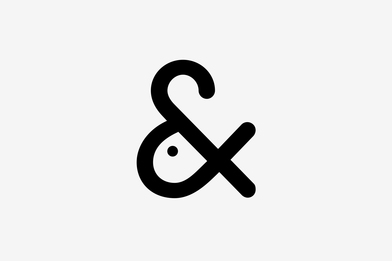
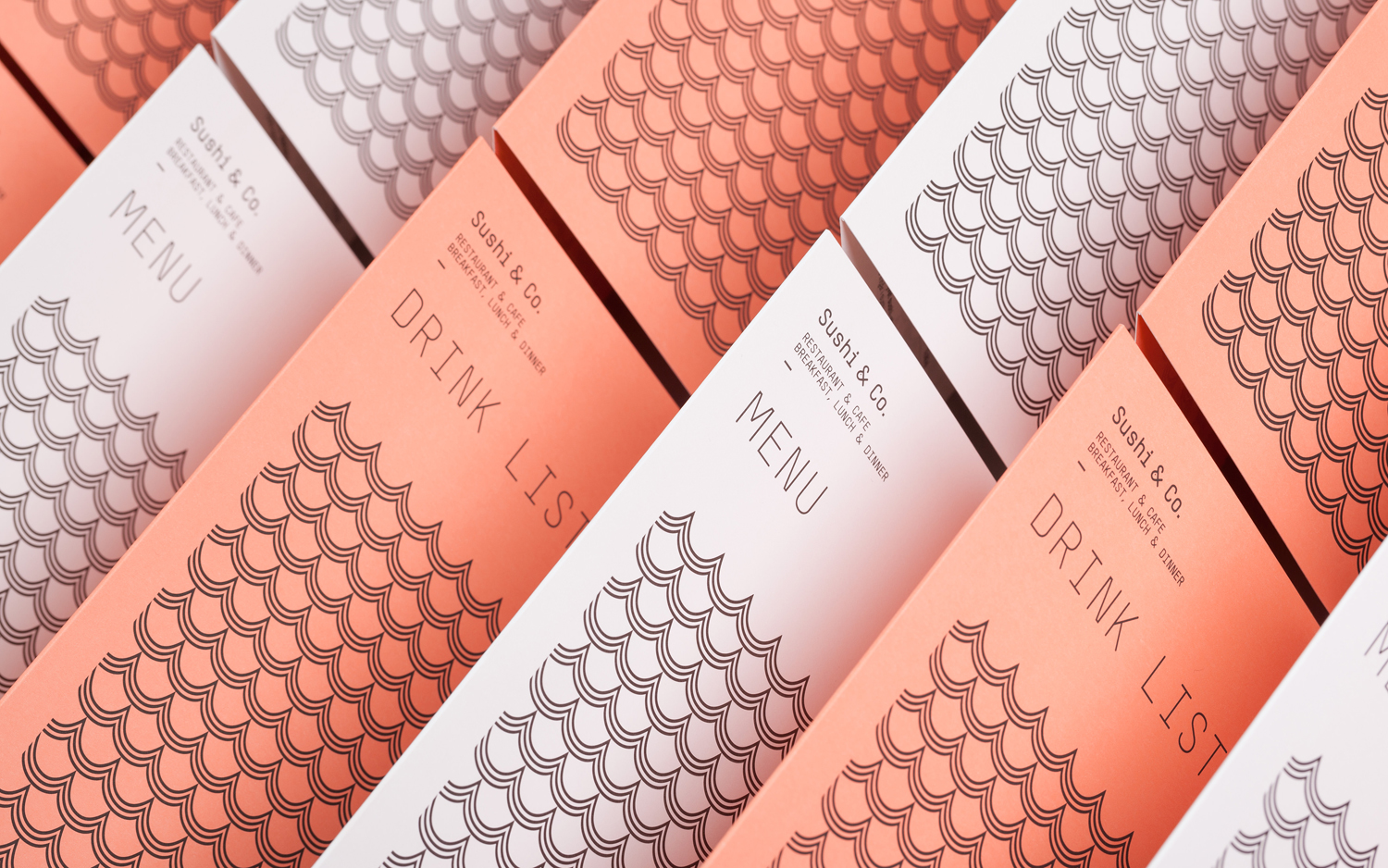
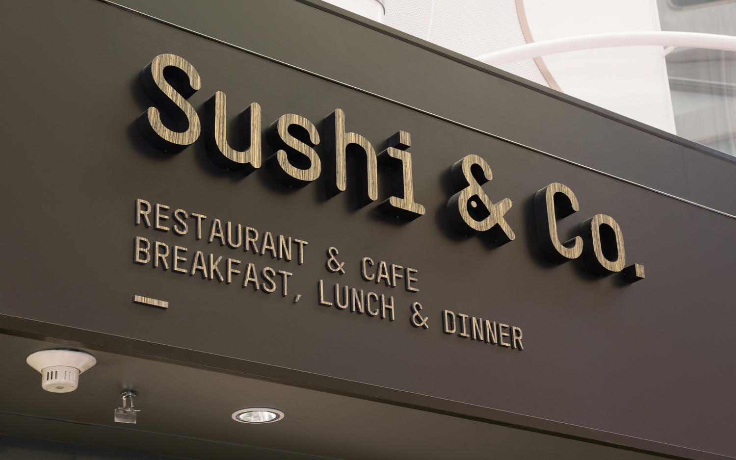
Where the wave and scale-like pattern, salmon red colour and fish iconography embraces familiarity and association within the context of a seafood restaurant, all the more relevant because of the restaurant’s cruise ship location, the monolinear, monospaced and condensed qualities of the logotype, punctuated by a moment of play within the ampersand, is unusual and unexpected.
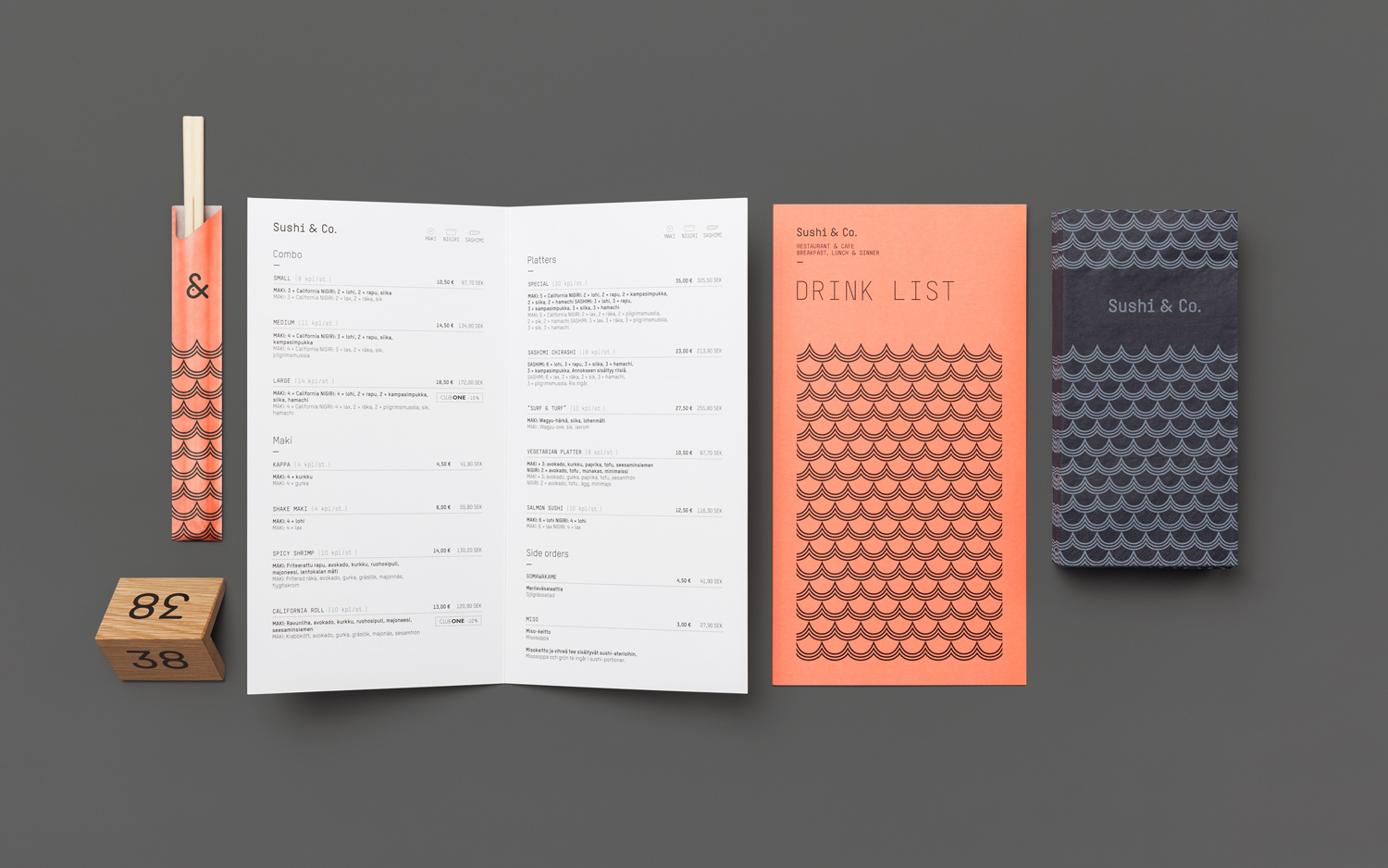
Although mechanical and impersonal across the menus, type is well integrated into environment through wood and illuminated signage.
Much like the fish within the ampersand, the use of a wood grain across the surface of monospaced type is distinctive in its contrast of ornamental flourish and typographical utility. This contrast continues through to a white paper and black ink economy alongside panels of a Pantone red that interrupts a dark interior with a moment of colour, in the same way the geometric wave pattern breaks from organic material texture.
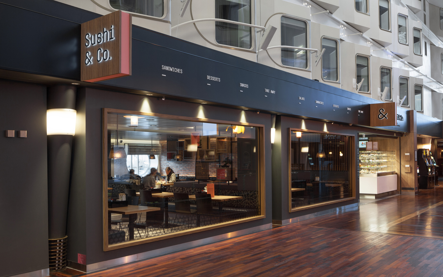
Highlights include the signage, which sandwiches a salmon pink in-between wood, and the goldfish tank-like windows.
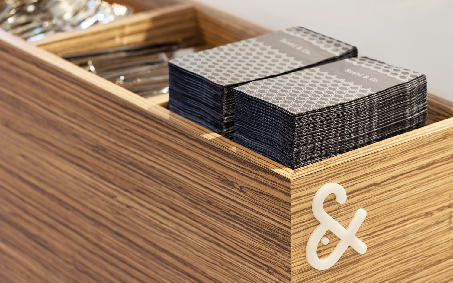
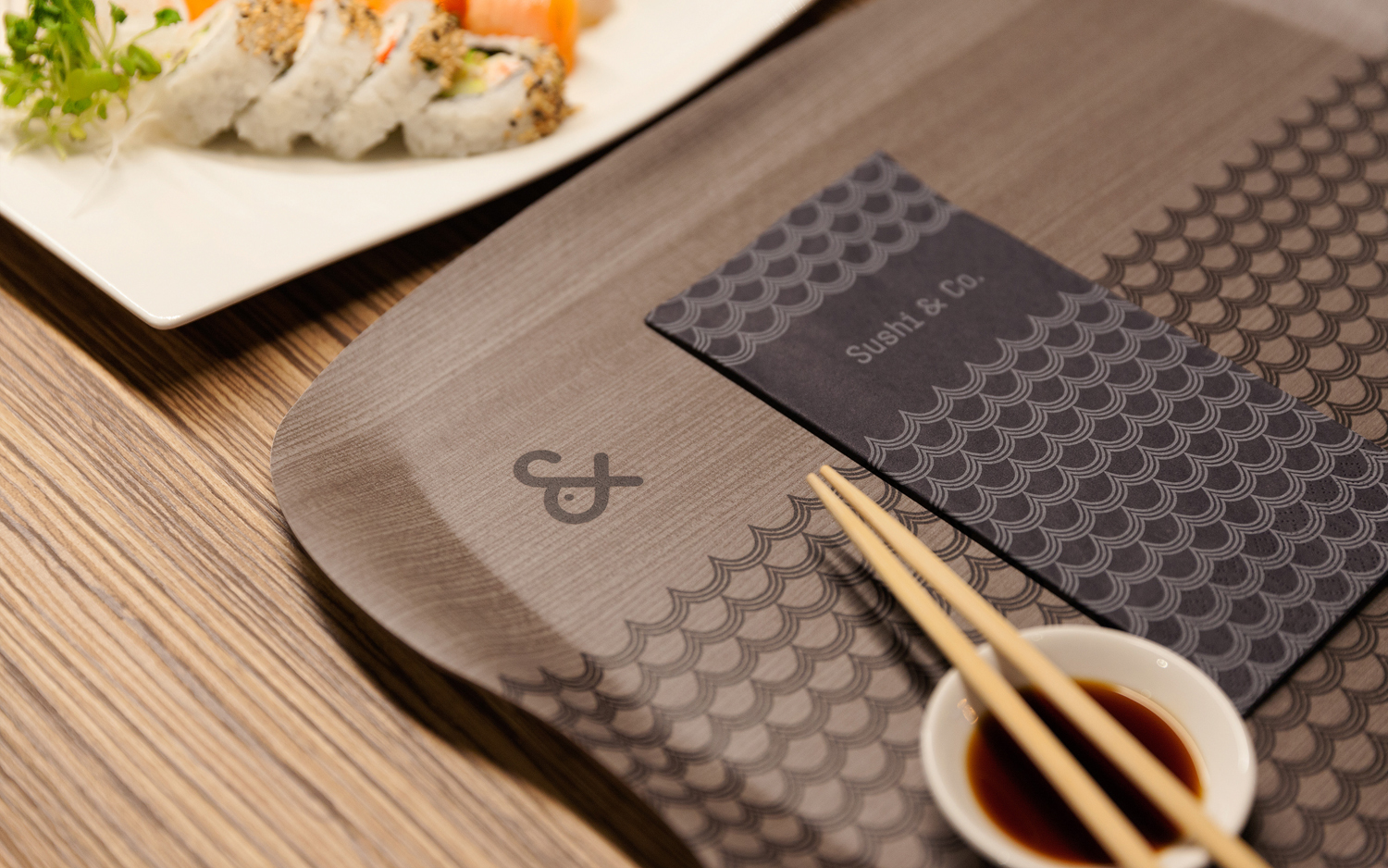
The result delivers moments of cohesion and contrast, utilises the expected and the unexpected, and draws play from utility with very few assets, an appreciation for space and reduction, interior detail and the restaurant’s Scandinavian location. More work by Bond on BP&O.
Design: Bond. Photography: Angel Gil. Opinion: Richard Baird. Fonts: T-Star Mono Round
