Hardpop 7 Years by Face
Opinion by Richard Baird Posted 15 April 2015

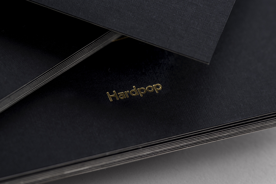
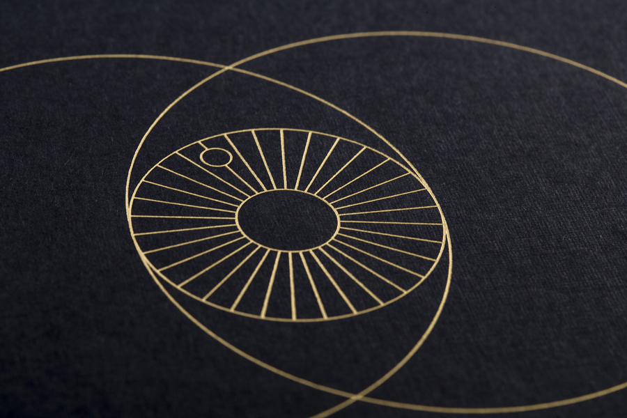
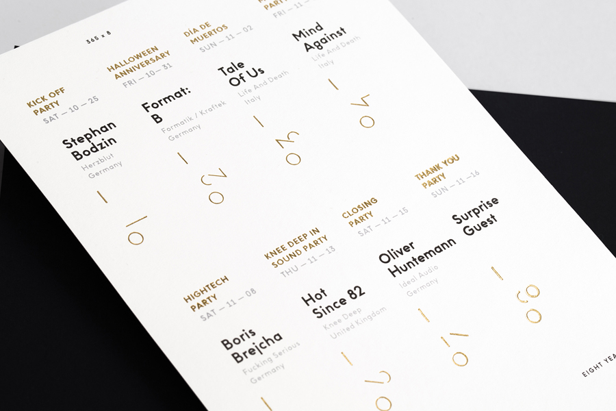
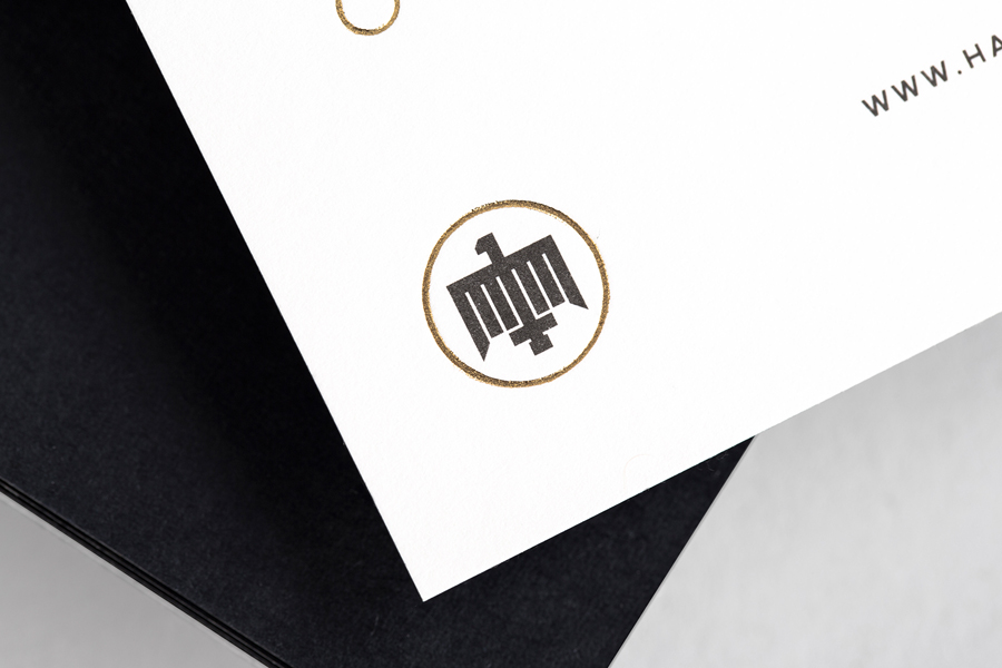
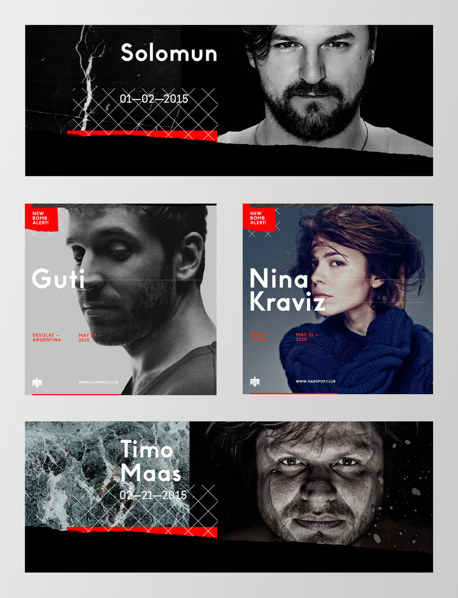
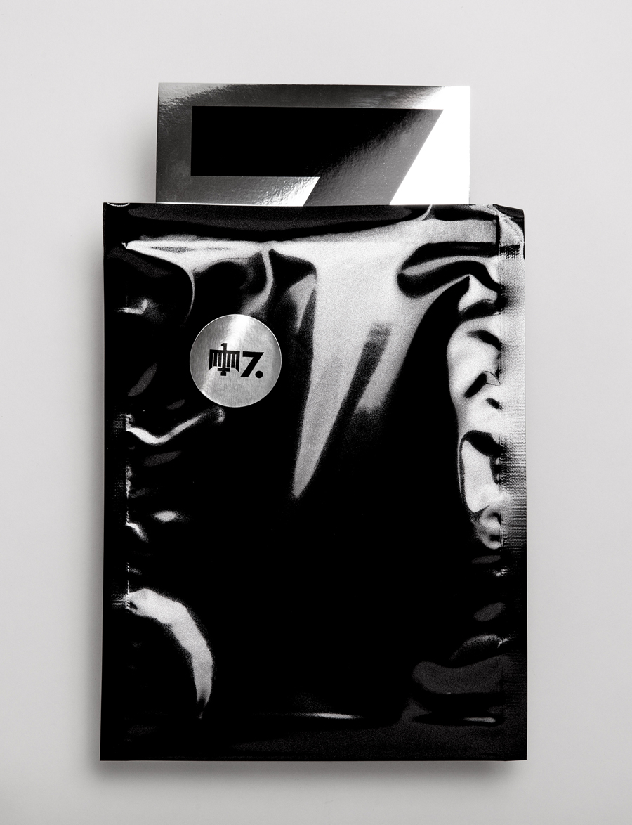
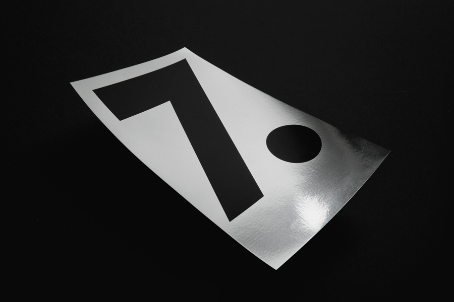
Hardpop is an electronic music venue located in the Mexican city of Juárez. It plays host to both international and national DJ’s and has been acknowledged twice by DJ Magazine as one of the best clubs in the world. Hardpop’s brand identity, a contemporary interpretation of military insignia, and a mix of conventional and unconventional typographic forms created by graphic design studio Face—a significant departure from its previous identity—draws its inspiration from an interior of classic and modern detail. To celebrate the venue’s seventh bithday, Face created a number of anniversary specials and a new flyer system that would fit neatly within Hardpop’s signature style.
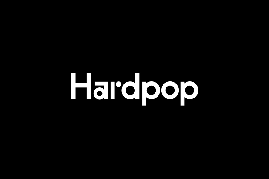
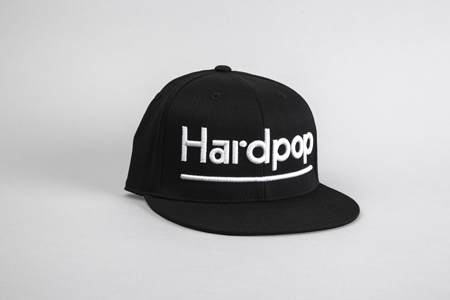
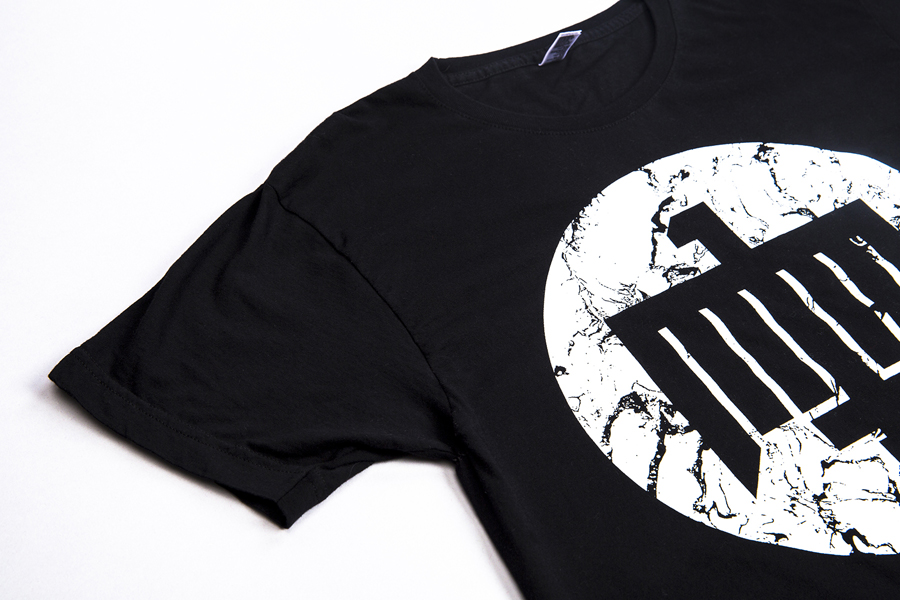
BP&O covered Hardpop’s new identity on its launch, noting the logotype’s distinctive contrast of characters, the geometric revision of its eagle motif, moments of duality in print and the use of raised and glossy thermographic print finish across uncoated boards as points of interest. Face build on this with a variety of new material textures and finishes, revised flyer layouts with new type choices and the introduction of gold and silver foil detail well-suited to the theme of celebration. These continue to favour the reductive alongside the high quality, and make good use of a distinctive logotype and logo across Hardpop merchandise through bold proportions. More from Face on BP&O.
Design: Face. Opinion: Richard Baird.

