Nongfu Spring Mineral Water by Horse
Opinion by Richard Baird Posted 2 June 2015
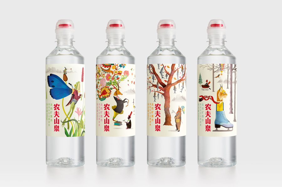
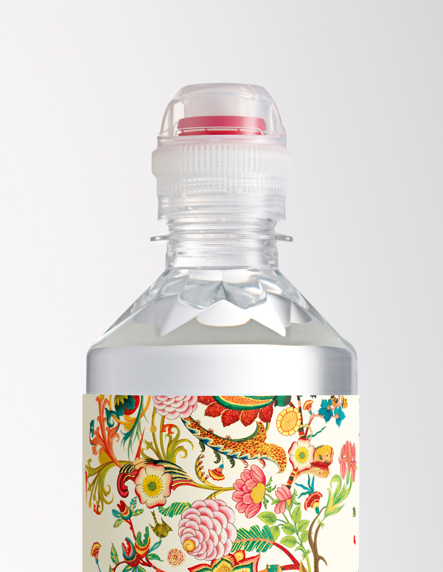
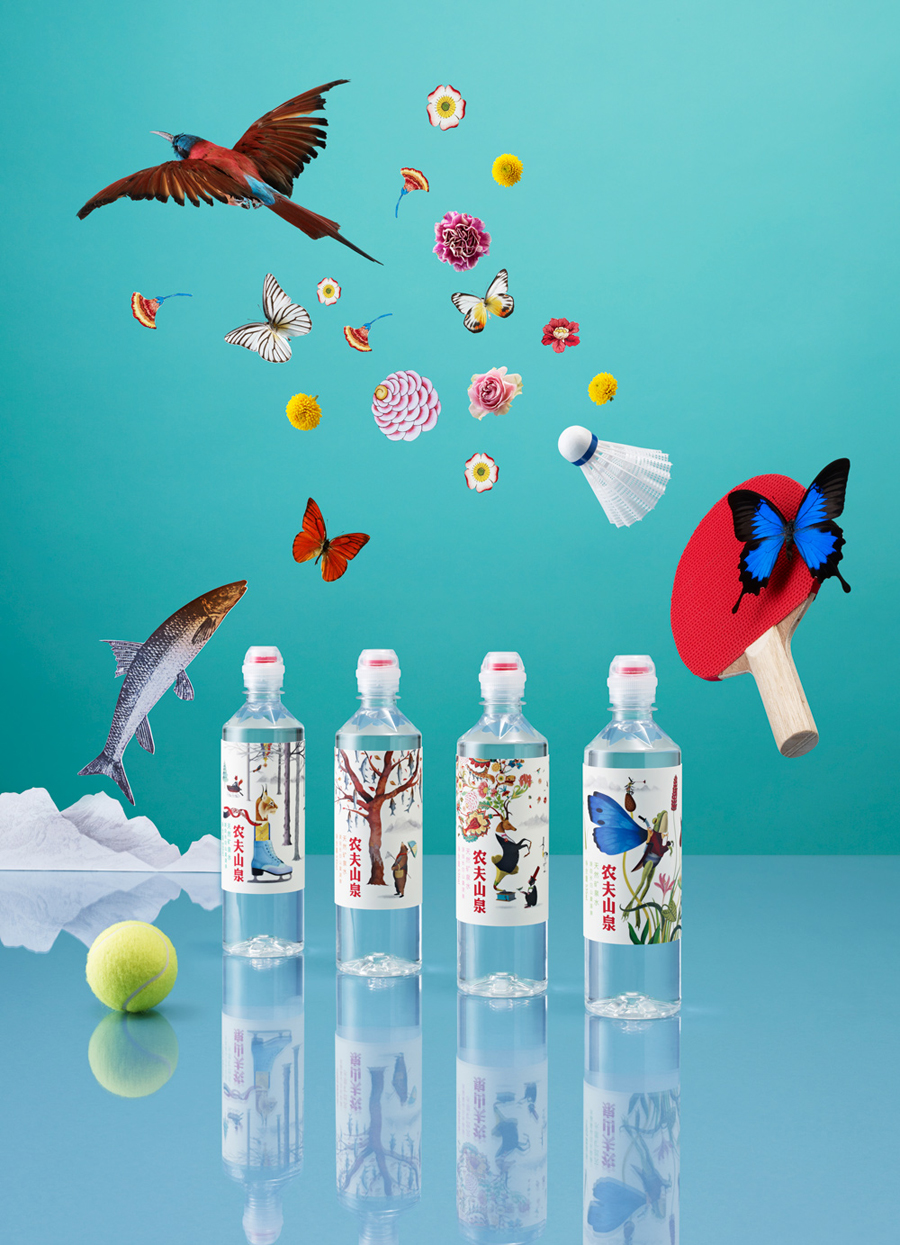
Nongfu Spring is a bottled mineral water brand and a leading Chinese beverage business. Nongfu worked with British design studio Horse to develop a new package design treatment that, using labels illustrated by designer Brett Ryder and a distinctive structural design with a slim profile and proprietary leak-free sports cap, would engage the youth market.
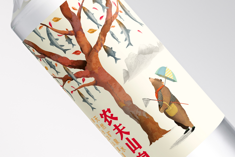
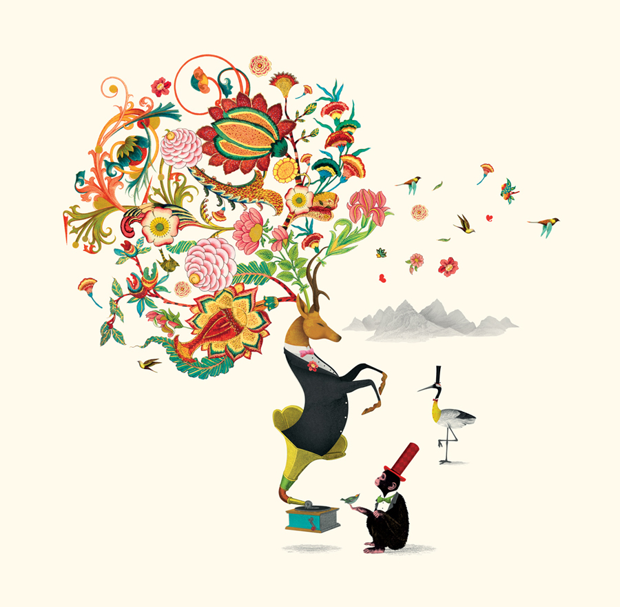
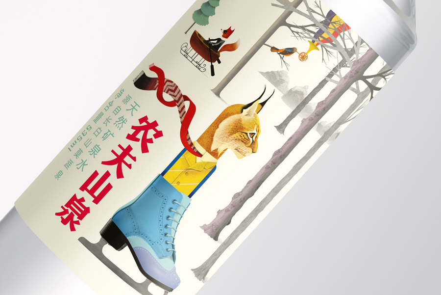
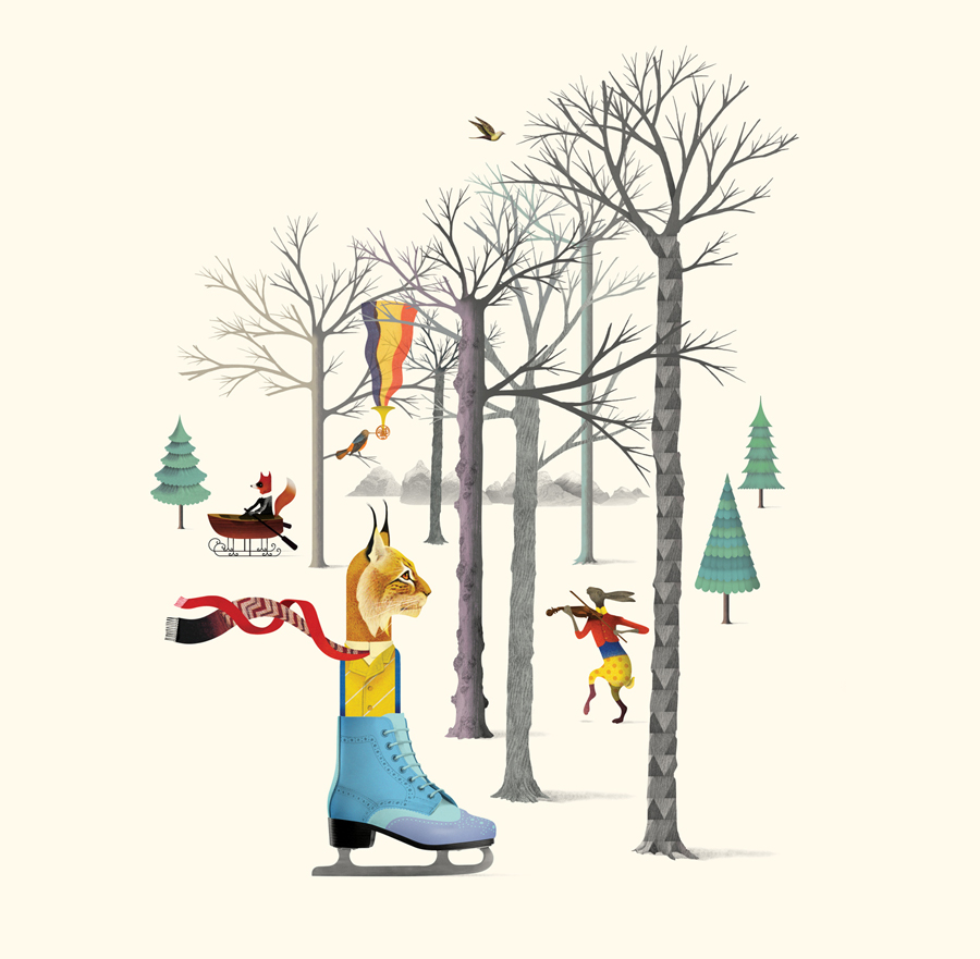
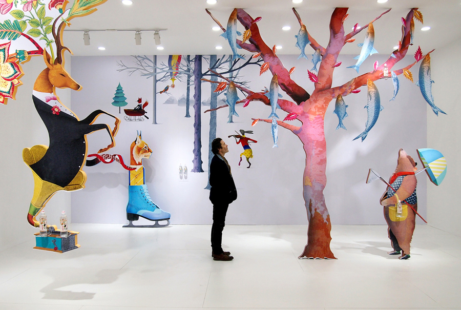
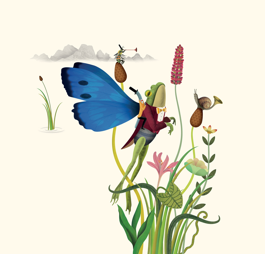
Brett’s illustrations are bound by a seasonality and draws on the flora and fauna of China’s Lushuihe National Forest Park, a densely wooded region and the location of the Moya Spring, the place that Nongfu draws its water. Winter features the Eurasian lynx, spring an Asiatic grass frog, a red deer, red-crowned crane and a variety of flowers capture the summer, while autumn features an Ussuri brown bear.
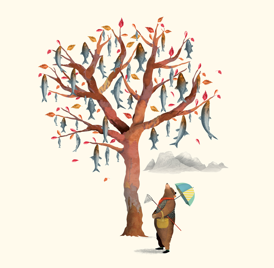
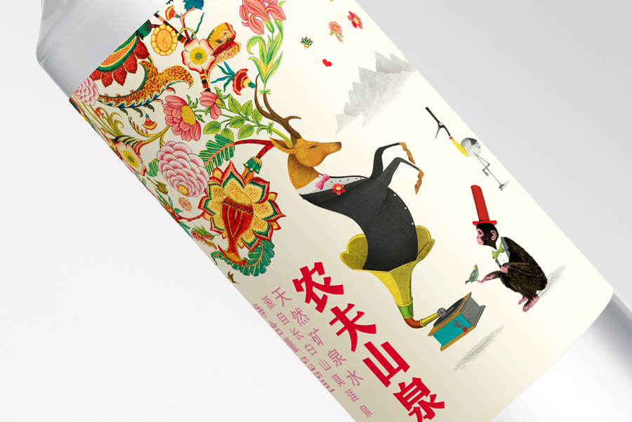
Each panel is well-rendered with a regional specificity. There is value in the variety, detail and quality of the illustrative work, where often you might expect repetition, effectively brought together by the seasonality of colour and image. Whimsy, derived from the exaggerated proportions and the anthropomorphisation of animals, is not an unfamiliar approach but executed with care and individuality. This introduces a fantastical and charming storybook component that avoids the childish and has a strong sense of brand character unique to the bottle water category.
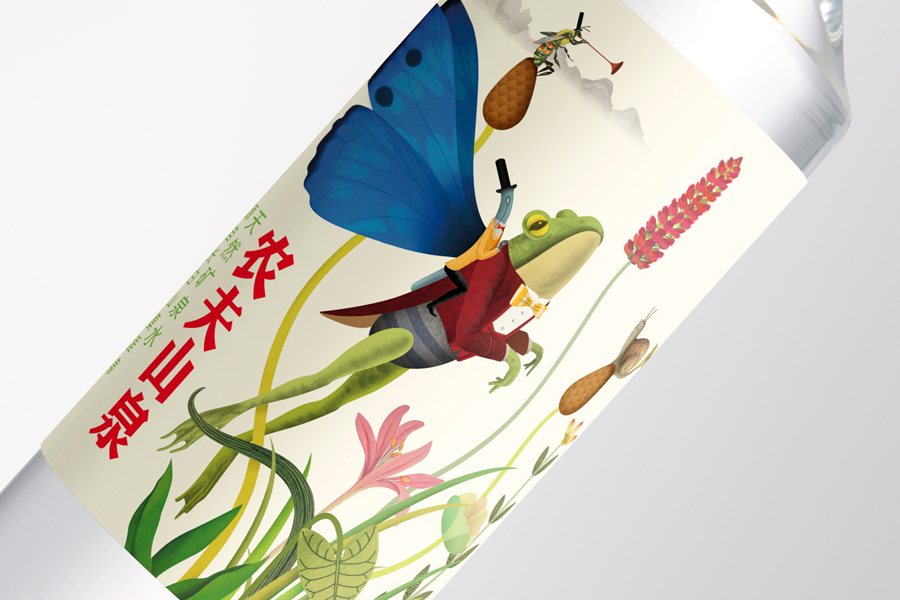
A contrast of detail and reduction, areas of unprinted space, earthy colour palette, and the crafted qualities of watercolour bleeding across art paper make for a rich and well-balanced treatment with clear focal points and a compositions that make good use of the slim structural design. The posture of the frog and deer, the windswept scarf of the lynx, and falling leaves makes sure that each panel has life and direction.
The structural design’s straight sided profile, sculpted shoulder and leak-free sports cap, alongside the illustrations, is a distinctive combination that blurs the line between luxury glass decanters like Voss and the sports bottles of Evian, the perception of high-value and an everyday convenance.
While those looking for a brand and product experience deeply rooted in region, drawing on the geography and geology of source, its mineral content and flavour profile expressed through language, image and online experience might be disappointed, origin, as it appears here, functions as inspiration for a very well-polished and compelling aesthetic treatment. One that secures differentiation and broadens Nongfu’s bottled water portfolio in a way that is sensitive to, and makes the most of the market and demographic. More from Horse on BP&O.
Design: Horse. Illustration: Brett Ryder. Opinion: Richard Baird
