Poseidon Helsinki by Kokoro & Moi
Opinion by Richard Baird Posted 3 June 2015
Poseidon Helsinki centralises the tasks of architect and builder with the intention of delivering higher quality construction projects based around visionary and uncompromising design solutions. Poseidon’s values are deeply rooted in a love for Helsinki, a belief in aesthetically ambitious architecture and expansive urban spaces, and improving the capacity and quality of the city through sensitive renovation and attic conversions.
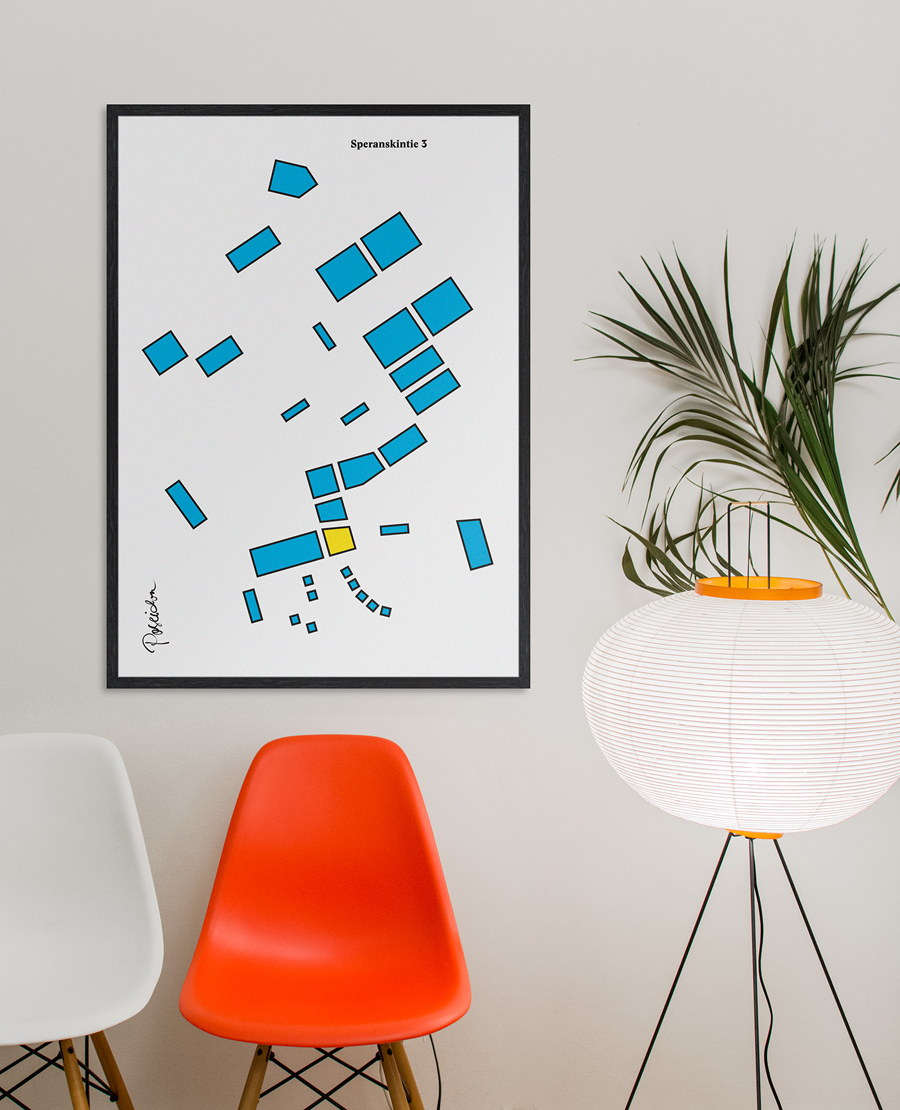
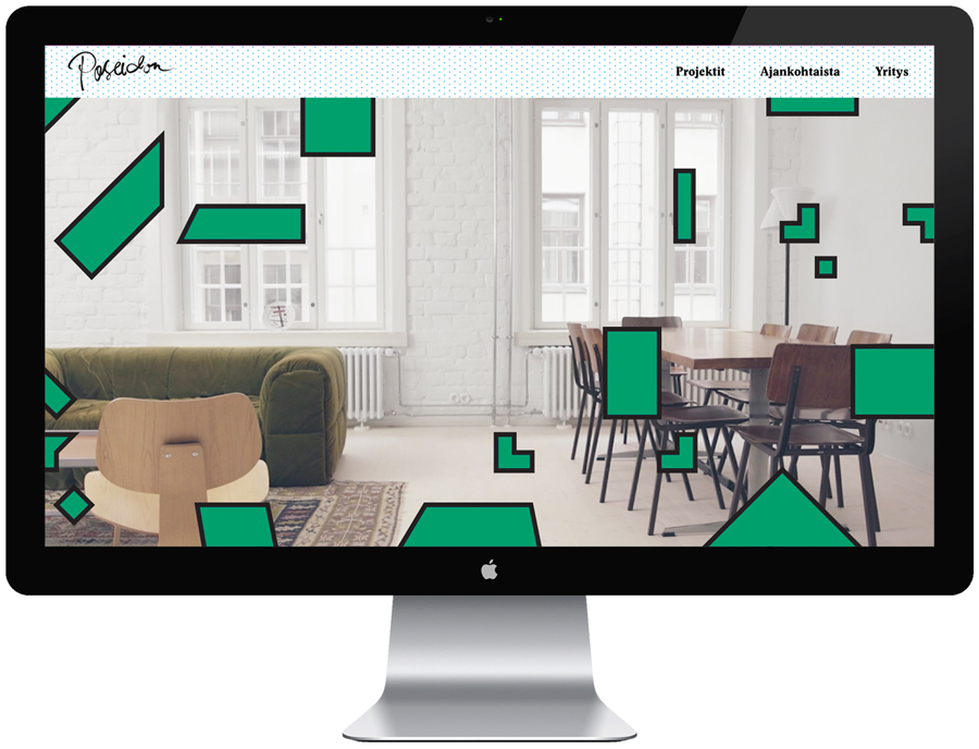
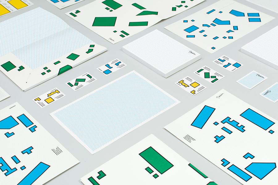
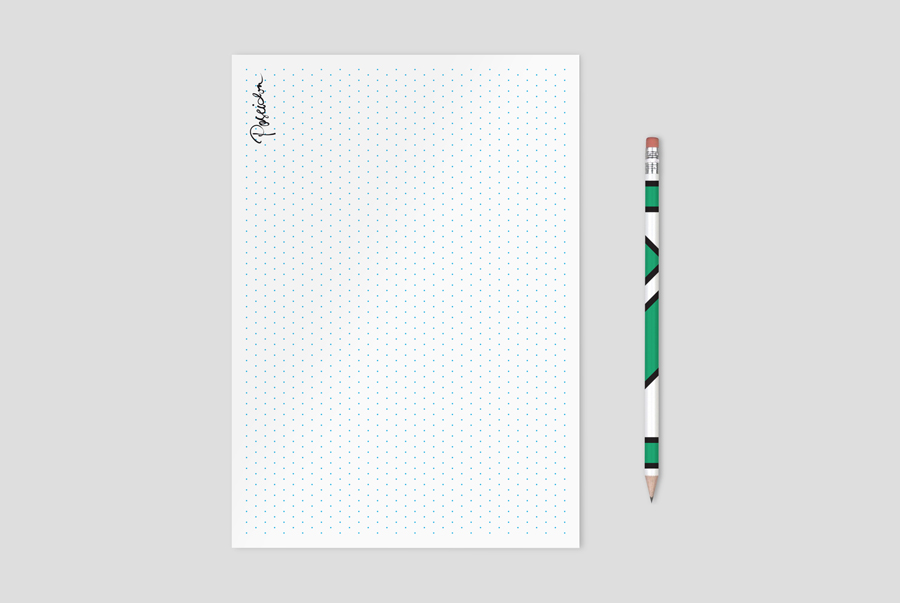
Poseidon’s visual identity, inspired by the colors, grids and shapes of modernism, and the architecture and art of Le Corbusier and the masters of geometric abstraction, was developed by Finnish design studio Kokoro & Moi, and went on to include business cards, stationery, posters and website.
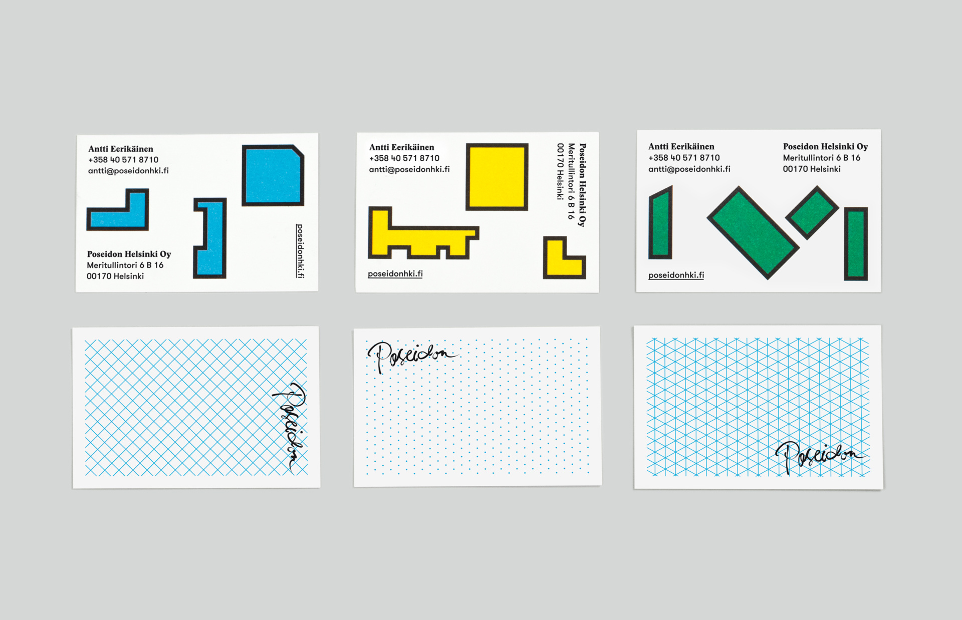
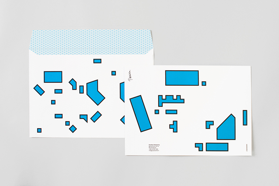
Kokoro & Moi draw an unexpected, distinctive and playful quality from familiar but appropriate architectural, construction and urban planning cues. This is perhaps most acutely observed in the conviviality of brightly coloured geometric shapes drawn from a map of the areas of Helsinki that Poseidon operates, and those it would like to renovate, but also in the aesthetic and functional qualities of graph paper, grids and guides, and subtly through vertical and horizontal type layout inspired by street names on maps.
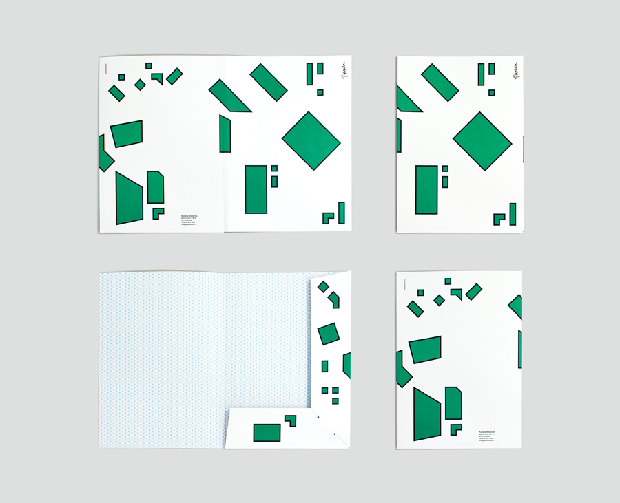
Footprints of large, immovable and schematised three-dimensional structures are visualised as simple two-dimensional blocks, appearing, absent context and technical detail, unconstrained, and alongside colour, as making a connection with play, experimentation and opportunity. This is accentuated by avoiding the restrictions of a logo-centric treatment but by allowing these shapes to play with scale across business cards and large format of posters, and establishing a memorable and flexible graphic treatment.
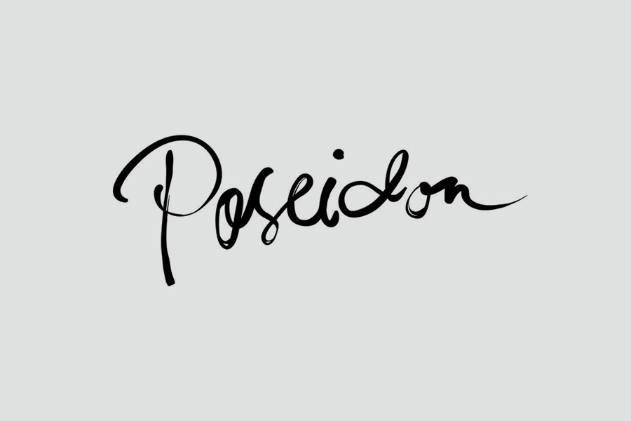
Constrast is effectively used to emphasise the aesthetic qualities, disparities and communicative value of each asset. This also extends to type choice and combination. The juxtaposition of the reductive sans-serif characters of GT Walsheim, alongside the engraved detail of Stanley and the flourish of a script handprinted by illustrator Linda Linko, appear as an interesting mix of functionality, historic sensitivity and an element of the personal.
The result confidently blends the familiar with the unexpected, draws the unconventional from the conventional, replaces a favour for asceticism with play, and manages to resolve a variety of assets, leverage their disparate qualities communicatively, and resolve these through a good use of structure and space. More from Kokoro & Moi on BP&O.
Design: Kokoro & Moi
Logotype: Linda Linko
Opinion: Richard Baird
Fonts Used: Stanley Poster & GT Walsheim
Follow BP&O:
Feedly
Facebook
Twitter
Instagram
