The Best of BP&O — July 2015
Opinion by Richard Baird Posted 30 July 2015
Highlights this month have included Inhouse’s work on the book Blutopia and ECC’s 2015 Milan Report, Mind’s brand identity for jewellery manufacturer Gripoix, P.A.R’s work for eternal flower business Flora, and DIA’s brand identity for PR and management business Life Or Death. However, there were five projects that stood out and have made it into BP&O’s Best of Series, a feature that brings together the most interesting and unusual projects published on the site each month for another opportunity to be seen and shared.

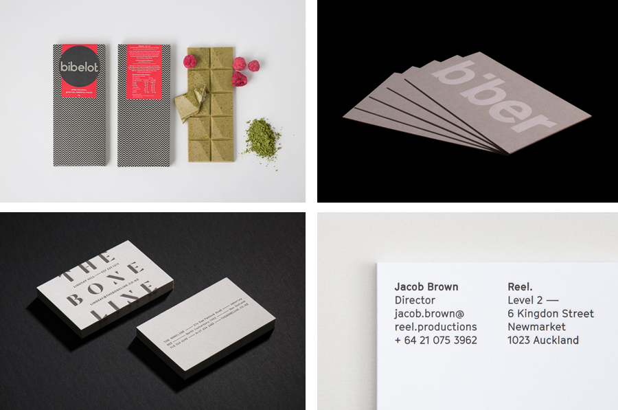
Biber Architects designed by Spin
Biber Architects is the New York based practice of teacher, author, architect and former Pentagram partner James Biber. Biber is made up of a tightly organized, highly experienced, and efficient team that have been producing design-led work—where others are process-focused or ideologically orientated—for more than 25 years.
The practice was conceived as a place to tackle architectural work from a fresh perspective, one that can respond to an industry that continues to experience significant change brought on by the personal computer, Internet ubiquity, rapid prototyping, instant and real-time communications, and the separation of design and production. Projects have included the Harley-Davidson Museum, the Fashion Center Needle and Button, and the Glass House Visitors Centre.
Biber’s visual identity, created by London based graphic design studio Spin and which included logotype, business cards, stationery and website design, is described as having a playful structure and an economy of expression that make a connection with the philosophies of the practice.
See more of this project here


Reel designed by Richards Partners
Reel, formerly Reel Good, is a digital production company telling memorable stories and crafting digital experiences from its offices in Auckland, New Zealand. It has positioned itself at the intersection between new technologies and established filming techniques, and delivers both creative and distribution services. These include providing direction, production, post-production, animation and music to clients such as New Zealand Air, Casio, Warner Music and Vodafone, amongst others. To coincide with the name change graphic design studio Richards Partners were commissioned by Reel to create a new brand identity treatment, which extended across business cards, brochure, posters and responsive website, that would help move it from start-up to respected production house.
See more of this project here

The Washington Post designed by Snask
Following an extensive studio search The Washington Post, one of America’s most widely circulated newspapers, commissioned Stockholm based graphic design studio Snask to illustrate The Favorite’s Issue with a fun and tactile idea that would unite, amongst others, topics such as food and drink, music, art and the outdoors. Snask’s concept is informed by the essence and characteristics of each topic, and individually visualised through form, texture, colour, process and material variety. These are combined to create a rich cover, spread and set of single typographic panels bound by a physical crafted quality.
See more of this project here

Bibelot designed by A Friend Of Mine
Bibelot is a Melbourne based, luxury, European-inspired dessert boutique with a coffee bar, chocolate shop, high tea salon, gelaterie and artisinal patisserie. It features an interior of long marble counters, a light spotted stone floor, spot lighting, cornicing, black and white walls, and bronze detailing. Bibelot recently worked with graphic design studio A Friend Of Mine to develop a brand identity and packaging design treatment. Based around monochromatic mosaics and a geometric sans-serif logotype, the studio’s approach is informed by the sense of permanence that underpins Bibelot’s concept and interior design, and draws out, using contrast, the bright handcrafted detail of its confectionery.
Read more of this article here

The Bone Line designed by Inhouse
The Bone Line is a New Zealand winery with a name that references the K—T Boundary, a thin band that runs close to The Bone Line’s location in the Waipara Valley, and that marks the end of the Mesozoic Era and the extinction of the dinosaurs. Auckland based graphic design studio Inhouse worked with the winery to establish a distinctive packaging and identity treatment. Like many good wine label solutions, Inhouse have taken its cues from the provenance of the wine. While conventional, this approach benefits from a significant regional prehistory that ties in well with the themes of age and vintage, and is effectively visualised through a contrast of type reduction, the detailed texture of fossil photography and a black, white and copper colour palette.
Read more of this article here