4B Arkitekter by Commando Group
Opinion by Richard Baird Posted 28 September 2015
4B Architects is an architecture studio with offices in Oslo, Norway, an experienced team and a holistic approach. It has a particular interest in low energy and sustainable projects, and has built a portfolio of restorations, public, cultural and commercial buildings, private housing and outdoor spaces. The studio’s team of founding partners (from its inception in 1971) and a generation of younger designers allows the studio to balance a long-established professionalism with fresh thinking and innovation.
Scandinavian graphic design studio Commando Group recently worked with 4B Architects to redesign its visual identity in a way that would work across and unite a variety of print based and digital platforms, and would communicate its innovative and dynamic nature.

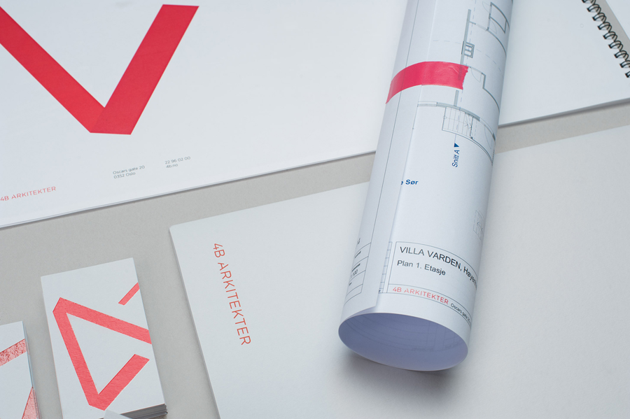
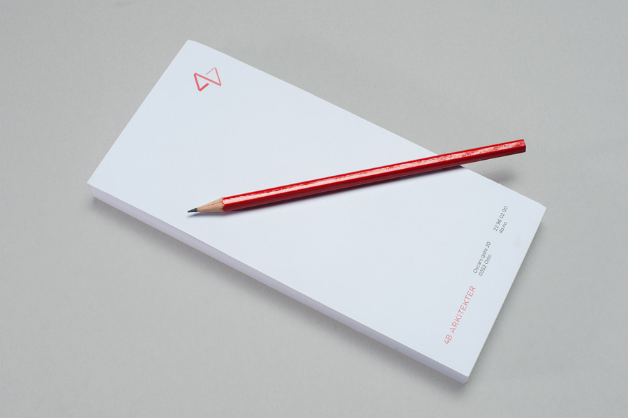
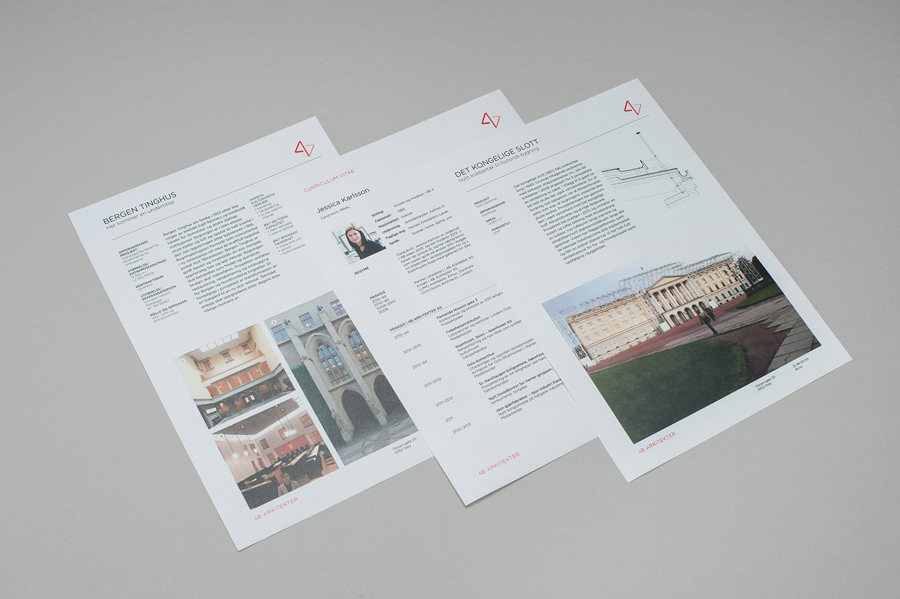
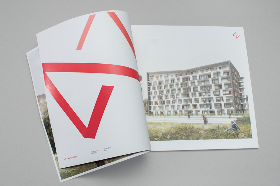
Commando Group’s approach to 4B’s brand identity, which extends across business cards, folders, project sheets and brochure, effectively touches upon space and perspective, play and professionalism, and architectural association/convention with just a few assets. This is achieved through a three-dimensional animated logo, the light and shade of its two-dimensional, oversized and cropped application in print, uppercase, geometric, sans-serif typography, grid-based layouts, and the use of plenty of white space, which is punctuated by a vibrant red.
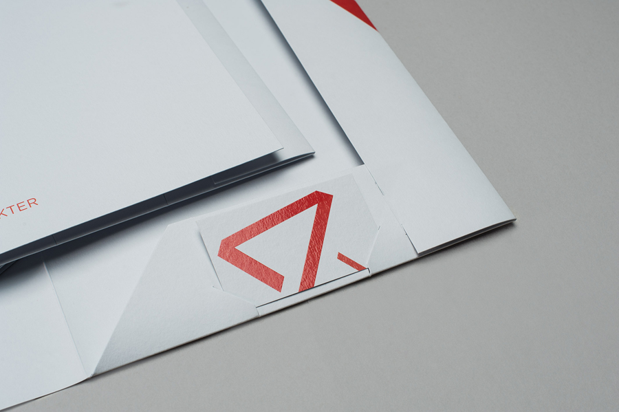
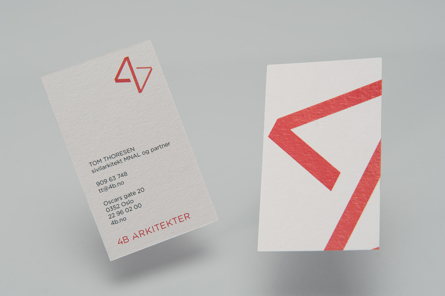
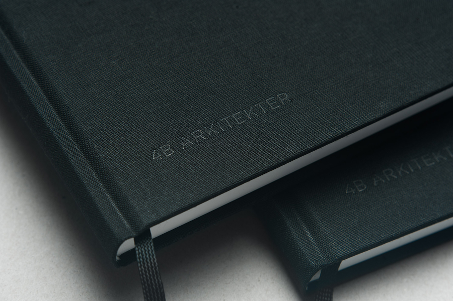
Other small details that share similar architectural foundations include the reflective qualities and gloss of a block foil print finish, a favour for height rather than width across business cards and compliment slip, and the small angular and reductive cuts to the logotype. More from Commando Group on BP&O.
Design: Commando Group. Opinion: Richard Baird. Fonts Used: Gotham
