Netsurvey by The Studio
Opinion by Richard Baird Posted 20 October 2015
Netsurvey provides organisations with employee and customer relation evaluation services using a precise, individualised and proprietary set of tools, and then helps to implement change with the intention of enhancing employee engagement, strengthening leadership and improving employer branding. Netsurvey works across a variety of sectors, for both small and large businesses and has grown to become one of Sweden’s leading consultants within the industry.
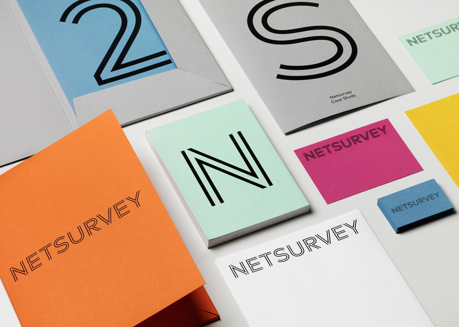
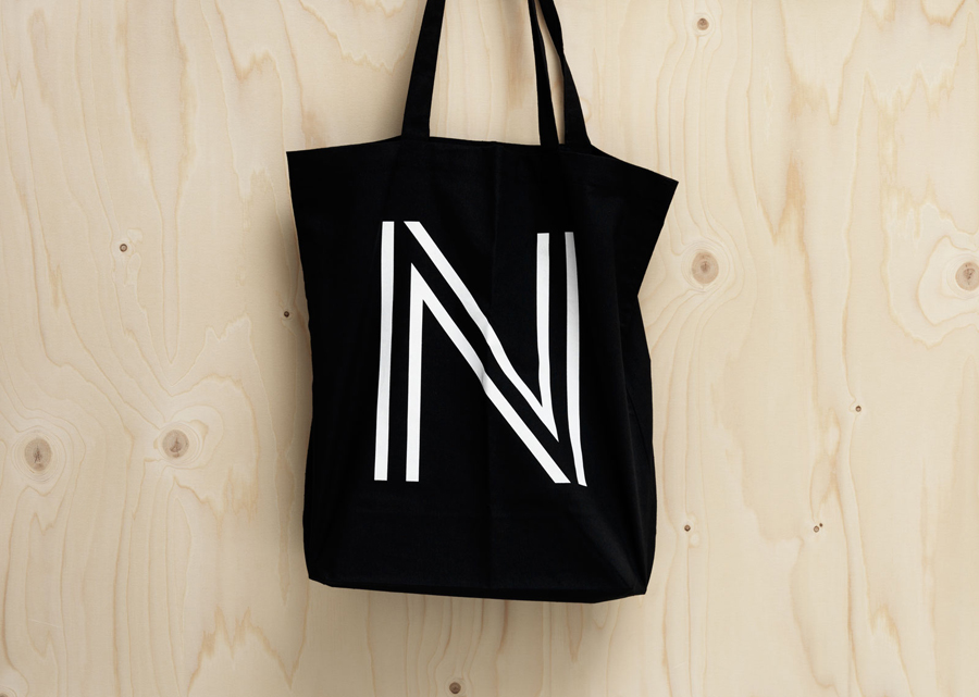
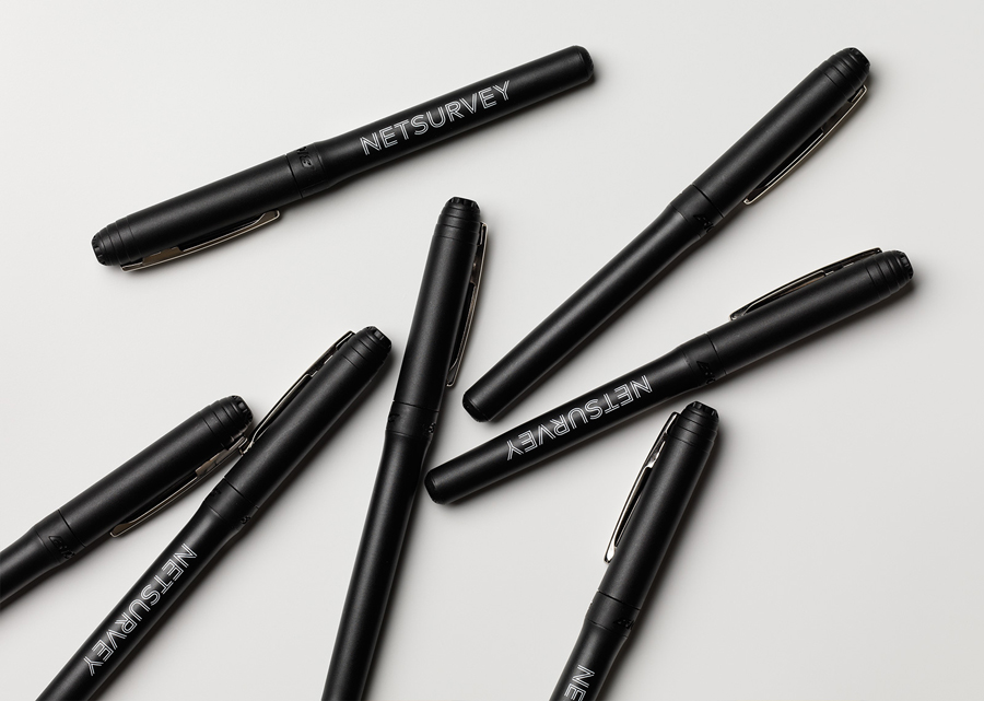
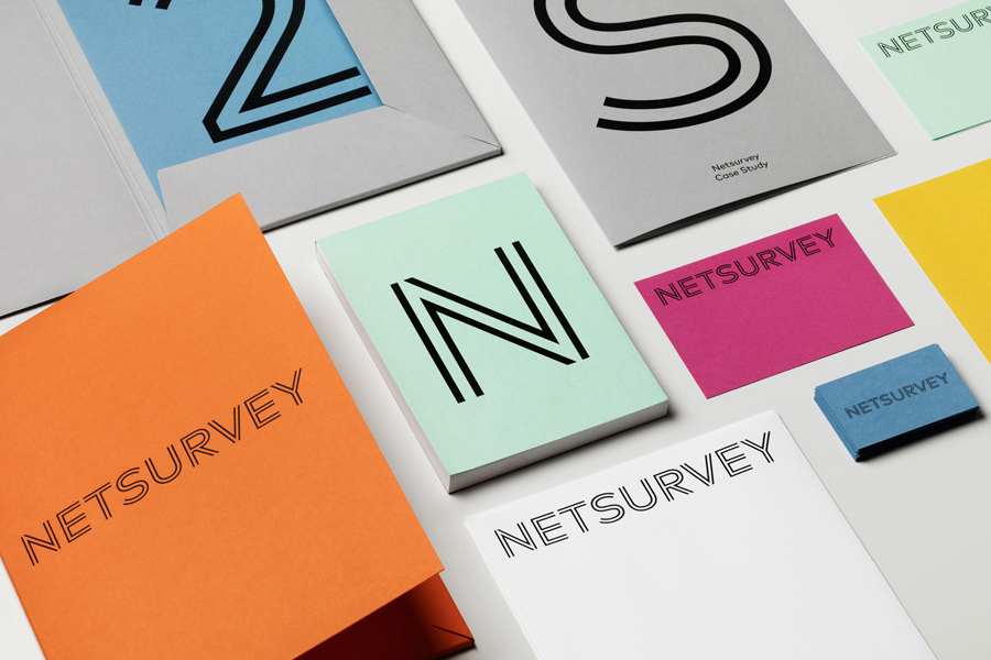
In response to what was felt to be an increasingly dated visual identity, one that failed to convey the warmth, engagement and innovative spirit that characterises the company, Netsurvey commissioned Stockholm based graphic design agency The Studio to create a new system that would communicate these key qualities but also their position as industry leaders through differentiation. This was achieved using a bright colour palette, custom typography, monolinear iconography and personable photography, and included business cards, stationery, print communication, tote bags, pens, and website.
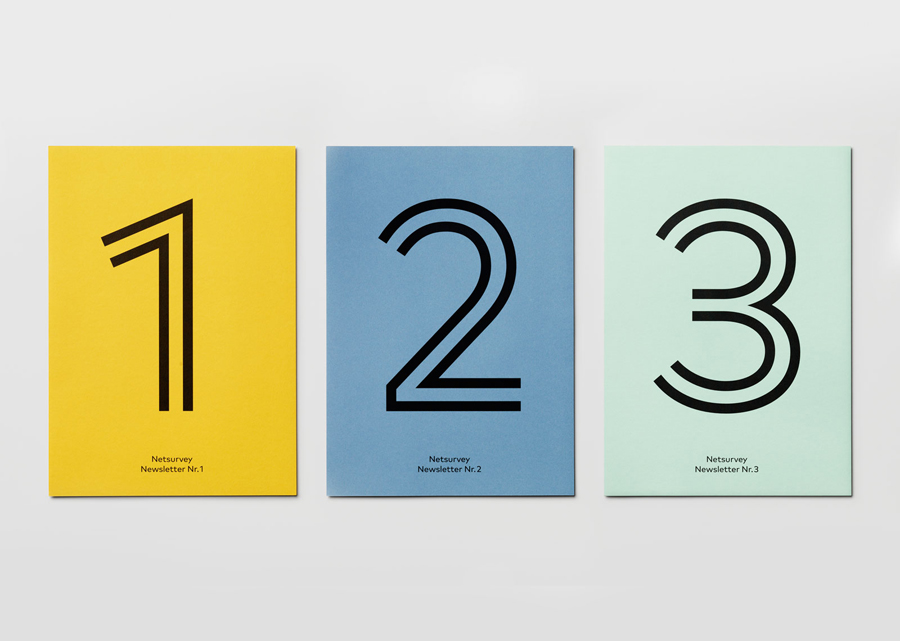
Custom typography and iconography, bound by the current favour for the monolinear, bright colour, and the sans-serif Mark Book alongside plenty of white space online, secures a thoroughly contemporary brand identity. It shuns the conventions of business to business communication, its aesthetic sensitivities and economy—described by The Studio as being dry, serious and boring—in favour of a warm, playful and expressive quality, and the expense of dyed papers and boards typically associated with consumer facing products and services.
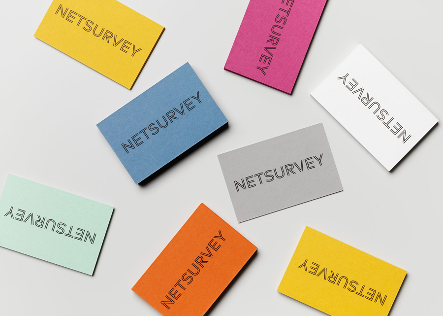
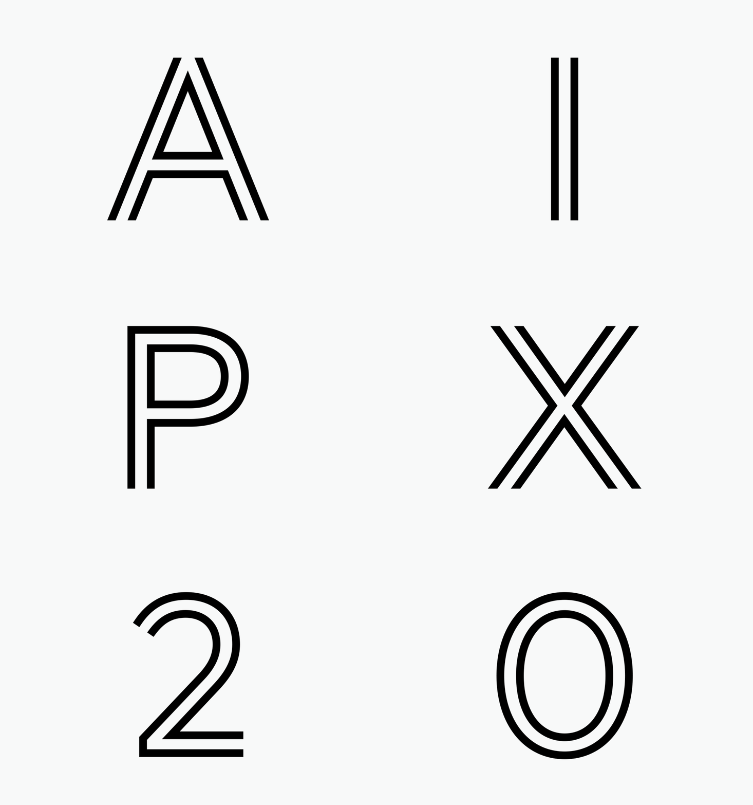
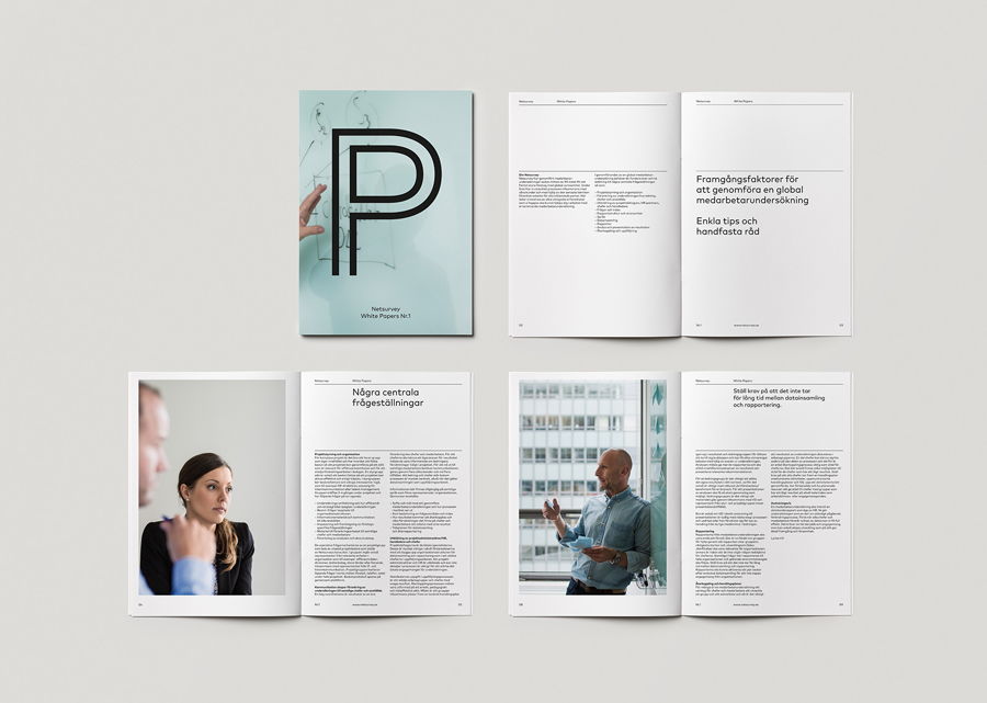
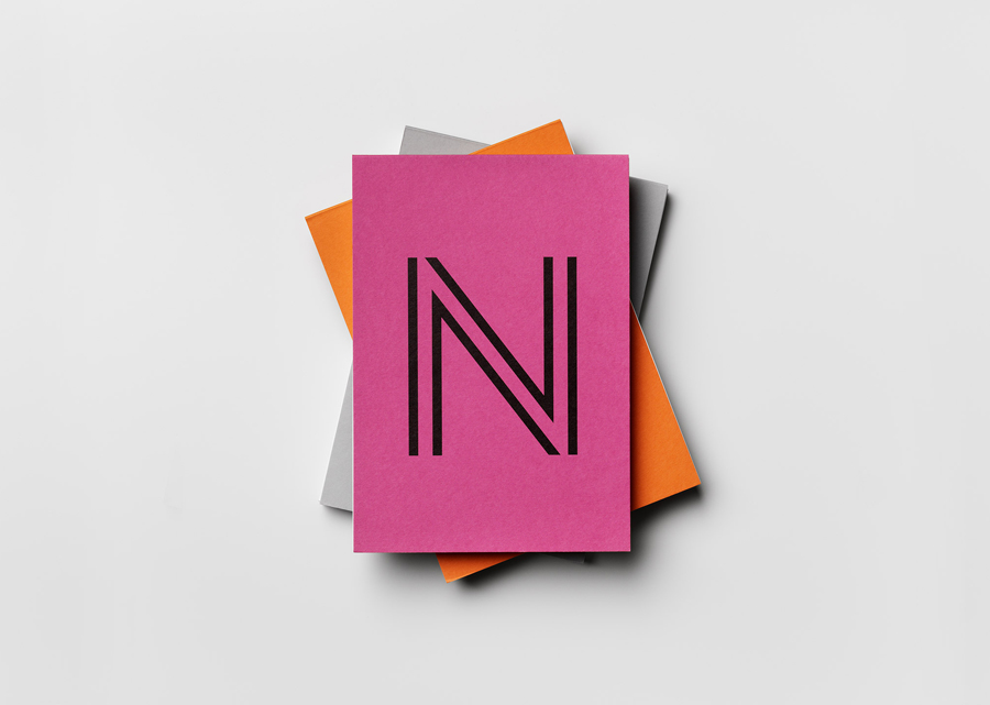
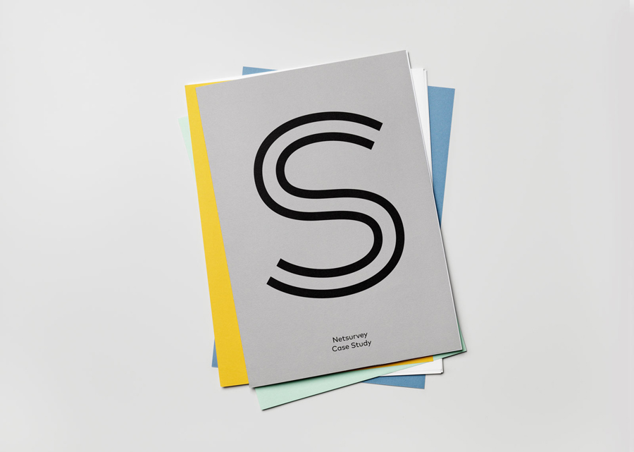
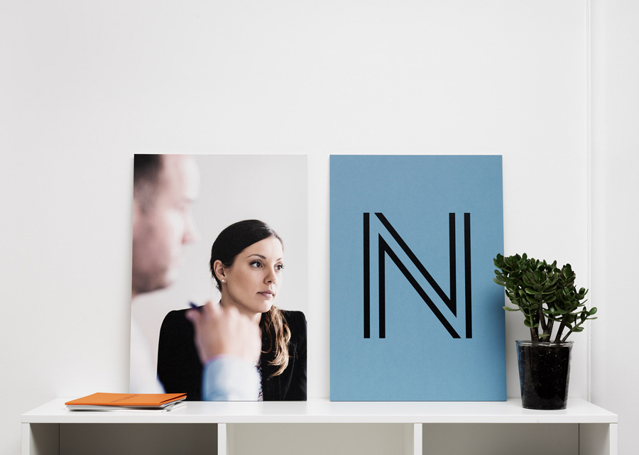
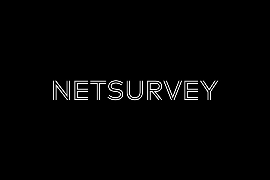
Uppercase geometric custom typography tempers the conviviality of the colour palette slightly with a single black ink and dual lines founded on the concept of business to business partnership, a familiar but relevant concept, and expanded upon with a set of pictograms. Oversized letters in print lean more towards the stylistic rather than communicative but sit well within the context of a business that is described as being bold in its actions.
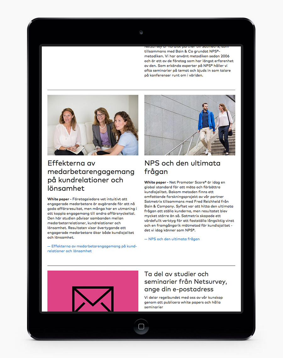
Photography, perhaps the most conventional component, manages to find a communicative balance between the professional and the personable, formal and informal settings and dress, and mixes meetings with casual conversation. Website structure, layout, type choice and colour provides balance, offsetting but not undermining the corporate aspect of some of the images and the business.
Design: The Studio. Opinion: Richard Baird. Fonts Used: Mark Book. Tip: Rorie McIntosh
